
Originally posted at The Film Stage
“Don’t Judge a Book by Its Cover” is a proverb whose simple existence proves the fact impressionable souls will do so without fail. This monthly column (with a special year-end retrospective today) focuses on the film industry’s willingness to capitalize on this truth, releasing one-sheets to serve as not representations of what audiences are to expect, but as propaganda to fill seats. Oftentimes they fail miserably.
It’s funny to think that streaming services like Netflix didn’t bother creating posters for their original work a few years back knowing they’d never have to contend with competition at the local multiplex. Slowly but surely they began doing a few here or there before steadily growing to the point where it seemed they enjoyed being able to embrace out-of-the-box designs for the same reasons they avoided the process altogether.
Now we’re at the end of a calendar to forget that saw a majority of theaters shuttered for nine straight months to make it so streamers became king. Big studios pushed titles out of 2020 altogether, small studios went virtual, and Netflix, Amazon Prime, Hulu, et al. watched subscriptions soar. Suddenly their digital multiplex formed the playground for cinematic competition and the continued creativity of poster design found itself working at the top of its game just like always.
That’s the beauty of movie key art. It works on-screen just as good as it does in print. Don’t get me wrong: nothing beats ink on paper. But the message remains intact regardless. The art’s aesthetic worth, typography, marketability, composition, and inventiveness are sustained beyond the platform used to experience it. So whether it’s housed in a frame on the wall or composed of 1s and 0s to inhabit a streaming library’s carousel, heads will definitely be turned.
Honorable Mention:
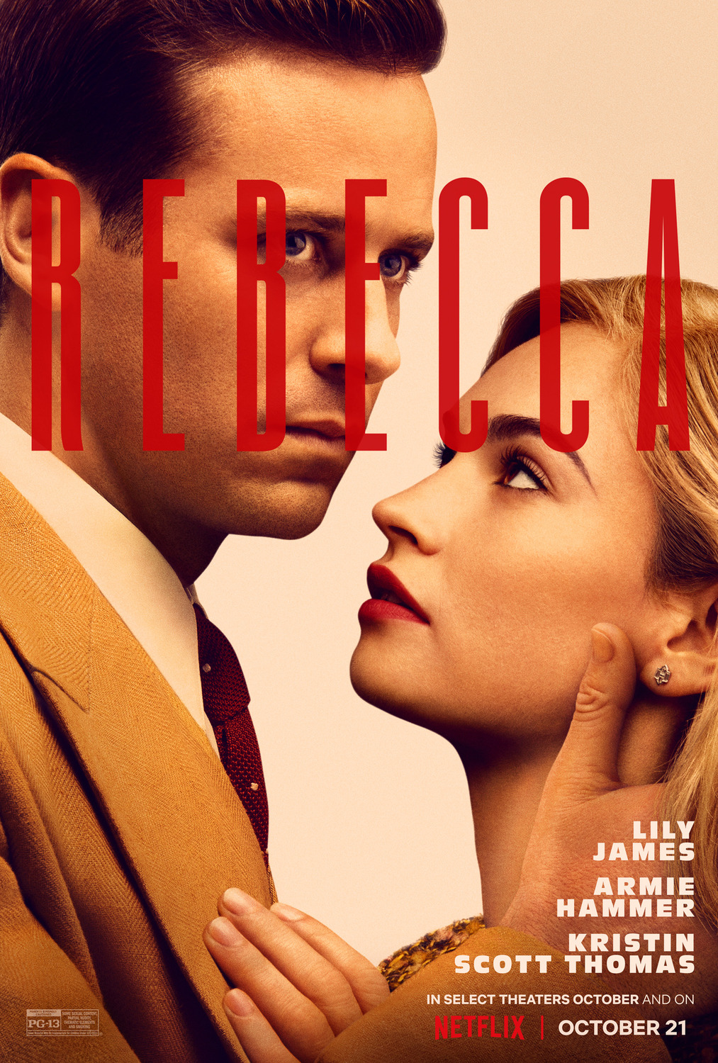
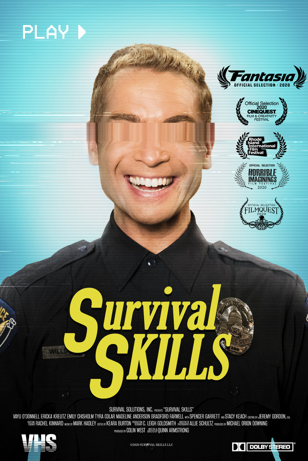
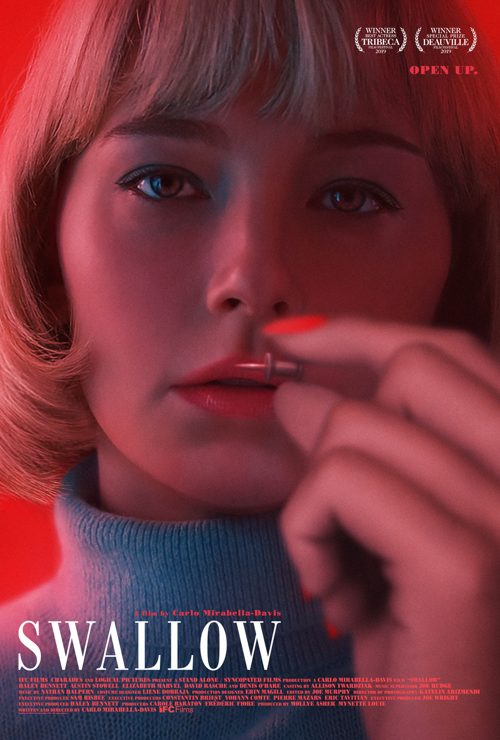

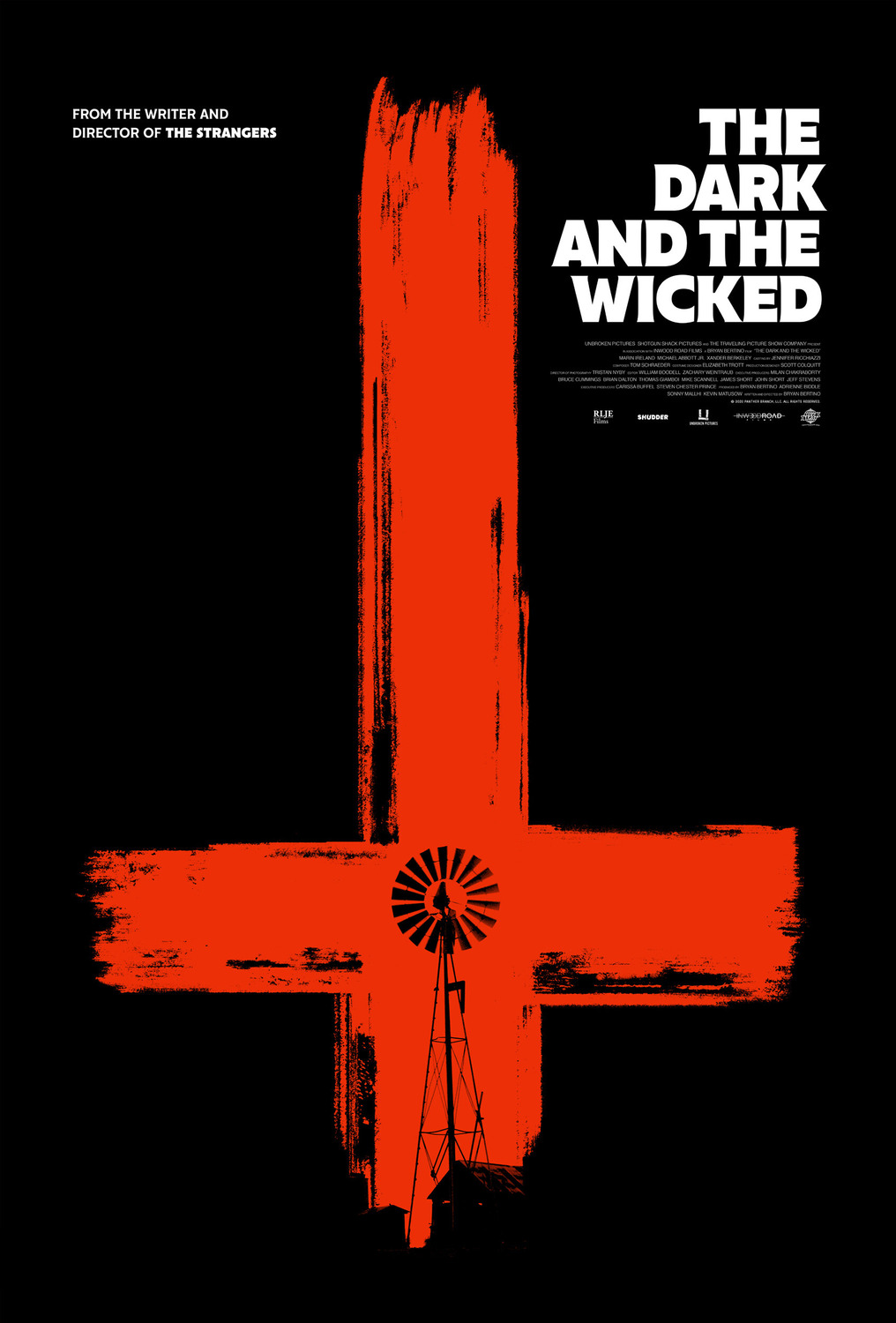
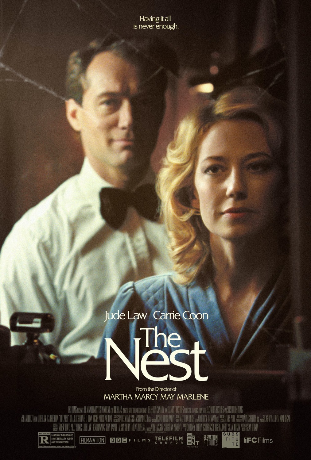
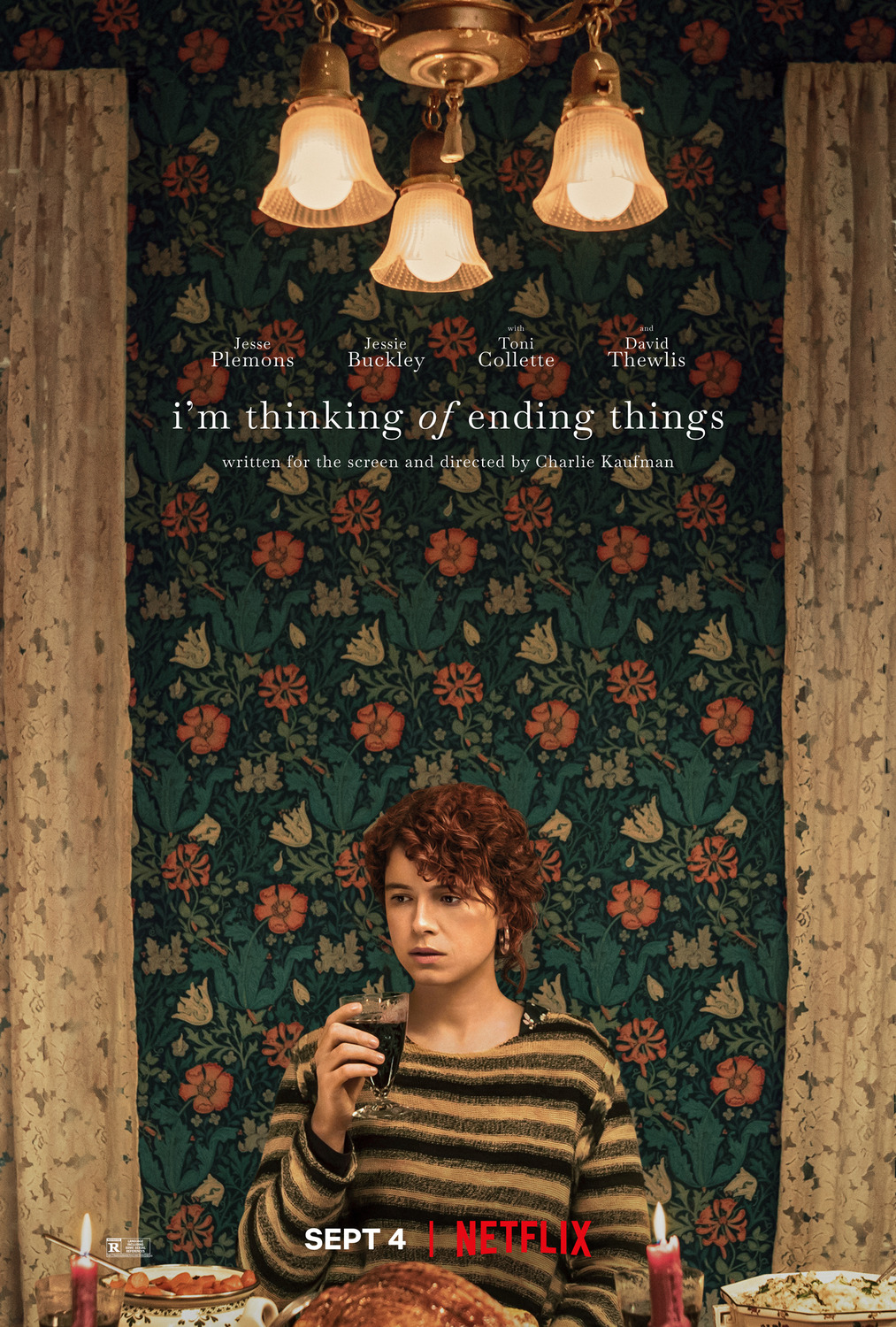
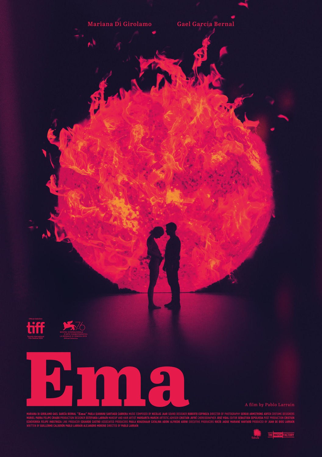
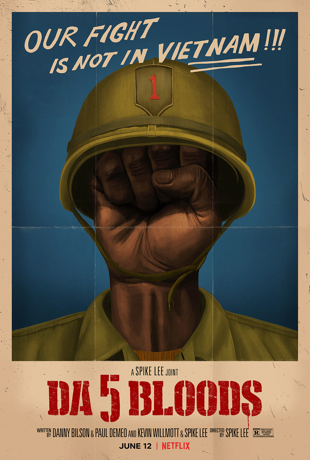
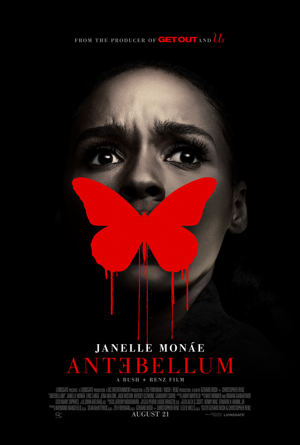
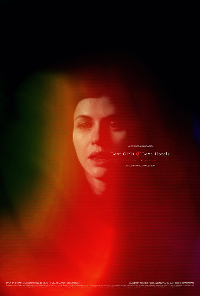
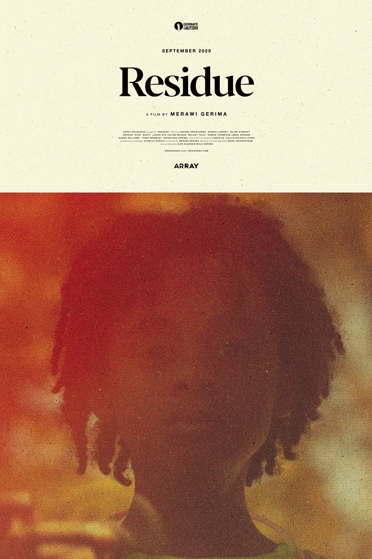
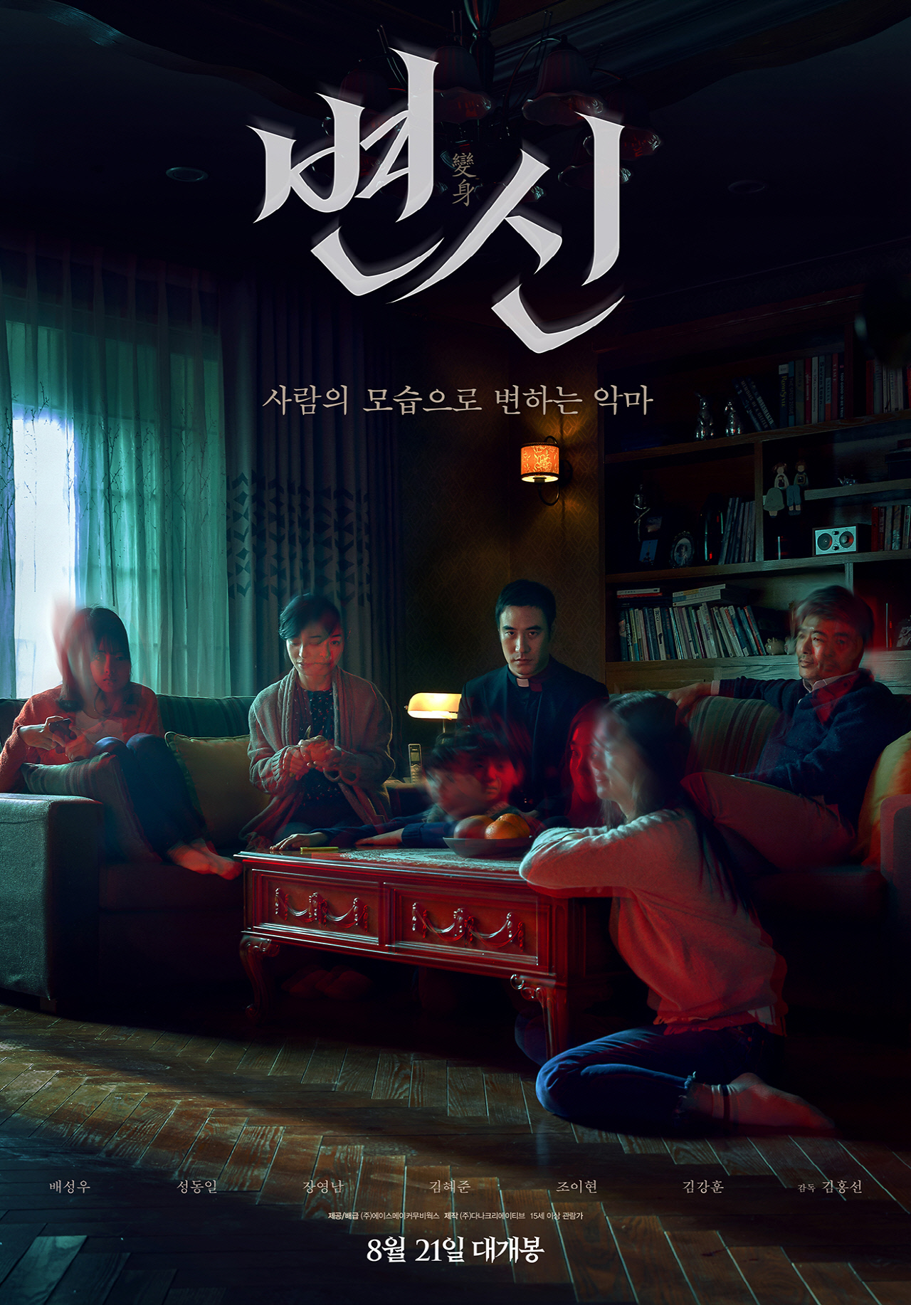
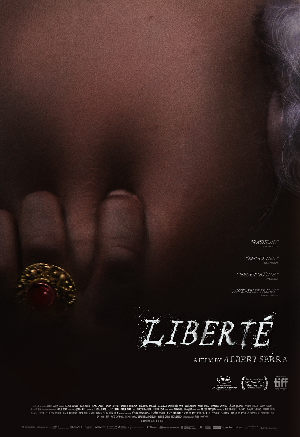
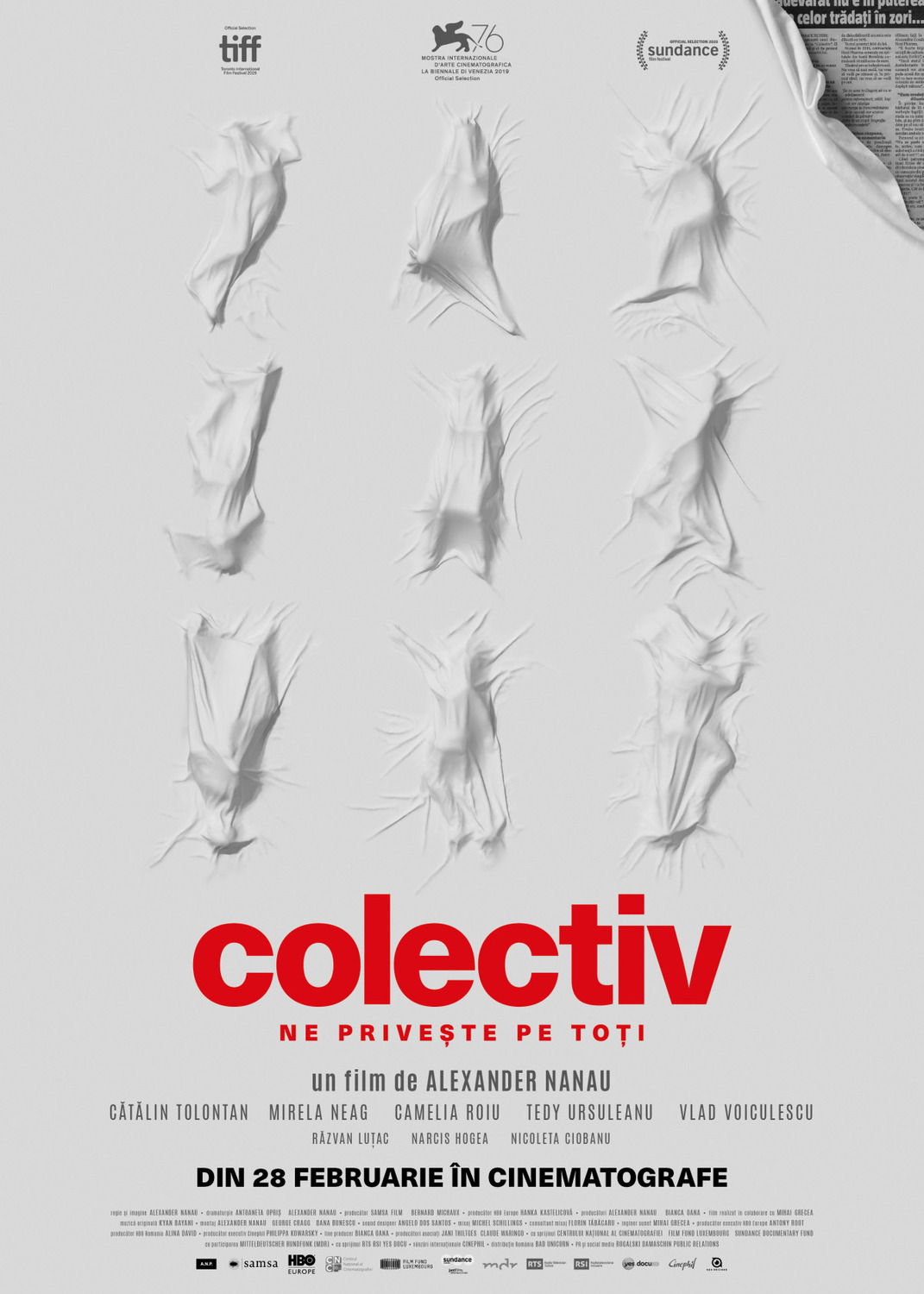
#25 – Rebecca (Empire Design, photography by Jason Bell); #24 – Survival Skills (Jeff Brush); #23 – Swallow (P+A); #22 – Deerskin (Frost Foundry); #21 – The Dark and the Wicked (Brandon Schaefer / Jump Cut); #20 – The Nest (P+A); #19 – I’m Thinking of Ending Things (Midnight Marauder); #18 – Ema (Unknown); #17 – Da 5 Bloods (GRAVILLIS, art by Akiko Stehrenberger); #16 – Antebellum (Leroy and Rose); #15 – Lost Girls & Love Hotels (Midnight Marauder); #14 – Residue (Matt Needle [face] | Garry Marta Design [fireworks]); #13 – Metamorphosis (Unknown); #12 – Liberté (Brian Hung); #11 – Collective (Eugen Erhan)
Top Ten:
#10 – Judy & Punch (Jeremy Saunders)
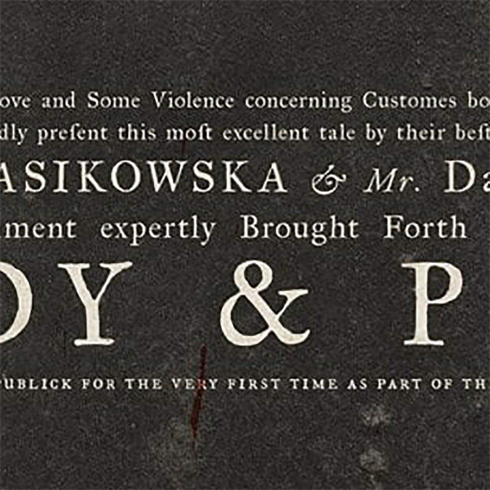
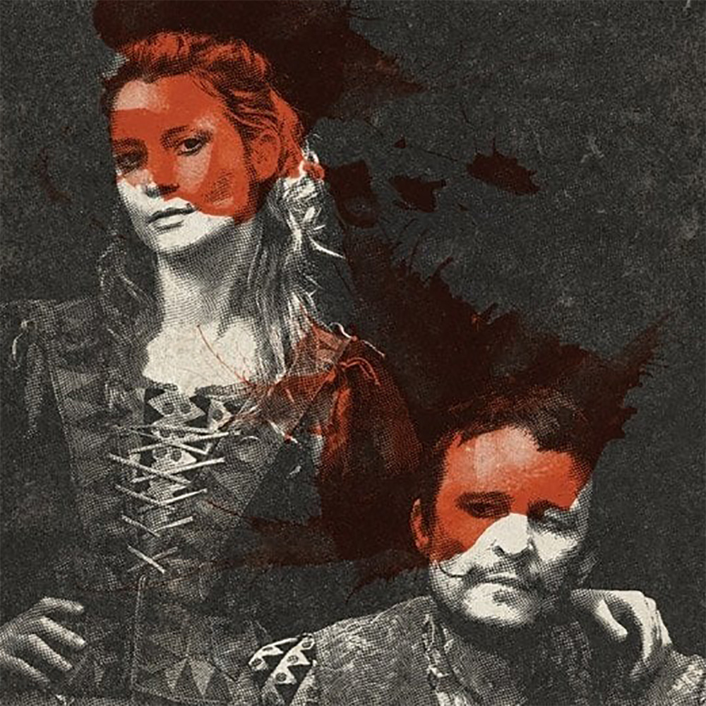
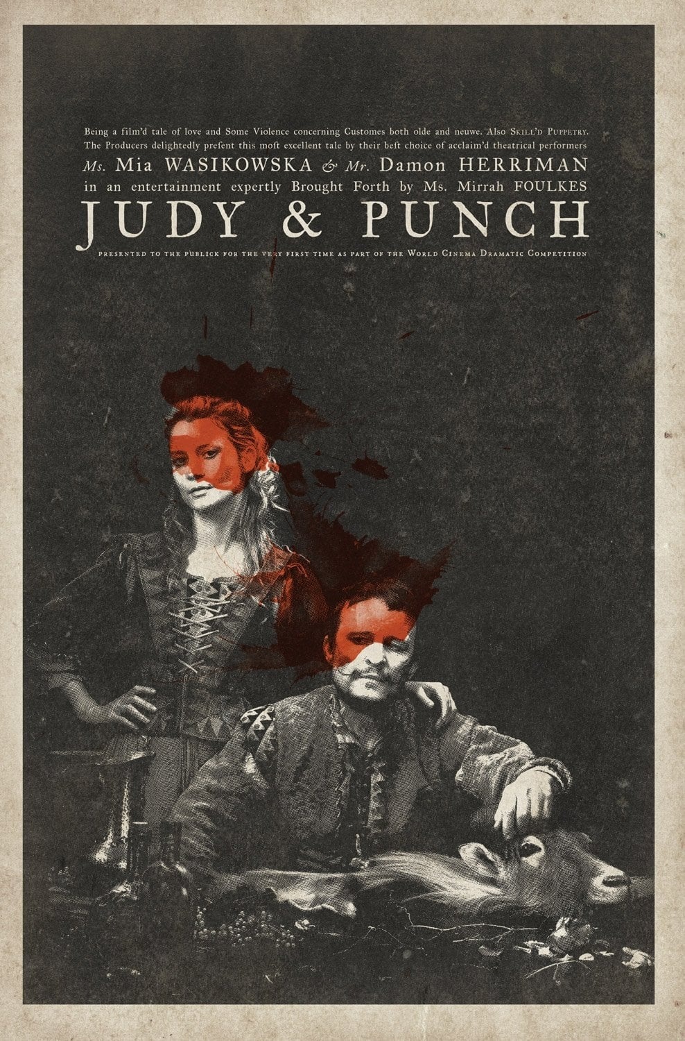
I love it when a film’s poster could also double as a prop. Put this sheet for Judy & Punch outside the theater in which the titular characters are to perform and it fits right in. The texture of the paper with its imperfect ink coverage. The fully justified text block composed with a janky serif font—complete with long s. And the gloriously overwrought portraiture of serious poses and still life accoutrements all transport us back to the anarchic, 16th-century town of Seaside. Add a bit of blood (or alcohol if you’re less macabre) to stain their faces and the shouts of a rowdy bar can be heard in the distance. It’s a brilliantly rendered, complementary work of art.
#09 – Wendy (eclipse)
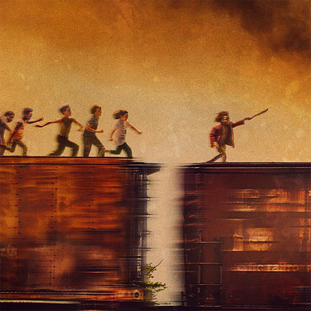
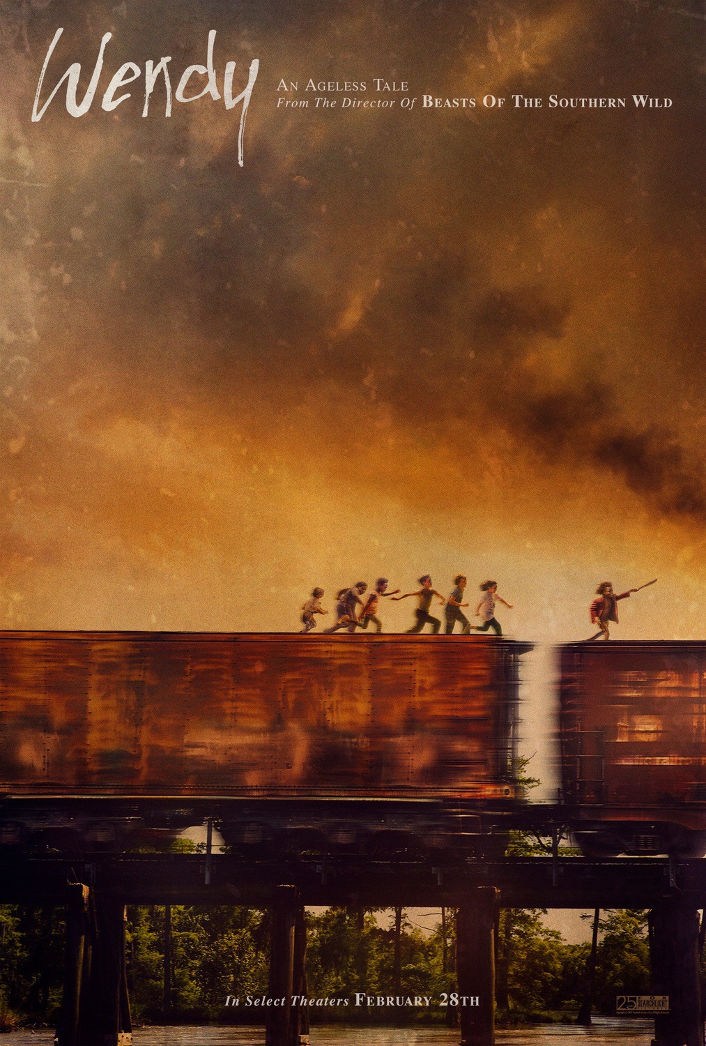
Rather than evoke a piece of the film, eclipse’s Wendy teaser embodies its atmospherically kinetic aesthetic. The brooding sky of an earth tone sunrise focuses its grimy yet beautiful, lived-in world of make-believe to help ground our expectations of a flying Peter Pan and experience how the breakneck speed of a cargo train can give the illusion of flight when running with its forward propulsion. The off-centered composition creates a sense that these “lost” children will soon move straight off the page unless we jerk our heads to the right to keep them in frame. It’s a grand-scale adventure moving from derelict corners to exotic expanses—a fanciful delight connecting the harsh reality of the bayou with the breathtaking vistas of Montserrat’s Neverland yet to come.
#08 – Wonder Woman 1984 (eclipse)

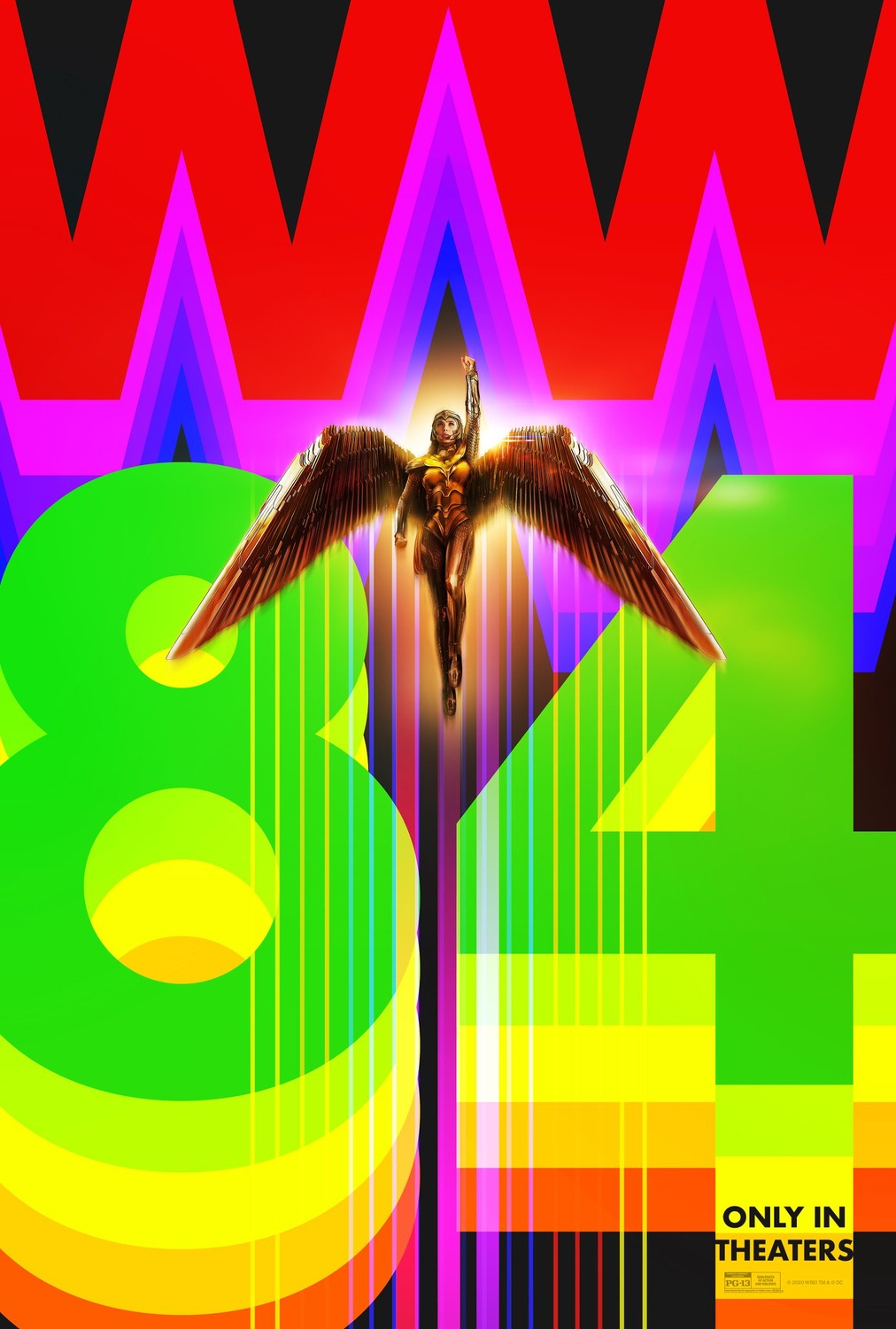
From muddy clouds to a face-slap of neon color, eclipse finally gets to launch into the sky with Wonder Woman 1984. They’ve got the bold, graphic iconography down pat with initials trailing repeats of themselves into the air in a complete reversal of the falling letters from Videodrome‘s 1983 Civic TV animation. Everything is therefore moving up: lines, shapes, and Gal Gadot herself with wings forming a rocketing arrowhead alongside the negative space between Ws for added oomph. It’s a visual marvel that markets the film’s setting more than its star because the powers that be understand the latter’s ubiquity transcends a need for additional hype. We’re instead being sold the exciting package her new playground provides.
#07 – Mank (Neil Kellerhouse; art by Anna Park)
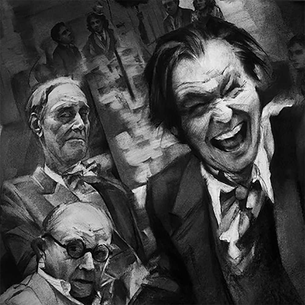

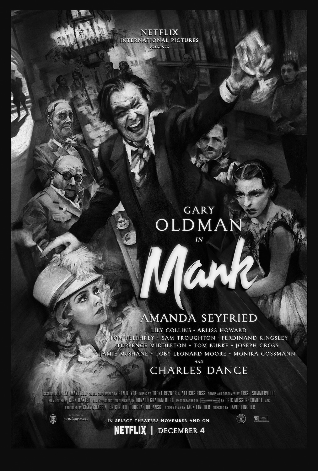
What better way to portray the grotesquery of Hollywood excess at the hands of frivolous parties amongst sycophants drowning in alcohol, apathy, and audacity than Anna Park’s surreally writhing caricatures? She’s thrown the curtain open to capture the horror beneath a beautiful façade to the point where I can’t stop wondering how great a Mank directed by David Lynch could have been. Marry her unforgettable composition with Neil Kellerhouse’s expert use of text (it has to be when you’re forced to include that expansive cast list) and stunningly simple title font for a one-of-a-kind artistic powerhouse amongst the glossily photographed masses.
#06 – Promising Young Woman (Art Machine)

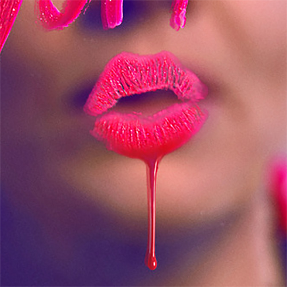
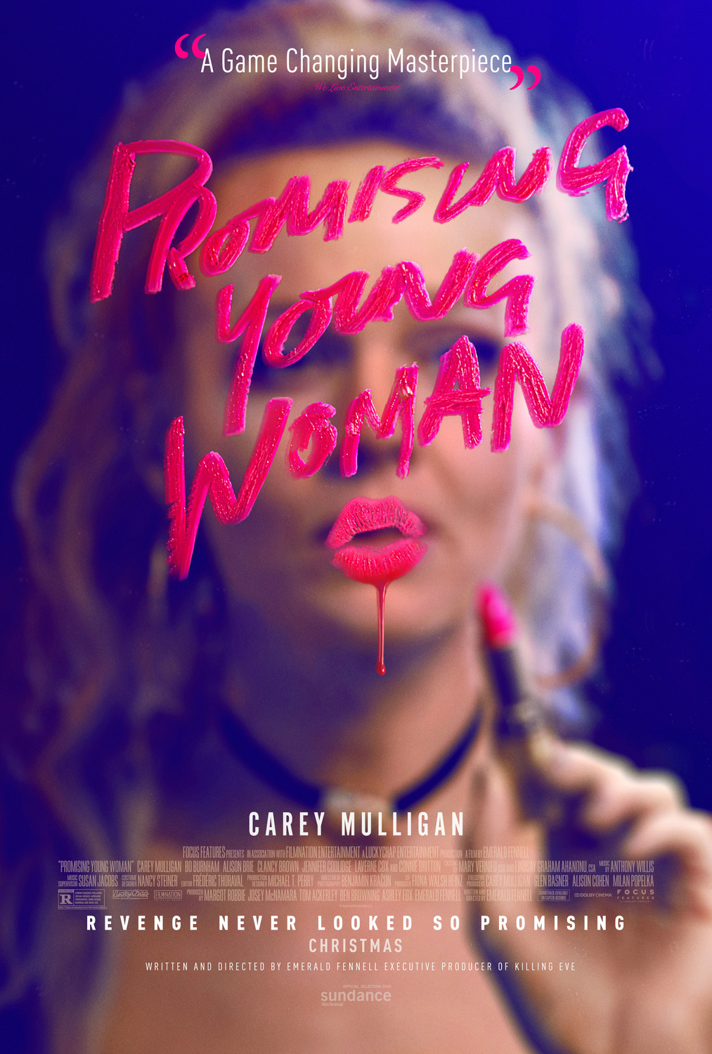
Which isn’t to say glossy is inherently bad. When you use it as a conscious choice like Art Machine with their provocatively confrontational (like the film itself) poster for Promising Young Woman, you can’t imagine anything else doing it better. Just like the make-up and drunken stumble, this gloss is a ruse. It’s bait. We’re being lured into an arena of lipstick fantasy and hazy-eyed expectation so that we miss the sinister, blood-like drip descending from Carey Mulligan’s kiss. Suddenly we recognize that she’s us. She’s our reflection in the mirror admiring this playful yet antagonistic calling card before commencing her hunt as predaceous prey.
#05 – The Other Lamb (The Refinery)
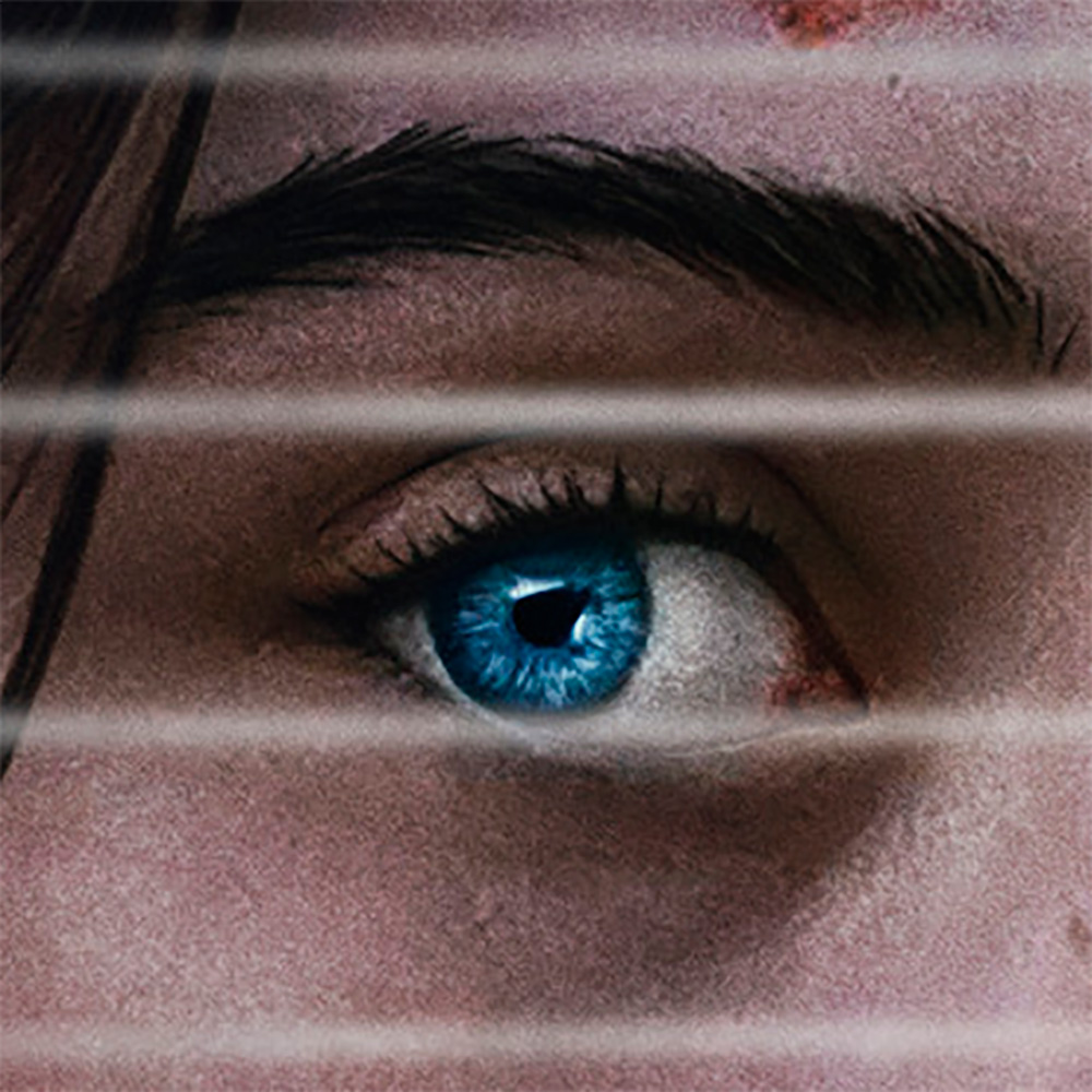
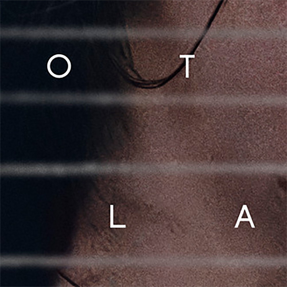
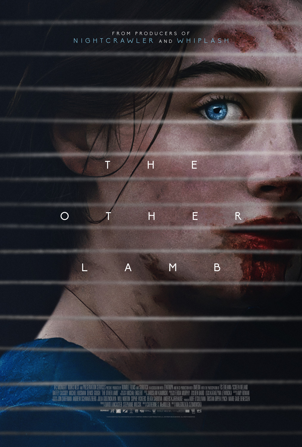
The Refinery outdid themselves with their sheet for The Other Lamb. A film about outsiders versus insiders and predator versus prey often only separated by the philosophical idea of a boundary manifested by a wall of string tied to trees has its iconic imagery built-in, but it takes a keen awareness of composition and focus to make it pop as dramatically as it does here. The uneven strings juxtaposed with a crisp, art deco sans-serif. The close-up portraiture caked with blood. And the piercing blue of Raffey Cassidy’s eye catching us frozen in curiosity and perhaps terror. Its design, typography, and mood are measured with precision.
#04 – Stray Dolls (Caspar Newbolt / (version_industries))
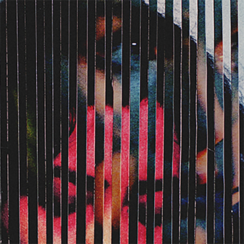
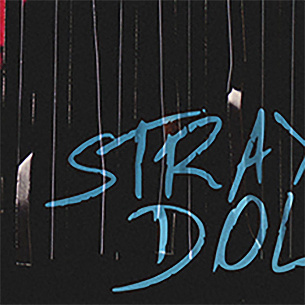
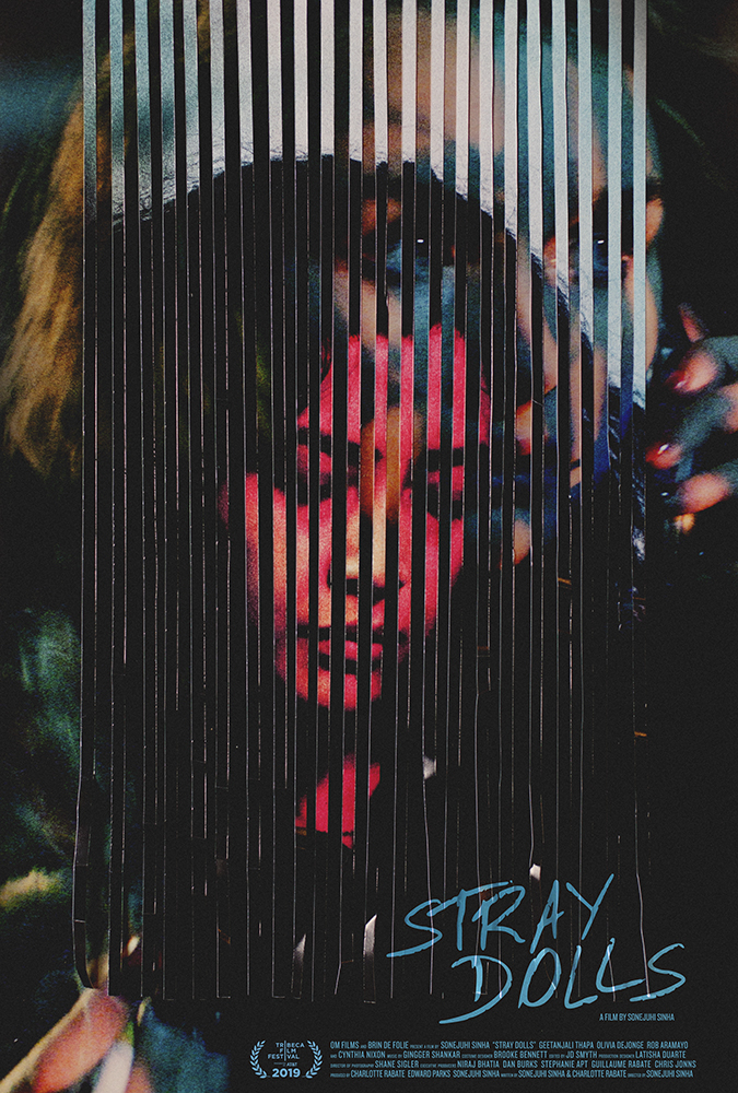
Caspar Newbolt and (version_industries) take that sense of barrier through line work one step further to create a piece for Stray Dolls like only they can: dark, evocative, and eccentrically off-kilter in an almost discomforting way. Our vision is in constant flux like an optical illusion, shifting back and forth between the woman looking down on the page and the woman on the phone behind it. There’s a sense of before and after … or perhaps lost and found when you bring in the title. The red hue supplies connotations of danger that the cool blues beneath—via depth (the second face) and direction (the text)—contrast less with the promise of safety than the allure of mystery.
#03 – Nomadland (Searchlight Pictures)
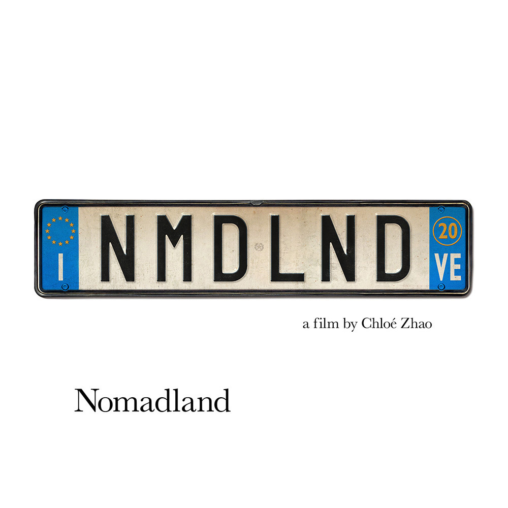

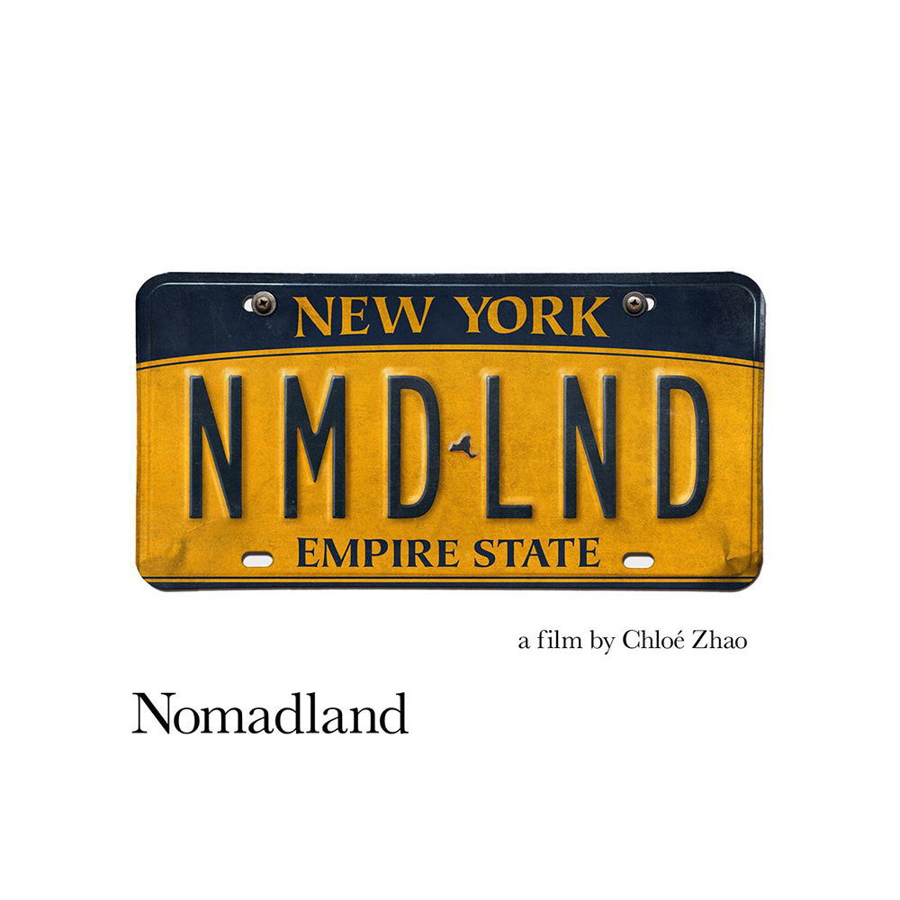
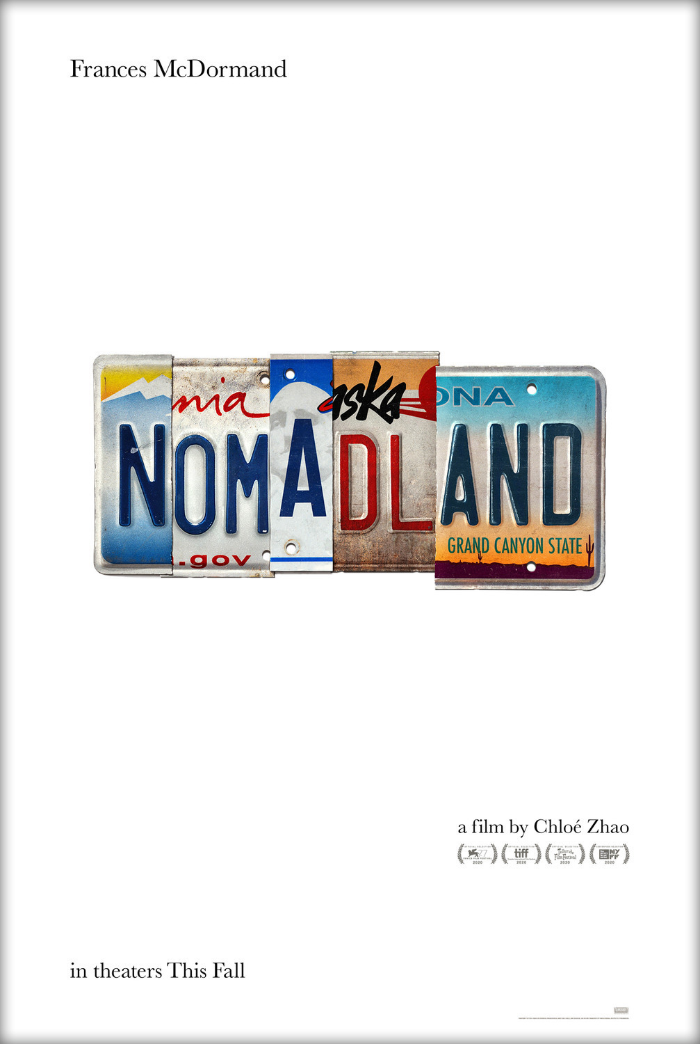
Concepts as simple and singular as Searchlight Pictures’ in-house campaign for Nomadland have a tendency to make you believe graphic design is easy and yet the time, effort, and tweaking that go into them sometimes reveal more work than their elaborate counterparts. First there’s the decision of which license plates to choose—aesthetic, font, and state all must be considered. Do you line them up or create movement with subtle y-axis slides? Do you dare let it standalone on white? The dirt, rust, and aging of the metal provides character, the conceit an ingenious ready-made festival-centered offshoot of personalized siblings. Nomadland becomes its place without an address, a dream without borders.
#02 – The New Mutants (Ignition)
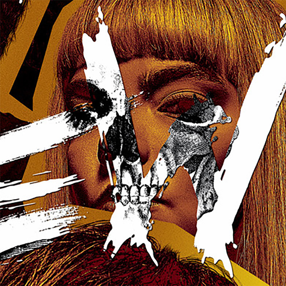
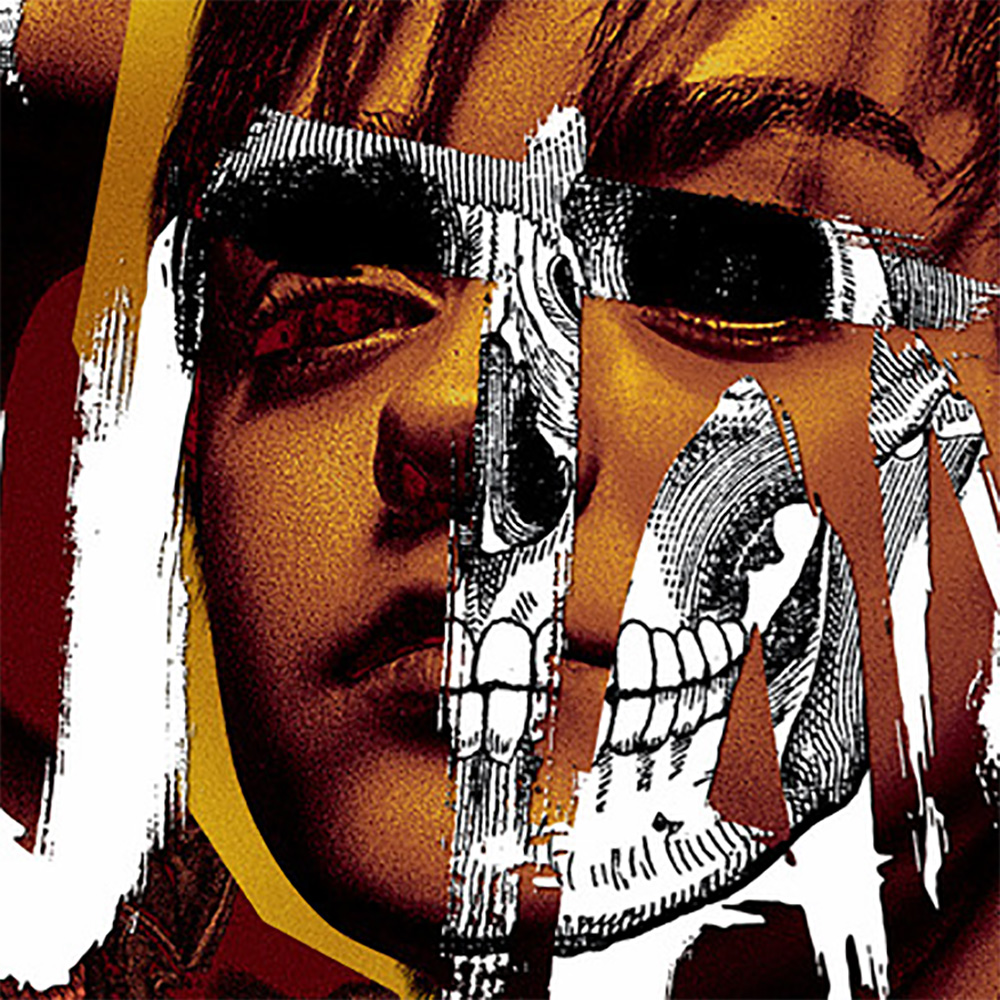
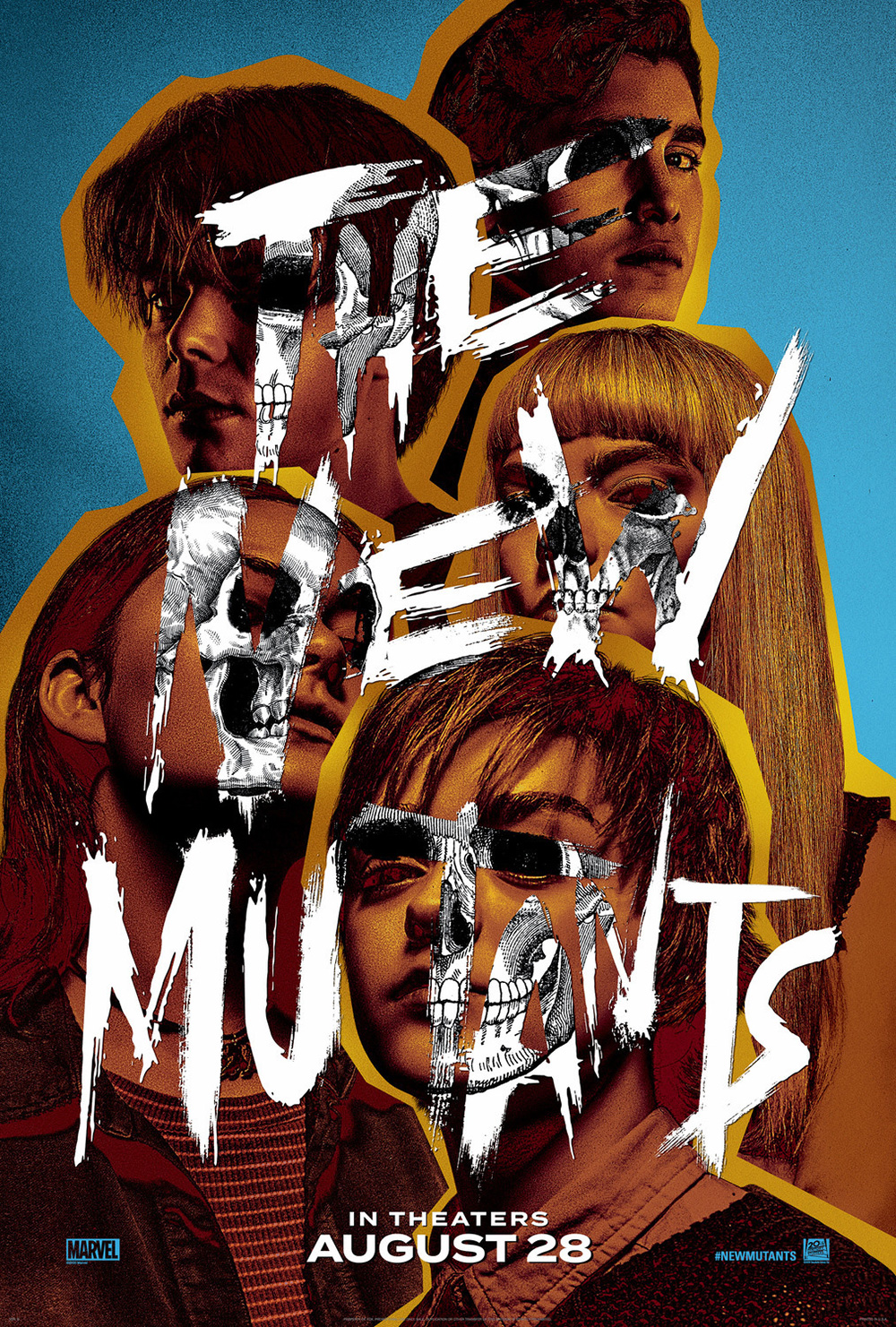
I don’t think I’ve ever had two blockbusters in my Top Ten Posters of the Year before, but how can you ignore Ignition’s revamped The New Mutants (released two years after the firm’s first teaser)? The cut-out, color-filtered portraits collaged together lend it a comic book feel as the torn strips of its graffiti-font fool our eyes into thinking we’re gazing below the surface when its black and white skeleton diagrams are actually superimposed above. We receive the horror of monsters, the biologic humanity behind the superpowers, and the new school generational leap in focus beyond Professor Xavier’s school for mutants. It’s an x-ray excavation into these characters’ psychological and emotional scars.
#01 – The Sharks (Brandon Schaefer / Jump Cut)
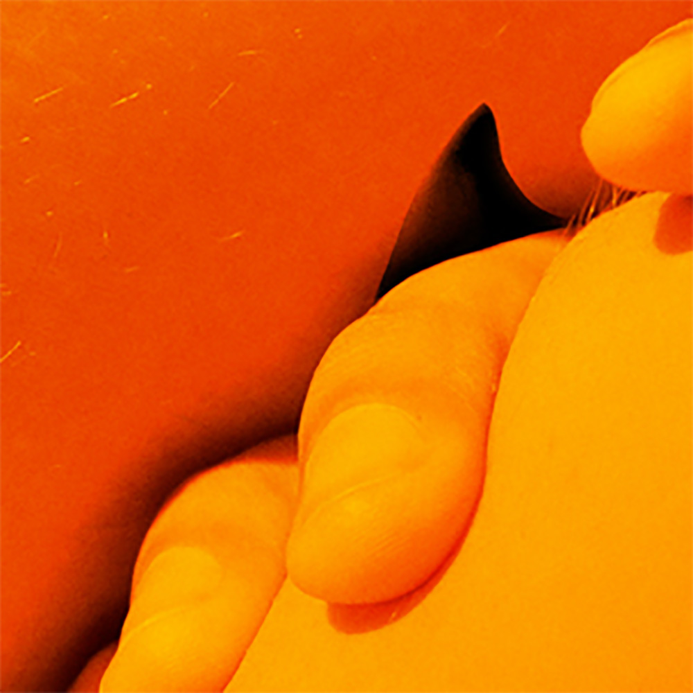
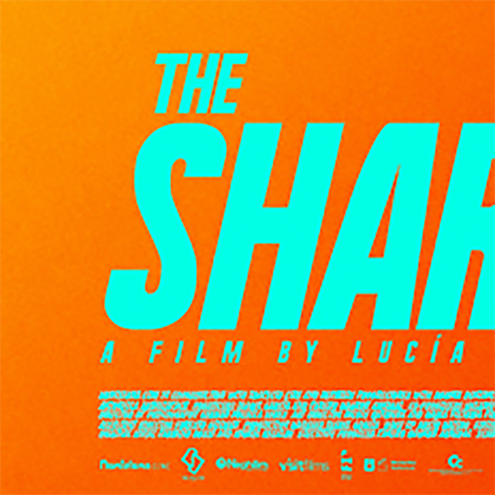
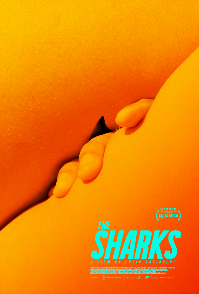
Because I base my Posterized columns on US release dates, I’m forced to sit on great work like Brandon Schaefer’s The Sharks for what feels like years. The wait is always worth it, though—especially when the poster stands tall to remain atop my rankings and prove my bookmarking it for the future was a sound decision. It’s another of those seemingly simple yet complex orchestrations turning skin into sandy shores, shadows into waves, and fingers into the sexual fears and pleasures rising through the surface like that shark’s foreboding fin. There’s blood in the water of adolescence’s tumultuous seas and the visual metaphor couldn’t be more apt.

Leave a comment