
Originally posted at The Film Stage
“Don’t Judge a Book by Its Cover” is a proverb whose simple existence proves the fact impressionable souls will do so without fail. This monthly column (with a special year-end retrospective today) focuses on the film industry’s willingness to capitalize on this truth, releasing one-sheets to serve as not representations of what audiences are to expect, but as propaganda to fill seats. Oftentimes they fail miserably.
So many posters proved their greatness this year by being bold enough to make interesting choices where composition is concerned. I’m still talking about mid-tier studios (very few of the below twenty-five are advertising movies produced by Hollywood with a capital-H), but even those independent establishments leaning towards artistry above celebrity wasn’t always a guarantee. That they’re using reflections, extreme close-ups, overlapped objects, and uniquely cut windows turning negative space positive is a testament to a willingness of putting craft above commerce.
It’s no coincidence then that almost half of the posters you’re about to see are credited to an individual rather than just a design firm. Some are surely art directors who oversaw the project with many others involved, but some are also familiar names that have been popping up more and more as illustrators and creators delivering work all their own.
As the popularity of boutique alt-posters continues to rise, it seems only fitting that film producers are going directly to the source. Why let the best representation of your product only grace the walls of fans at home when you can use it to help recruit more fans at the theater?
Honorable Mention:
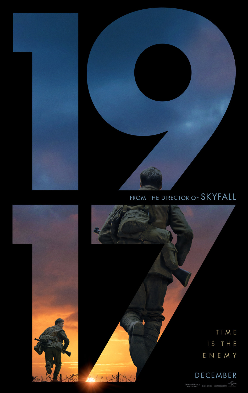
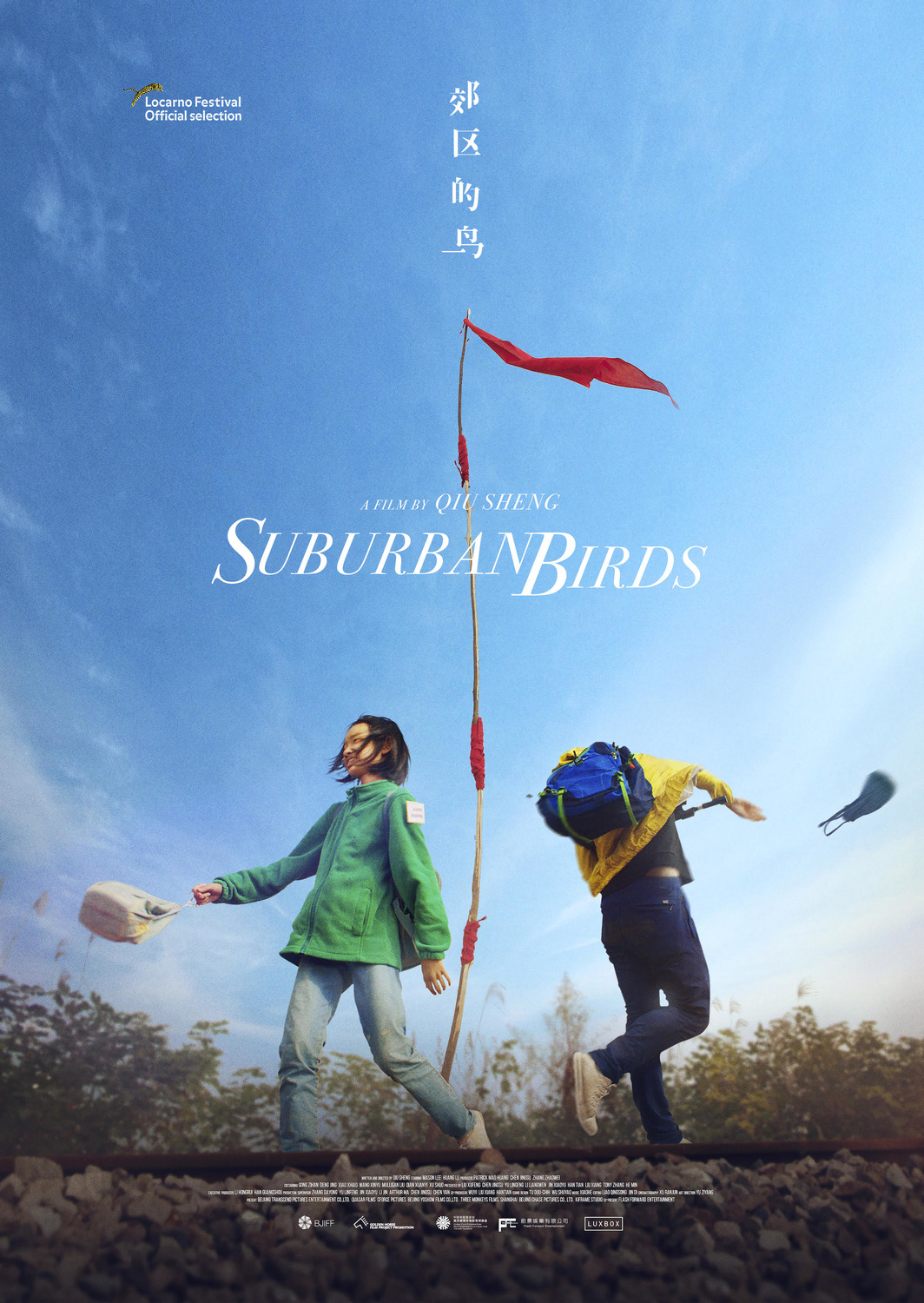
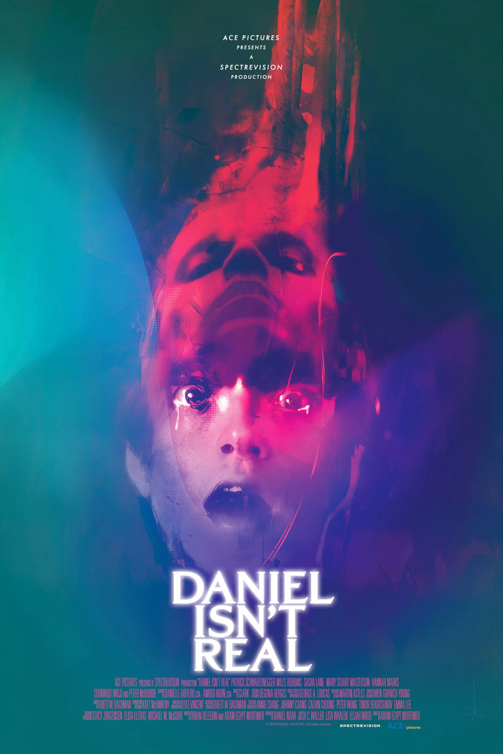


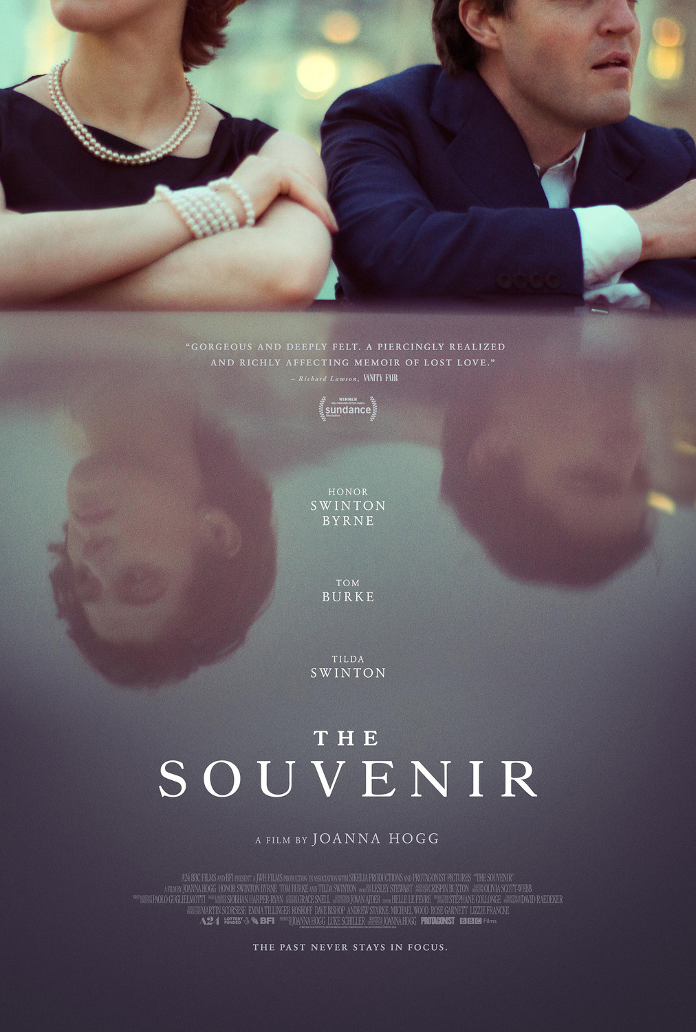


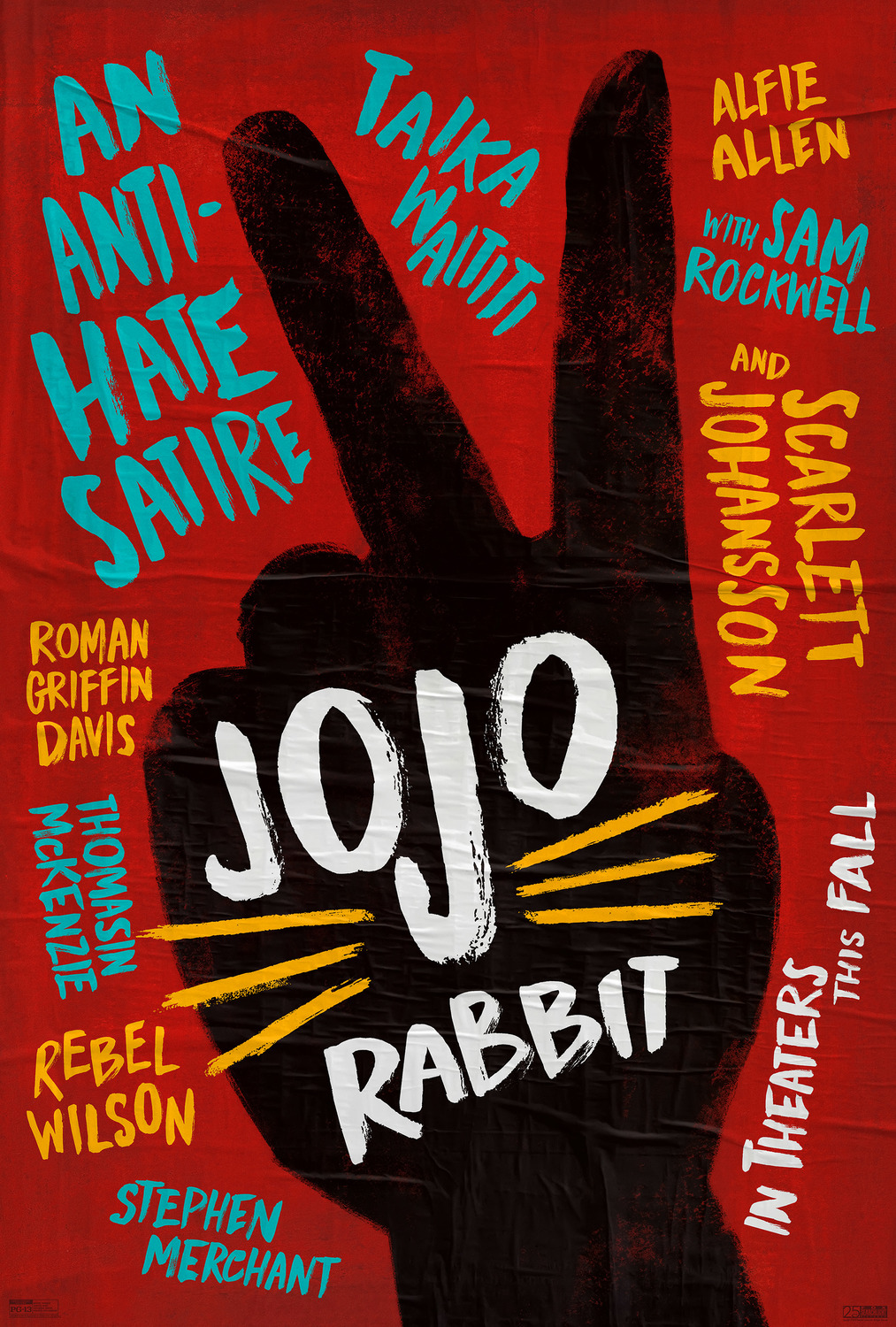
#25 – 1917 (Concept Arts); #24 – Suburban Birds (Unknown); #23 – Daniel Isn’t Real (Jock); #22 – Us (LA); #21 – Transit (The Boland Design Company); #20 – The Death of Dick Long (P+A); #19 – The Third Wife (Caspar Newbolt / (version_industries)); #18 – Honey Boy (Gravillis Inc.); #17 – The Souvenir (P+A); #16 – The Last Black Man in San Francisco (Akiko Stehrenberger); #15 – The Mountain (Sam Smith); #14 – Monos (Legion Creative Group); #13 – Styx (Unknown); #12 – Greener Grass (Jump Cut & Brandon Schaefer); #11 – Jojo Rabbit (Mark W. Carroll)
Top Ten:
#10 – Marriage Story (BLT Communications)


It’s such a simple concept. Marriage Story is about two people discovering how uniquely different they are despite a union that began to demand they become a homogenous whole. One’s head is stuck in New York City, the other in Los Angeles. The entire film pits them against one another in moments of calm civility and chaotic rage. So BLT Communications does the same. One poster is for her and one for him—each a window into their souls as epitomized by geographic identity. Neither smiles. Neither scowls. They simply stare indifferently, defeated in knowing their lives are now forever separate despite still being indelibly connected by love, history, and family.
#09 – John Wick: Chapter 3 – Parabellum (LA)


If you’re familiar with the John Wick franchise, you know the character sacrificed his place within its mythology’s realm of protection. He was declared “excommunicado”—a man on the outside looking in. And since the Continental Hotel is the physical embodiment of “in,” placing Wick behind a closed door emblazoned with its name perfectly portrays where John Wick: Chapter 3 – Parabellum begins. LA was confident enough to let authenticity transcend legibility, Lionsgate daring enough to let context trump title (beyond a hashtag). Together they showed Hollywood that IP could stand on merit alone within the public consciousness. Your audience can be trusted to connect the dots.
#08 – Our Time (Sam Smith)


A wonderful illustration hewing towards paper craft, this one-sheet is unlike anything else at your local multiplex. Sam Smith goes all out with Our Time to create mood and recreate emotion. The bull is at once representative of the creatures raised by the film’s leads and a symbol of the unpredictable tumult their relationship is currently combating. Faces and naked bodies are formed within the animal’s abstract, ribbon-like construction as human creation and destruction overlap. So too does the artisanal product of imagination with the hazy cityscape of oppression—rural vs. urban, personal vs. impersonal. It’s a work of contrasts fueling the drama within.
#07 – Apollo 11 (Gravillis Inc.)


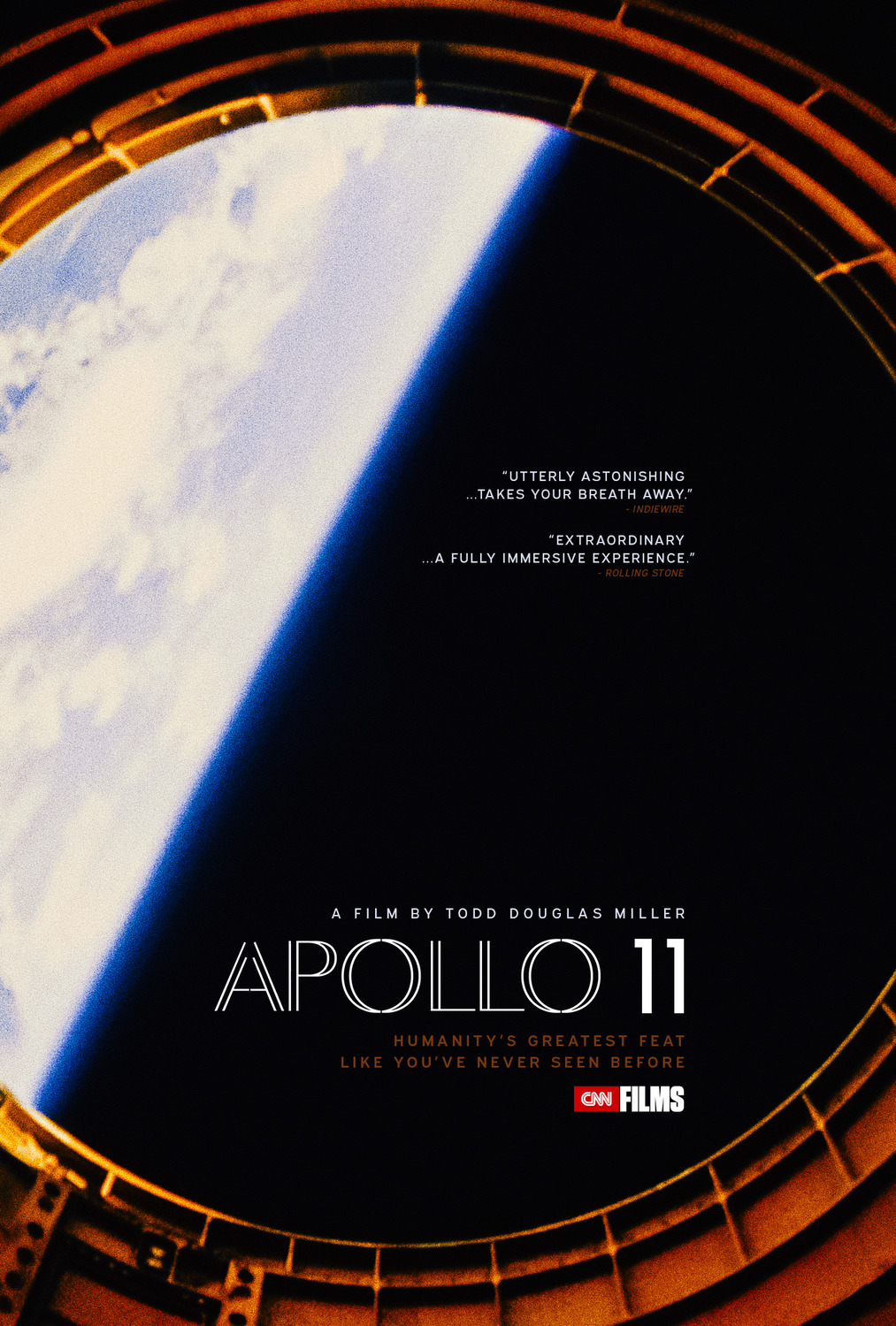
A gorgeous film with gorgeously restored, unreleased 70mm footage from 1969 deserves an equally gorgeous poster. Gravillis Inc. not only found (or created) a wonderfully-composed shot to intriguingly place an off-centered celestial body within its circular frame-within-a-frame, but they also retain the film’s natural grain to capture the awe-inspiring texture of the vintage stock from which Apollo 11 is comprised. With a title font of delicate curves and double lines nicely contrasting the imagery’s human vs. God dynamic and tastefully positioned text to match the main light to dark diagonal, it’s obvious that the designers ensured every detail was meticulously measured for maximum visual impact.
#06 – Peterloo (AllCity)


While the majority of Peterloo is much quieter in its dialogue-driven politics than AllCity’s advert promises, no one can fault the choice to focus upon its incendiary climax. With orator Henry Hunt speaking to an engaged Northern England crowd at top and the carnage ignited from a long-building calvary charge of Southern England aristocratic might at bottom, we’re provided a glimpse at the horrors born from a civilian massacre with nothing but the bright letters of the title between. The result is equivalent to an epic painting commissioned to immortalize a moment in history—one this film strives to honor lest it be forgotten.
#05 – Cold Case Hammarskjöld (Tobias Røder)

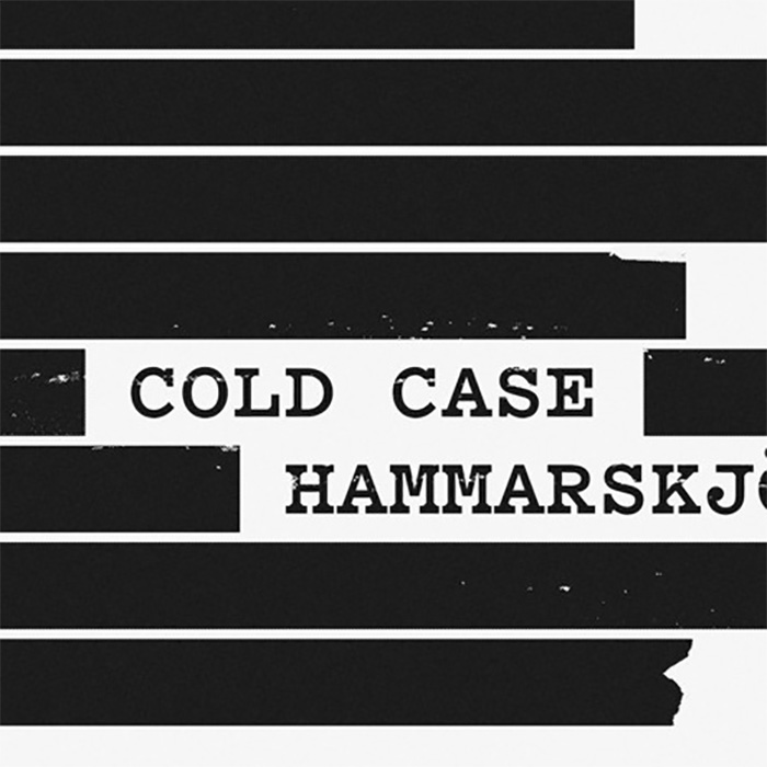
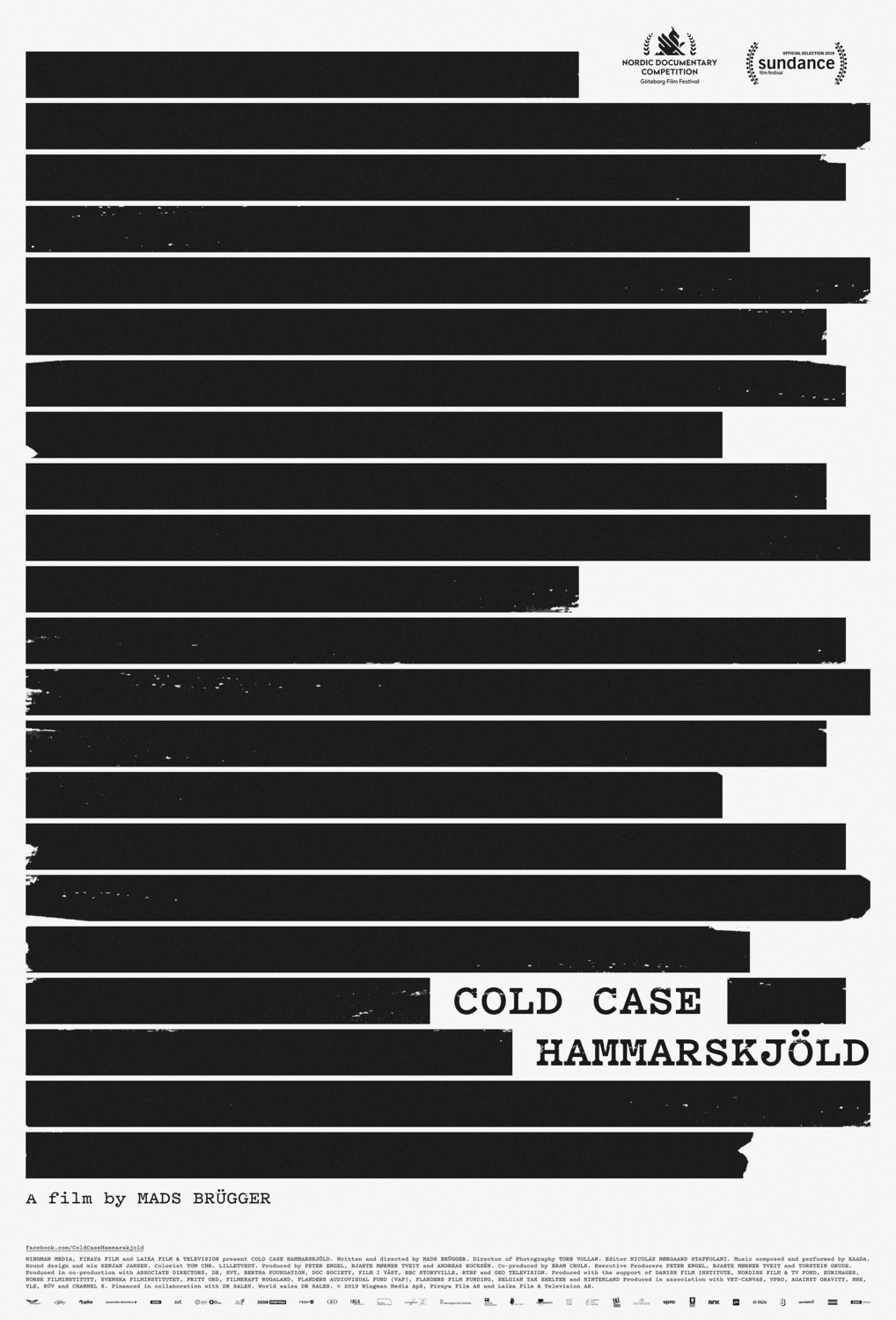
While you may think you’ve seen this poster before, I’m going to guess it’s never been this good. Why? Because too many firms wield redaction without possessing the guts necessary to let its concept breathe alone. Tobias Røder’s Cold Case Hammarskjöld has them in spades, however. To show important information everywhere anyway proves you’re using the process as a gimmick because that would be the redaction has failed. Going beyond a simple aesthetic flourish means blacking out everything besides one detail: the title. Now our minds are reeling as to what the film might hold. It’s all mystery, anticipation, and excitement. I want to peel back every line.
#04 – La Flor (Simplissimus & Scott Meola)


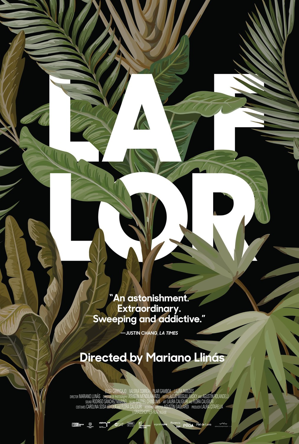
There are a lot of leaves in Simplissimus’ art director Scott Meola’s graphic illustration for La Flor, but I don’t see any flowers. The title therefore becomes a substitute for itself—a singular white bloom peeking out from behind the scene’s otherwise black and green uniformity. It’s a powerful, minimalist statement especially considering its brazenly odd decision to split the “F” and “LOR” apart, forcing us to parse all six letters as a cohesive, indivisible block. Six letters. Six stems. Six genres. Each a unique growth devised from a single cast and crew to create a garden unto itself.
#03 – Birds of Passage (P+A)


P+A delivers one of the year’s most beautiful images with Birds of Passage. From the gritty texture to the muted, almost sepia filter to the billowed sheet of red rising against gravity, it’s quite a sight to behold. That’s all without digging deeper into its exquisite detail work: the careful symmetry of a title block working credits into its stepped design; the line-of-sight movement from gun to sheet, popping our eyes up as though we’re a gust of air; and the ominous shadows forming a skull where this man’s face should reside. Death lies in wait as Colombia’s violent history stares at us through a metaphorically bloody release.
#02 – Parasite (Kim Sang-man)


The captivating imagery Kim Sang-man puts to page with Parasite proves a delicious puzzle to unpack. Why are some censorship lines white and others black? Is that a dead body? A giant stone? There’s obviously a good vs. evil, predator vs. prey vibe at play, but who’s who? Spying could provide an answer (if one even exists), but our cover’s been blown. And we’ve nowhere to run. The resulting uneasiness of their antagonistic, eye-less stares will only increase as the film unfolds because this isn’t some idyllic magazine family inviting us into their happiness. These are survivalists daring us to test their entitlement and/or desperation’s resolve.
#01 – Portrait of a Lady on Fire (Akiko Stehrenberger)


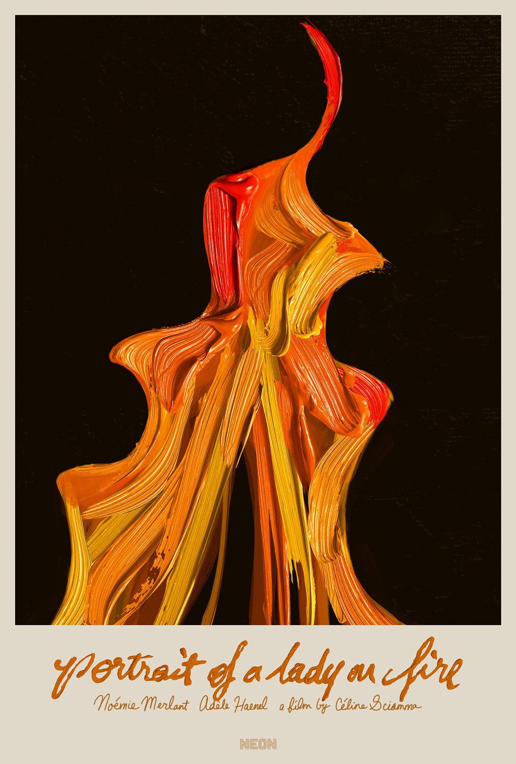
One look cemented Akiko Stehrenberger’s vivid optical illusion atop this list. I hadn’t seen Portrait of a Lady on Fire at the time and yet it felt as though I experienced its entirety in an instant. That it simultaneously proves a portrait of the film’s lustful emotion in positive (thickly slathered paint as inferno) and negative (lips converging through the heat) space is a profound distillation of what transpires on-screen. While this blaze shall inevitably take its inseparable display of passion down once it’s extinguished, understand that no love will burn as brightly or as resolutely without regret. This canvas renders its flame eternal so we’ll never forget.


Leave a comment