![]()
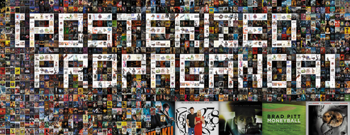
“Don’t Judge a Book by Its Cover” is a proverb whose simple existence proves the fact that impressionable souls will do so without fail. This monthly column focuses on the film industry’s willingness to capitalize on this truth, releasing one-sheets to serve as not representations of what audiences are to expect, but as propaganda to fill seats. Oftentimes they fail miserably.
September is the start of the film festival season. Unsurprisingly, while Toronto, Venice, and New York debut the flicks we’ve been waiting all year to see, the box office decides to finally give the public a glimpse at what’s been making the rounds since last September. There are also some bigger studio works on the way and almost all are sadly lacking on marketing aesthetic. It’s a better month for posters than the last, but bad still reigns supreme. Hopefully the upcoming Oscar season will change the tide in the coming months.
Floating heads and Photoshopped comradery
 |
 |
 |
 |
 |
|
 |
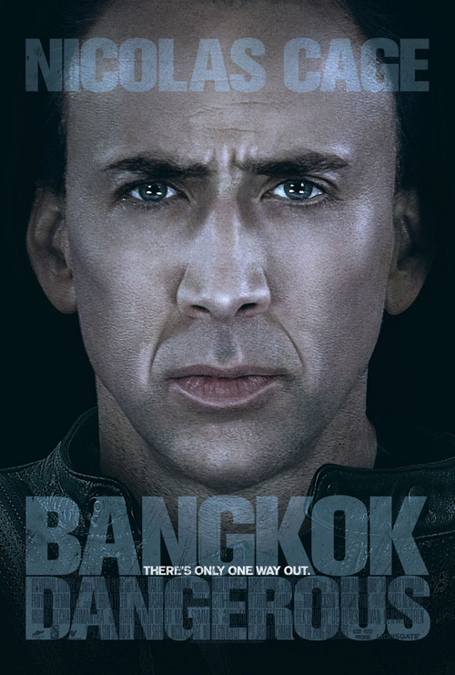 |
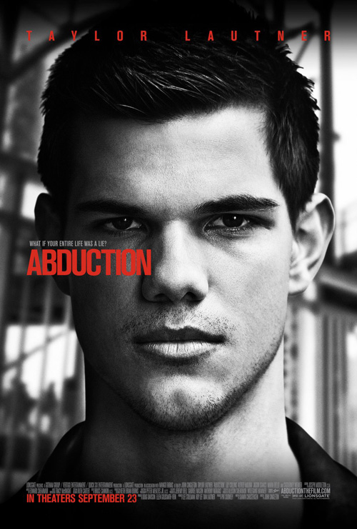
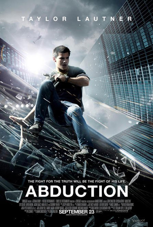
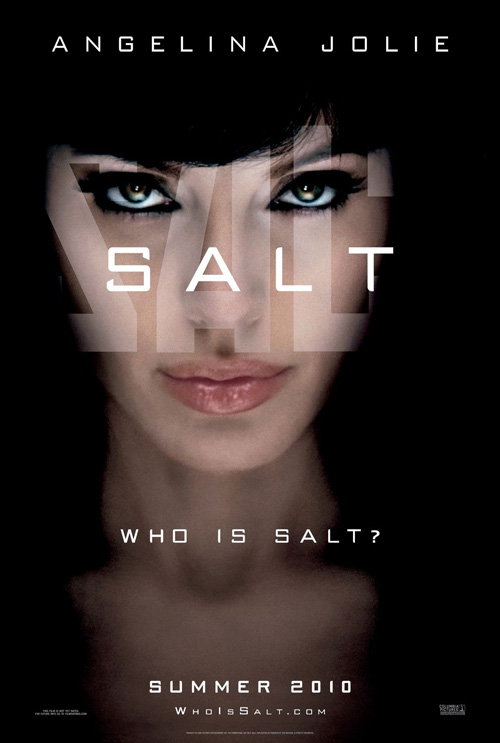
Honestly, what has Taylor Lautner really done? The dude bulked up and became half-naked poster fodder for young tweeners while slogging through the earnestly trite words of Stephenie Meyer. Maybe the world’s opinion will change with Abduction (opening September 23), but until we find out, should he really be the recipient of a full frame headshot advertisement? Granted, the new one sheet of Lautner brood by Ignition Print is way better than the original’s laughable slide down a glass skyscraper, but he simply hasn’t earned it. If anything, the people who want to see an actioner will look at his face and buy tickets to something else. Leave the vanity pieces to Angelina (Salt) and Cage’s hair (Bangkok Dangerous, amongst others).
The Twilight star’s prepubescent features are better than the next few entries, though.
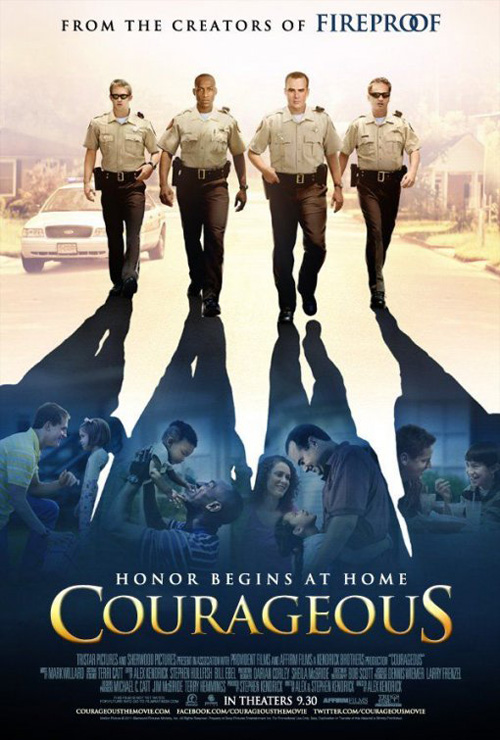
I hate to hate on a film like Courageous (opening September 30) because I can imagine the lack of budget given to its Christian message vehicle—and yet I must. The concept of having the cops’ families framed in their shadows is workable, but poorly executed. I’ve never been a huge proponent of the ‘grid’ poster, but I believe it could have served this idea well. Instead, the amateurish artistic quality shows how it’s little more than a TV movie of the week. But maybe that’s intentional. They know their audience and they cater to it.
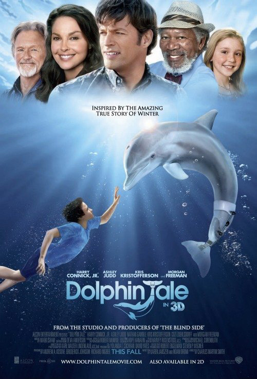
Dolphin Tale (opening September 23) runs into the same problem. Art Machine, A Trailer Park Company knows it’s going to be targeting youth and thus needs a kid-friendly, innocuous design to be as non-threatening as possible. My problem with it doesn’t concern its goals or limitations, it’s about those damn actor heads at the top. Guess what: kids don’t know who Harry Connick Jr. is and they don’t care. You’ve got a beautifully composed shot of the boy and the dolphin, matted and flowing in fake water. Use it. Don’t subvert an interesting image for unnecessary clutter.
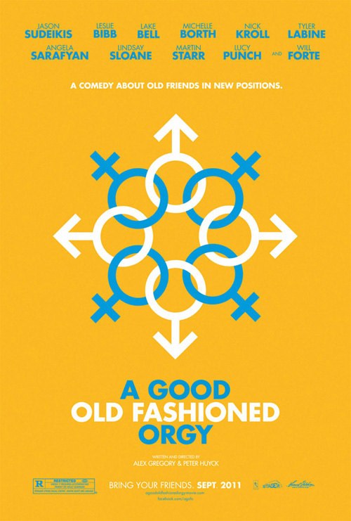 |
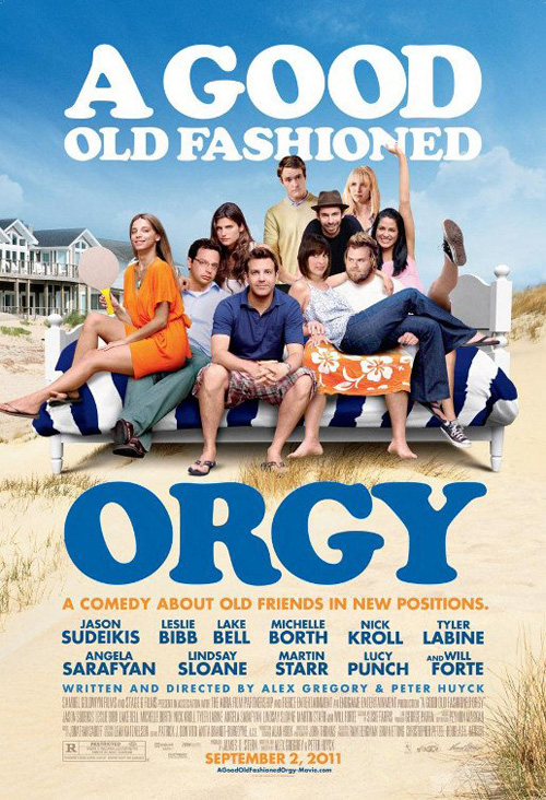
And that goes triple for A Good Old Fashioned Orgy (limited September 2). People going to this indie comedy know the actors by name. Stick to your guns and feel confident to use a graphic poster like the original spiraling link of male/female icons. That thing is cool and the names at the top will click with its audience because they know Sudeikis, Forte, Labine, and Punch. Slapping an obviously manipulated photo of everyone layered on a couch only comes off as pandering and lazy. Trust your conceptual design, please! The minimalist approach of the first poster probably would have made it a favorite for the month if not for its tragic replacement.
Colorforming actors
 |
 |
 |
 |
I remember loving Colorforms as a kid in the 80s. I had my favorite characters in 2D color vibrancy and a background image with which to pose them. It was my own re-workable comic book frame to do as I wished—a simple toy now replaced by video games and motion. Who wants motion? What a fad that’ll end up being …
 |
Anyway, it appears marketing firms have fond memories of the past as well when looking at this grouping. Each one is composed of cutout actors that are bunched together into the most appealing/unappealing manner possible.
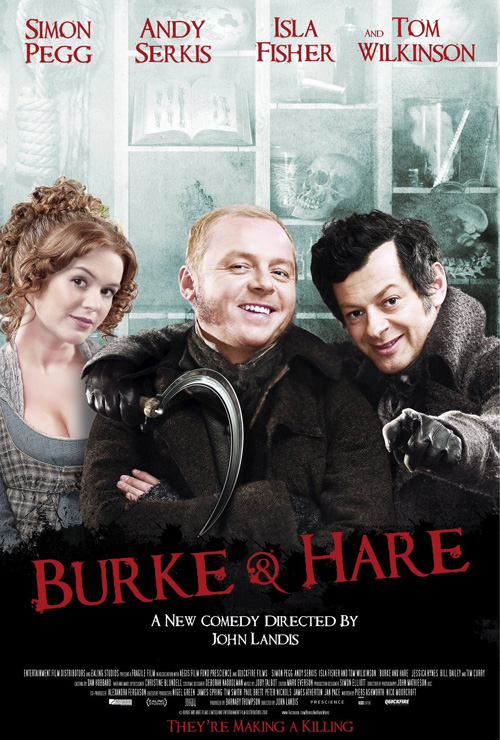
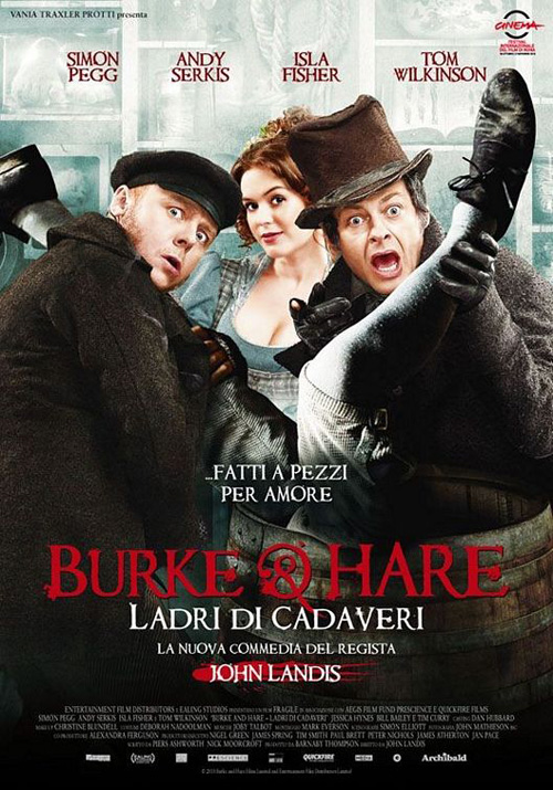
Burke & Hare (limited September 9) at least remains consistent throughout languages, layering Simon Pegg, Andy Serkis, and Isla Fischer against an identical, drab background. I can’t therefore chide our English-language version for ruining a wonderful foreign concept, something I love to do and probably will later on. Funnily enough, seeing that trio on the one-sheet is actually enough for me. I like them and thus want to see their shenanigans despite the uninspired artwork.
 |
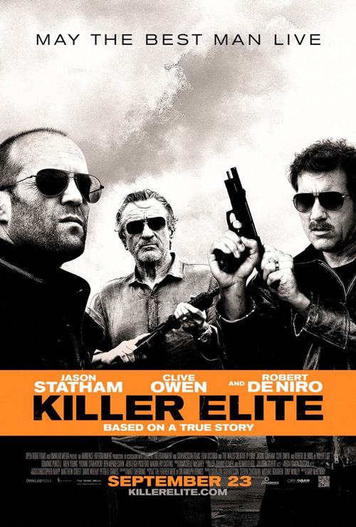
I love this Killer Elite (opening September 23) duo because it actually tries to differentiate domestic and international, going from Colorform to slanted box crops. The beauty and comedic genius for me, however, is that each utilizes the same exact imagery. So we see Statham’s constipation flipped as well as Owen’s porn ‘stache cocking his gun with arms that don’t really look as though they’re angled to be his. I actually didn’t mind Ignition’s constructed composition over the graying sky until I saw the blatant artifice by comparing the two. The incongruities really start to be noticeable afterwards.
 |
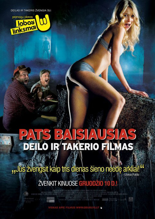 |
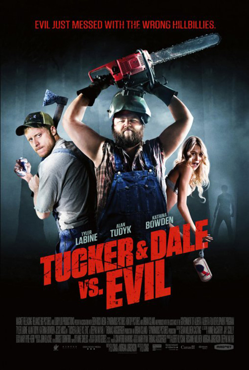
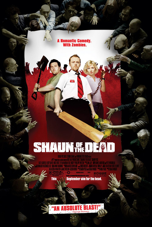
Unlike these previous two, if cold open’s Tucker & Dale vs. Evil (limited September 30) does anything right in its blatant rip-off of Shaun of the Dead, it’s that they don’t try to be more than the collage they are. Lacking Shaun’s fun border of zombies to grasp at the ‘poster’ inside, we simply get the titular hillbillies ready to cut demons down. It’s bland in its execution and lacks the sex appeal its foreign counterpart obviously thought would be best front and center. After all, what sells horror comedy better than bikini-clad blondes screaming their lungs out?
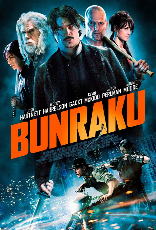
Bunraku (limited September 30)—a film I was lucky enough to see in Toronto last year and liked a lot—is the laziest of this bunch, though, because it doesn’t even try to compose the floating torsos into a position that could be deemed realistic. They lord over the large typeface and dwarf the ‘action’ of Josh Hartnett and Gackt on a motorbike. But the real tragedy is how utterly fantastic this poster could have been. Anyone who has seen the movie knows how inventive the visuals are— at least bring the puppets in! Guy Moshe should have done his own.
Misfired opportunities
 |
 |
 |
 |
Next up comes a couple attempts to let typography work its magic. Unfortunately, said magic is only possible in the right hands.
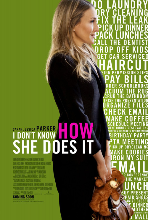
You can’t just fill up half a poster with alternating sized text and think it gives texture or meaning. The Cimarron Group’s I Don’t Know How She Does It (opening September 16) didn’t get that memo, however, and they decide to bisect green and white with Sarah Jessica Parker in profile—not her most appealing angle, if she has one. I don’t know what they are trying to accomplish at all. She appears to be standing as though about to give her vows and I guess she’s super Mom doing all the textual jobs listed yet still having time to hold a teddy bear. It looks like a college assignment gone wrong as a student took the piece parts given and slapped them all together the night before it was due.
 |
 |
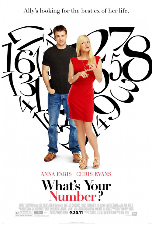
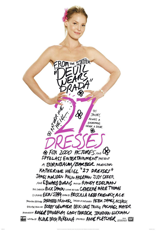
The Refinery’s What’s Your Number? (opening September 30) does a better job by using the type to make something rather than sit statically. But does the heart need to be made of numbers? What do the numbers mean anyway? I assume they are a list of Anna Faris’ ex-boyfriends, but what if they are their ratings instead? It tries so hard to mimic the brilliance of Ignition’s 27 Dresses yet doesn’t even come close. Now that is a uniquely inventive poster that truly takes type into an aesthetically pleasing direction.
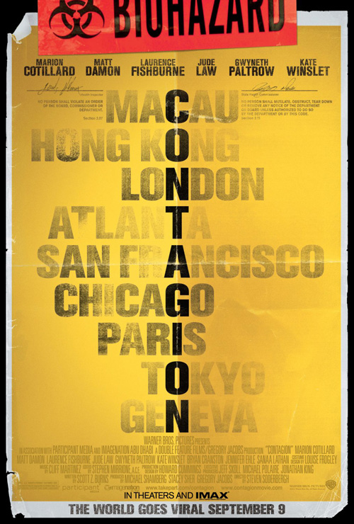
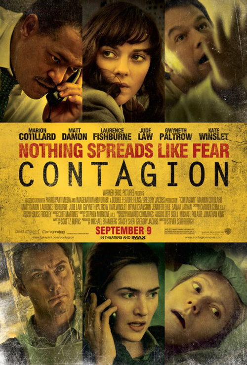
This is something Canyon Design Group and/or Shel Starkman Design Group have done for Steven Soderbergh’s Contagion (opening September 9). They make the one-sheet into a biohazard form, complete with official signatures at the top, and turn the title into a crossword with the cities its deadly disease strikes. It’s a conceptual design that delves into the film itself without needing the actors populating it to distract. Sadly the studio wasn’t confident enough to keep that allure, too afraid to keep Paltrow, Law, and Damon’s faces in the shadows. Just a shame they had to include them in such unflattering freeze-frames.
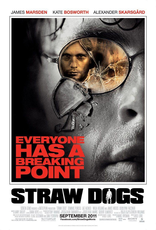
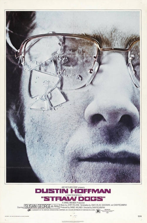
But the biggest missed opportunity of all comes from the hack-job that is Straw Dogs (opening September 16).
 |
 |
Sam Peckinpah’s original had a poster with such an iconic image that Criterion wouldn’t even mess with it for the cover of their DVD release. The shattered lens of Dustin Hoffman’s glasses speaks to the destruction of his idyllic look on the world as new neighbors desecrate his home and wife. I can’t blame the remake from wanting to cash in on that striking imagery, but why mess with it? Don’t put Alexander Skarsgård in the lens—we don’t need him. This is about James Marsden’s character alone; the others are merely the reason for his psychological fracturing.
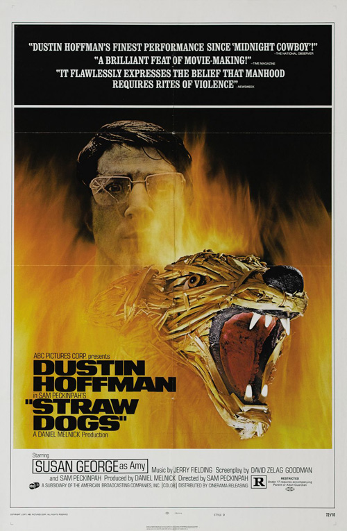
And yes, it has nothing to do with what I’ve written, but isn’t that alternate ad for the original Dogs pretty bad ass? Love that animal rising from the fire. Very, very cool.
On the cusp of greatness
 |
 |
 |
 |
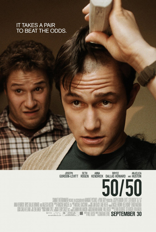
There is something familiar about Ignition’s one-sheet for 50/50 (opening September 30) that I cannot quite put my finger on. It could be that the simplicity of a film still atop the credit box has been used often, but I want to think it is more than that. Not much is going on except to show the film’s two leads alluding to the ‘cancer’ at its center while its tagline foreshadows a much more comical feel than one might imagine. It’s not flashy, nor inventive, but posters don’t have to be.
 |
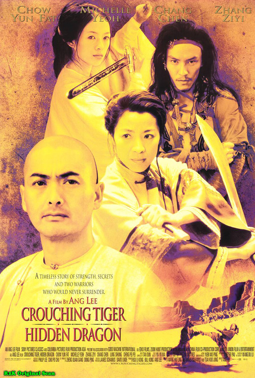 |
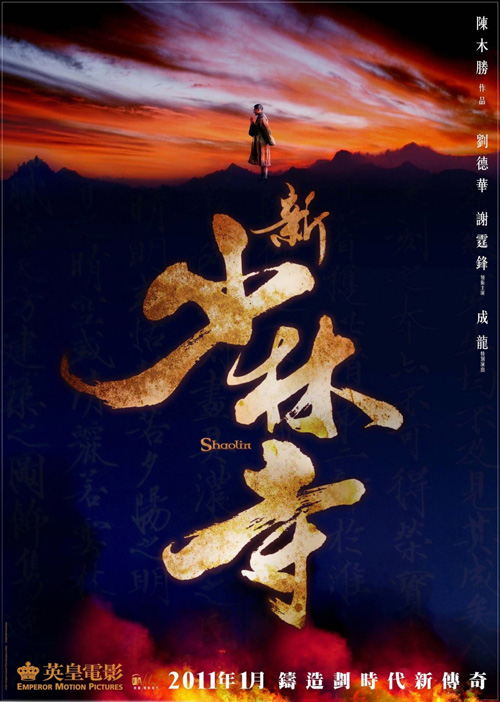
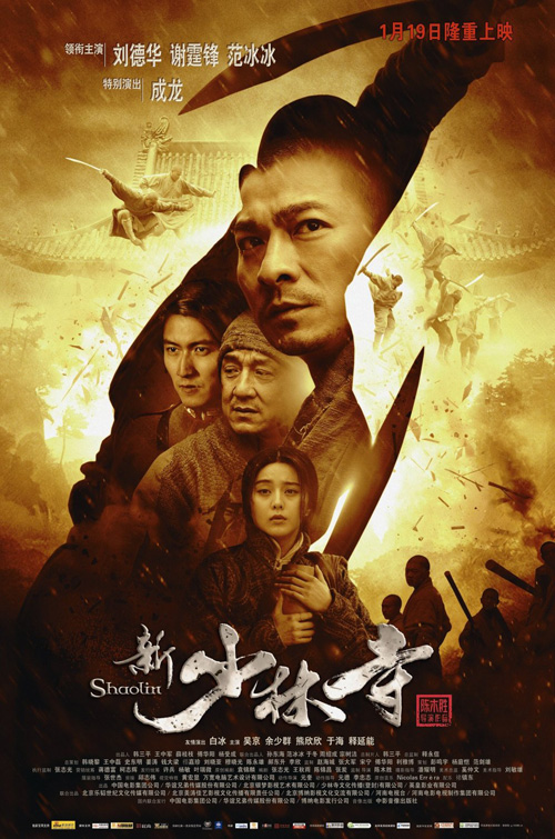
Shaolin (limited September 9) goes minimalist too in its teaser. I love the colors and the giant Chinese characters, Andy Lau’s small profile praying at top the only human form. It succeeds much better than its Photoshopped brother with too much going on in the background and way too much happening inside a silhouetted warrior. It wants to be Crouching Tiger, Hidden Dragon, but goes too big. The title is a singular shaolin after all, sticking to the teaser’s isolation is simply more appropriate.
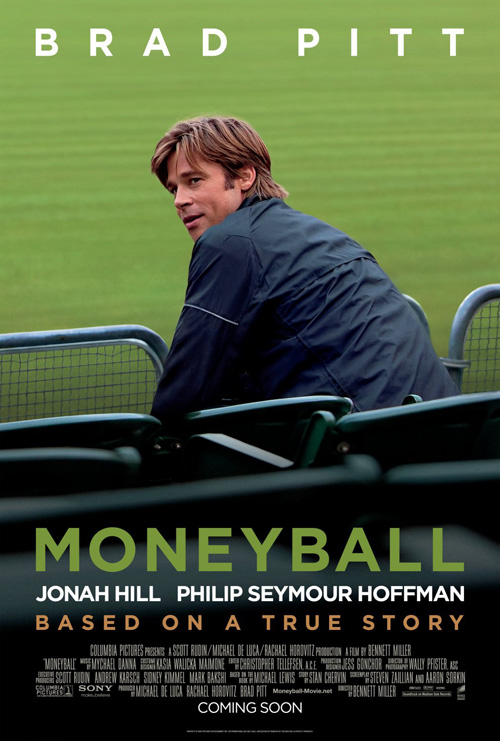 |
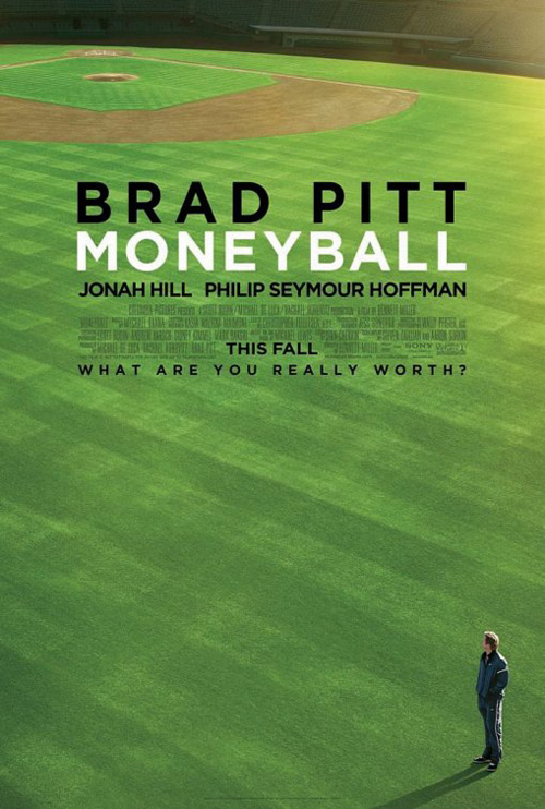
Continuing the trend to ruin great design by adding Hollywood faces, Moneyball’s (opening September 23) first poster is a spectacularly cropped image of a baseball field. The wide expanse of green is a blank canvas for Brad Pitt’s character to populate with a winning team. It’s a true story that pits a newcomer into a world set in its ways for too long. We see the ‘against-all-odds’ theme in the empty space, not in Pitt’s smiling face. I like the second image and the bold sans-serif font with the bright green, but it tells us nothing. I guess BLT & Associates just figured their star would sell seats whether they had faith in the story or not.
 |
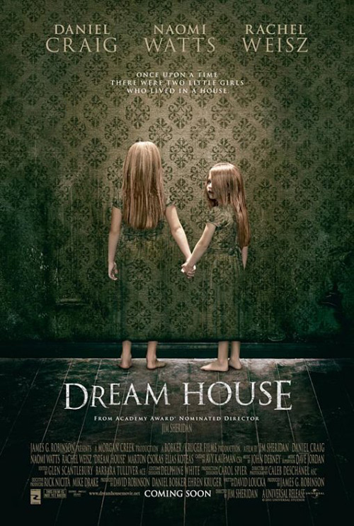
Thankfully Mojo finally shows us good concepts can work above whoring out actors. With Daniel Craig, Naomi Watts, and Rachel Weisz at their disposal, the firm decided to let two creepy girls fading into a wallpapered wall promote Jim Sheridan’s Dream House (opening September 30). The depth of field-bending illusion has been seen before—watch the Garden State trailer again for an example—but I find this advertisement has more in common with the jarring image of A Tale of Two Sisters mixed with a Poltergeist-like sneer from the child. It successfully demands your attention and your curiosity.
Skirting with fearlessness
 |
 |
 |
 |
And then comes this quartet of truly captivating work. None are especially unique or groundbreaking, but they all have enough intrigue to set them apart from the September pack.
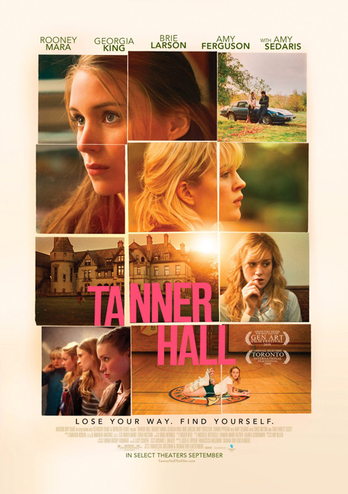
I may be giving Bemis Balkind’s Tanner Hall (limited September 9) more credit then is deserved, but there are subtle nuances that really work for me. The squared puzzle construction actually reminds me of last month’s One Day, but without utilizing the Polaroid shell, it comes off more as an artform. The uneven quality adds interest and the glow of the sun seeping into multiple photos is mesmerizing. Couple that with the title font divided on the left and separated by the distance between images and it just simply works for me.
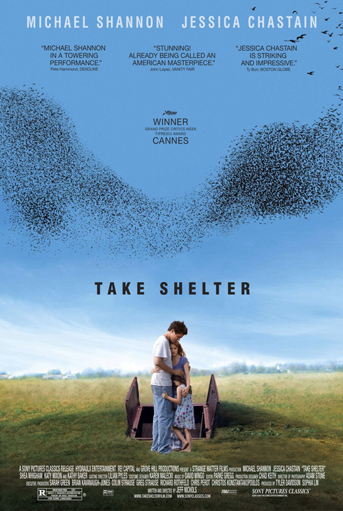
Take Shelter (limited September 30) decides to use the negative space trick in its entry. By putting the huddled trio of its leads—including Michael Shannon and Jessica Chastain—the designer allows for three-quarters of the space to be used for its publicity notes and the sky holding its swarm of birds: either the force to hide from or signifying the impending arrival of it. It’s foreboding meets hope and compassion as the sky becomes its own character and the poster instills the inherent fear this family feels.
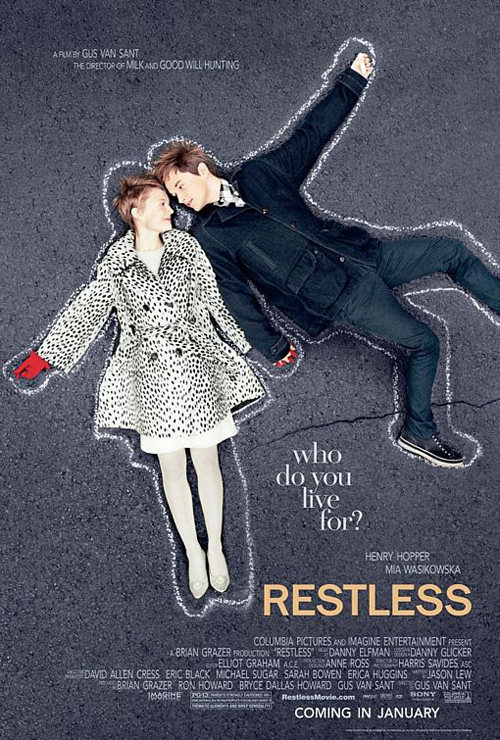
Bemis Balkind should be applauded for giving us another winner in Gus Van Sant’s Restless (limited September 16). The chalk outline motif may not be understood by the one-sheet itself, but combine it with the trailer and it comes together. Dealing with a dying girl and the eccentric boy she meets along the way, the juxtaposition of their glee with the iconography of death works wonders. I love the birds-eye view from above and even the playfulness of viewing both bodies together as a winged angel.
 |
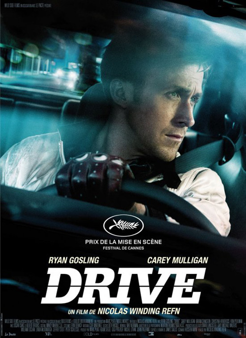 |
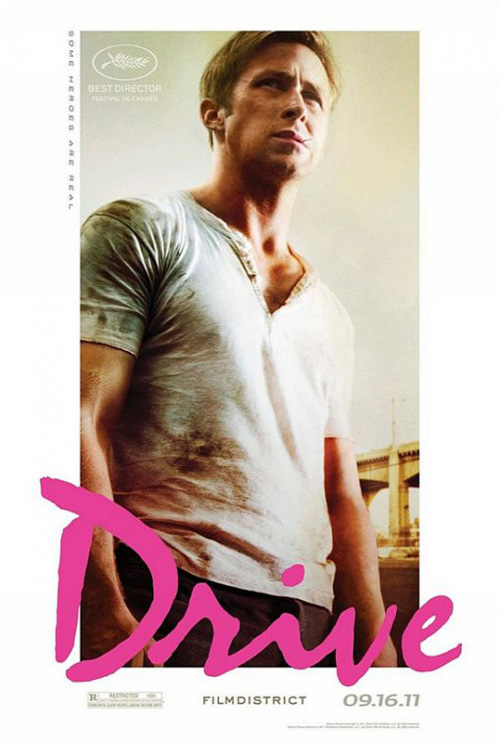
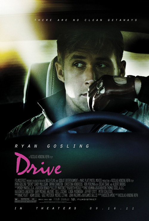
But it’s The Refinery who redeems themselves from the What’s Your Number? misstep and comes out victorious with Drive (opening September 16). The firm created a second more obvious work to go with Le Circle Noir’s more interestingly composed piece—the former a straight shot into the driver’s seat at Ryan Gosling while the later skews one in action—but neither compare to the white bordered, James Dean-esque photo with pink typography. Pairing perfectly with the tagline “Some heroes are real”, this larger than life visage exudes strength, power, and confident attitude—a definite brother to the steely-eyed coolness of Rebel Without a Cause. It may do nothing to bridge the title with its visuals, but that only makes it more fascinating.