
![]()
“Don’t Judge a Book by Its Cover” is a proverb whose simple existence proves the fact impressionable souls will do so without fail. This monthly column focuses on the film industry’s willingness to capitalize on this truth, releasing one-sheets to serve as not representations of what audiences are to expect, but as propaganda to fill seats. Oftentimes they fail miserably.
Say goodbye to summer. Tent pole season is over and the critical darlings have begun to pop up on the Fandango queue.
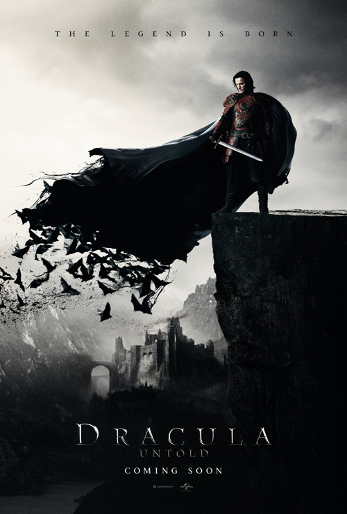
October is still a weird month, however, since it sees the big name festival faves trickling in amongst genre fare attempting to exploit good ol Halloween. So for every Gone Girl there’s a Dracula Untold—teaching us that a rising star with current name recognition (Luke Evans) can save a movie from the doldrums of a January dump release with the studio leftovers it resembles.
Oh, and we get Nic Cage‘s latest hairdo … [poster]
Black as night
 |
 |
 |
 |
 |
 |
 |
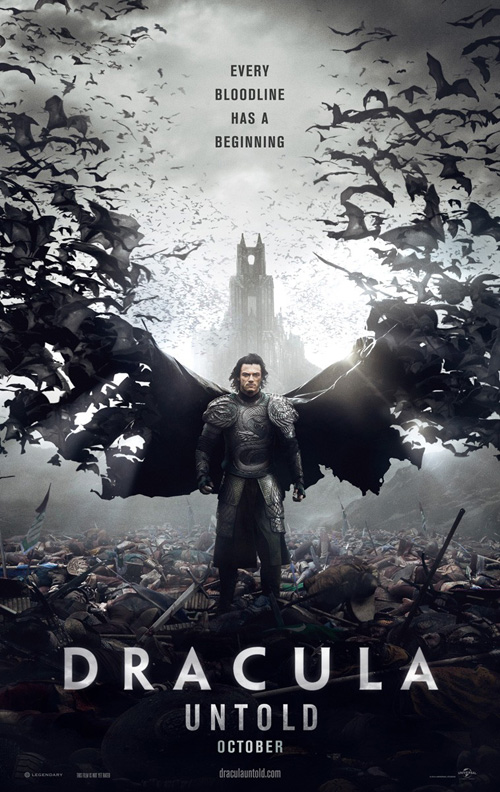
Speaking of Dracula Untold (opens October 10), I must admit to liking the teaser sheet. It’s simple with a concise tag at top, beveled title font fading into the darkness at bottom, and a cool liquid morphing of Evans’ cape into bats. There’s just a hint of color in his armor and the mood is bleak to say the least.
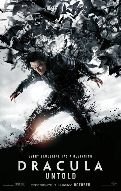
And then the studio screams for excess until their marketing materials become cartoonish. Look at the second sheet’s new bold font wherein “Dracula” looks normal and “Untold” is inexplicably compressed for no reason. No reason at all since “Dracula” would still be bigger and longer either way. You’re advertising an origin story and yet you replace the old school aesthetic for modern sleekness? BLT Communications, LLC may have designed the poster, but I have to blame Universal/Legendary since Ignition uses the same on there’s.
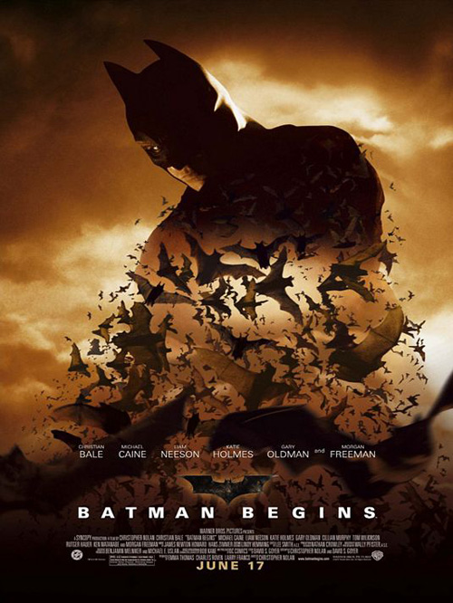
What I can put on BLT and Ignition’s shoulders is the desire to make everything bleed into bats. A cool effect in small doses, BLT decides to dissolve Evans’ legs. Seriously? Why? At least Ignition sticks to the wings and makes it a relevant flourish. Even Batman Begins made sure the transition was from a silhouette and not a photo.
Ignition may also have morphed Evans’ face with costar Dominic Cooper. It looks like them both and yet neither at the same time.
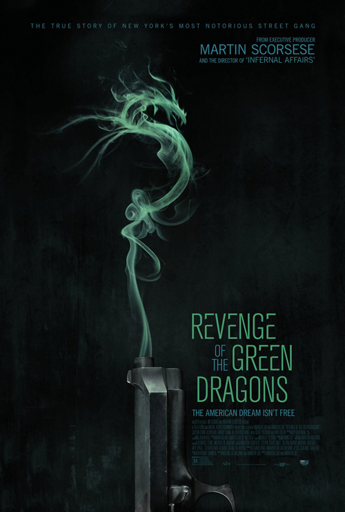
Revenge of the Green Dragons (planned October release) looks to make something into a shape it’s not too. Only InSync + BemisBalkind is allowed to remain subtle.
The imagery is pretty memorable if not wholly original. I like the texture of the gun’s brushed metal casing and the manipulated smoke looks real considering. They keep enough swirls to appear as both dissipating plumes and the titular dragon.
It’s coloring is appealing in its muted hues also. Nothing’s bright enough to overpower the central visual and thus keeps everything on equal footing attention-wise. This is preferred since there’s so little going on anyway because we’re able to breath rather than be smacked upside the head.
And while it doesn’t appear to have any real purpose other than looking cool, I’m digging the gapped separation of the title’s “Es”. Purely subjective on my part, but the result is pleasing to the eye.
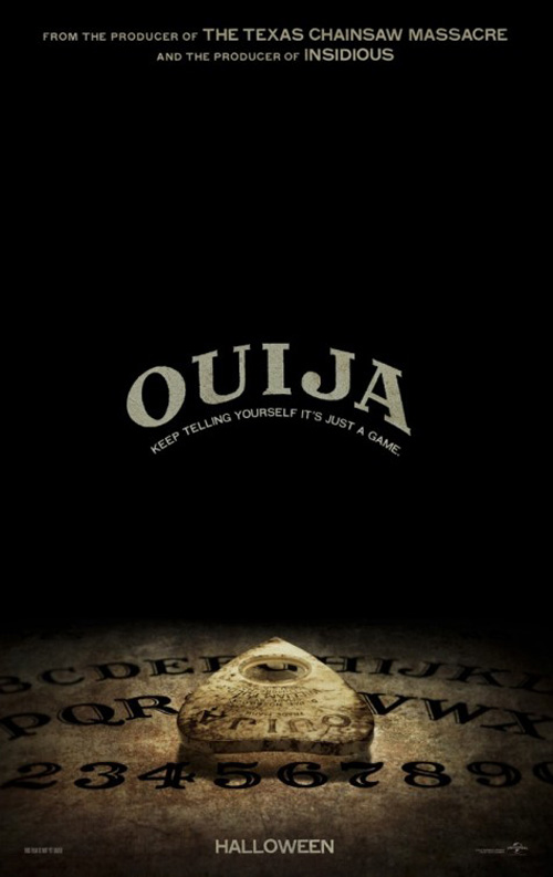
Sometimes appealing isn’t enough, though. For Ignition’s Ouija (open October 24) poster, I can’t help think an opportunity was missed despite the overall design’s effectiveness and successful composition.
I say this because they’ve done nothing with the board itself. We’re talking a hugely popular game that continues to be sold generation after generation. Why not have some fun with it? Write a tagline as a question, fill the whole poster with the board, and place the planchette in the middle between “yes” and “no”. Maybe have the planchette floating above the board with the title in its eye as the players seated around a table are seen blurred and below in the distance.
Do anything but shoot a dramatic catalog photo for the product rather than promote the movie.
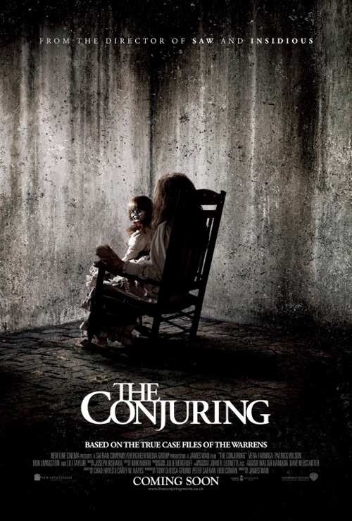 |
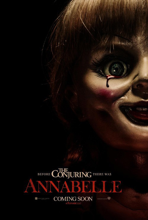
Ignition does thankfully have some fun with Annabelle (October 3)—a film I find myself having no interest in. The lore behind this doll was spooky and memorable as a small background detail of a larger world in The Conjuring. It did not need its own film to potentially ruin its effectiveness, but alas: here we are.
I digress. Ignition was the firm behind last year’s spooky poster of the doll turning its head towards us so it’s no surprise they were hired to give her our full attention. It’s not the greatest poster and is of course hampered by the necessity of a second logo almost as big as its own title, but it works nonetheless.
Cropping her face off the page is a nice touch so as not to overpower us with her gaze. In fact, Ignition even has her looking past us with her bloody-teared eye. This allows it to seem as though she could turn at any second after we’ve settle in with false comfort. It also makes us wonder if she’s looking at something even worse currently descending upon us while we’ve become distracted.
Fun with convention
 |
 |
 |
 |
 |
Kudos to Ignition for getting all the work this month, though. Truly. Give them a hand.
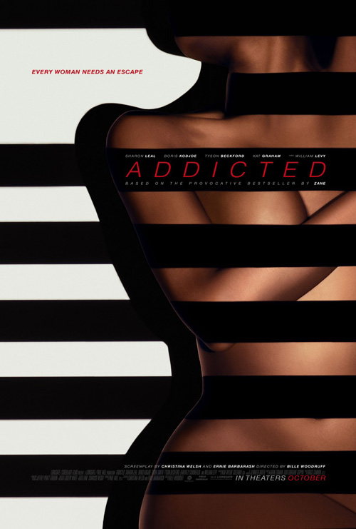
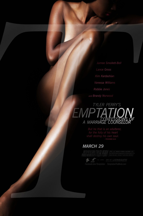
Success or failure aside, however, I’m not sure about the practice of recycling old designs—old as in last year. But here’s Addicted (open October 10) and its way too similar look to Tyler Perry’s Temptation of a Really Long Name.
Naked woman? Check.
Shrouded in black shadows as arms cover naughty bits? Check.
At least the firm didn’t try to mimic the typography by expanding the “A” of the title full-length. Although a giant red “A” probably would fit the subject matter. Better than black ribbon that adheres to the model’s contours on their edge but nowhere else.
 |
 |
For The Best of Me (open October 17), BLT Communications, LLC doesn’t rip itself off. It chooses to rip off WORKS ADV instead. Well, that’s not quite fair considering Nicholas Sparks probably has a rider in his contract stating how every poster for a film based on his books needs an almost-kiss from its two leads.
I only bring up WORKS ADV because they did the same thing for both Safe Haven and Lucky One. Other firms had done it before with The Notebook and Nights in Rodanthe. In fact, BLT may actually show us what not to do with the motif by making their showcased couple into floating heads rather than expertly cropped romance.
Slapping on James Marsden and Michelle Monaghan‘s younger selves at the bottom does them no favors. And having the title stand as though buildings in the distance makes it look like a pop-up book.
 |
 |
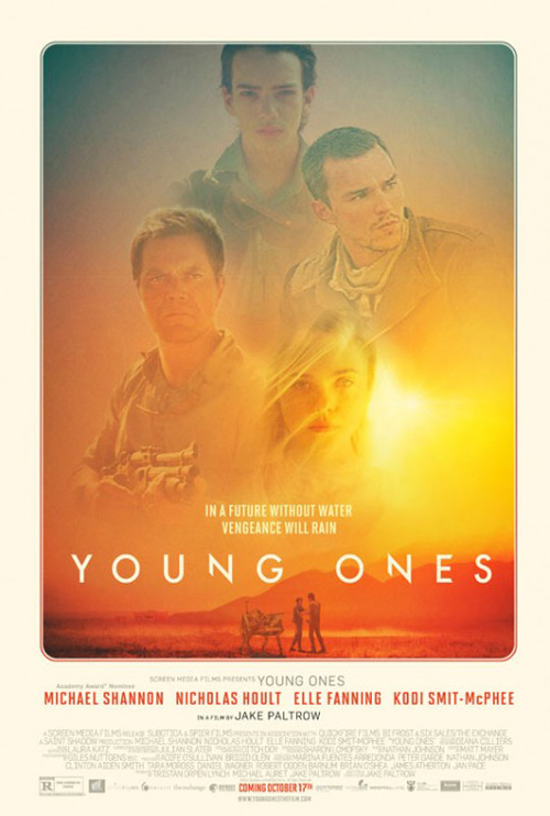
Where Young Ones (limited October 17) is concerned, I wish I didn’t look at it for so long.
It’s cool with its burned yellows and oranges of a future without water’s desert sky. The removal of half of the left line of both “Ns” in the title is a nice sci-fi choice and the bottom text looks retro thanks to the border surrounding the photo. It’s a lot more memorable than the French poster with Michael Shannon and the film’s awkwardly sized huge name.
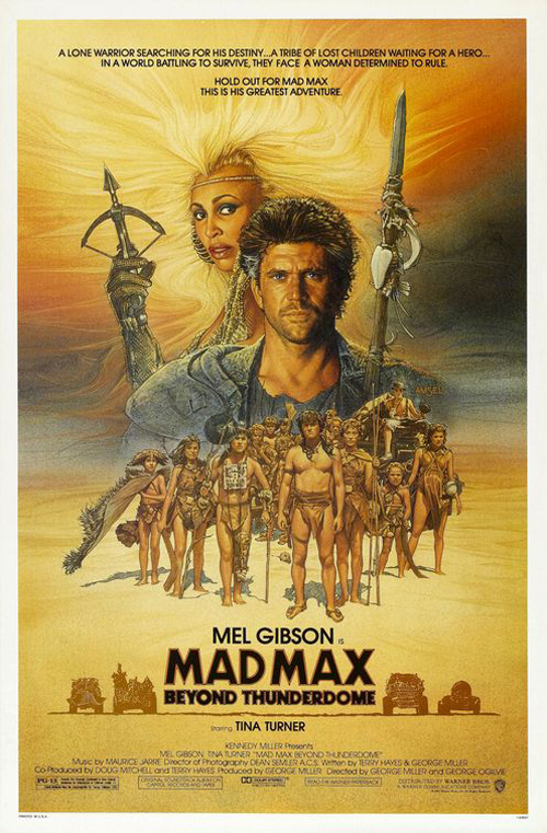
The problem with looking at the yellowed image so long—especially in context with this section of the article—is that I couldn’t shake a feeling of déjà vu. While it’s not a complete rip-off, I have to believe the designers had a copy of Richard Amsel‘s Mad Max Beyond Thunderdome in the studio for post-apocalyptic inspiration. The color scheme is the same, the collage of faces at top with small to-scale objects in the desert background is thematically identical, and the title draws our attention at its middle.
Young Ones does have a hatred of centering going for it, though. I can’t decide if I like that “Screen Media Presents Young Ones” and “Directed by Jake Paltrow” is too far left because it had to be intentional or if I hate it because it has to be a mistake.
 |
 |
 |
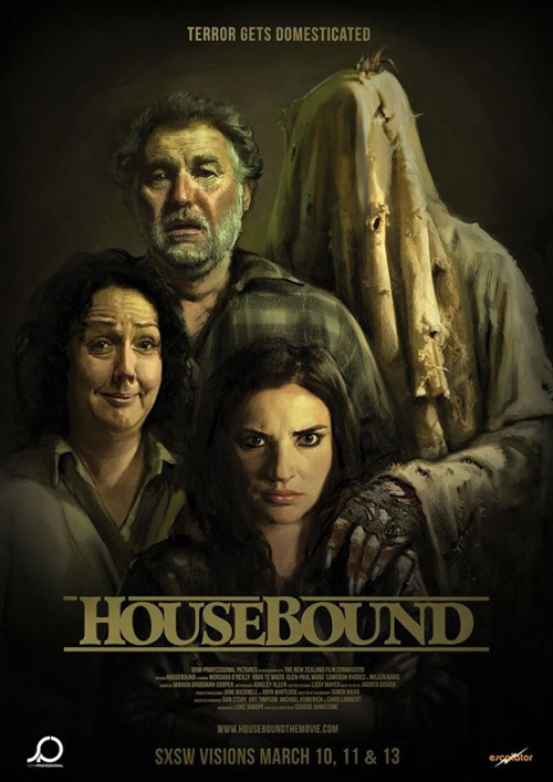
Less a copycat and more the convention of the section’s title, Cardinal Communications USA‘s Whiplash goes the accolade route with textual quotes galore. It happens a lot—in fact Housebound (limited October 17) does it this month too. While that film utilizes it without nuance and with much less panache than its humorous alternate family photo take, Cardinal deftly handles the challenge of so many words.
The use of color alone makes it dynamic by ensuring we know the title, the stars, and the festivals it screened at (including the Sundance Grand Jury Prize Audience Award). The rest consists of the usual soundbyte adjectives in a thin Century Gothic to help us decide whether to read or skim for the buzzwords. And in the middle is Miles Teller drumming away inside his spotlight.
While I enjoy the retro look of its Spanish sibling, Cardinal’s Whiplash is more dramatic, a harder design idea to pull off, and able to emit the music its isolated musician is playing.
Pretty colors …
 |
 |
 |
 |
 |
 |
 |
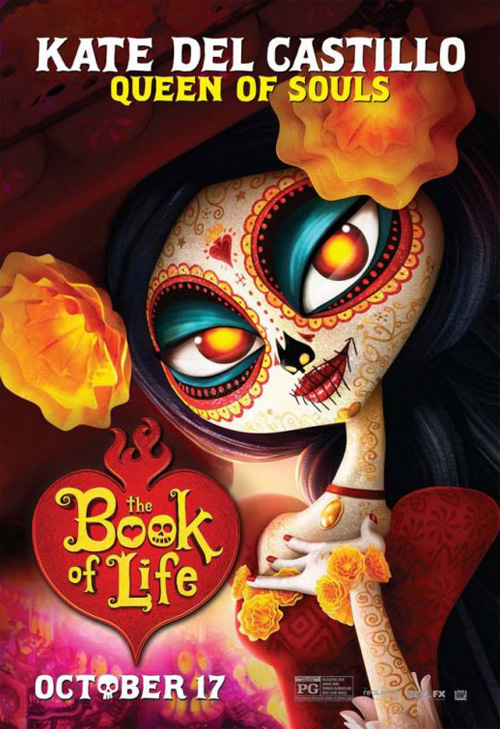
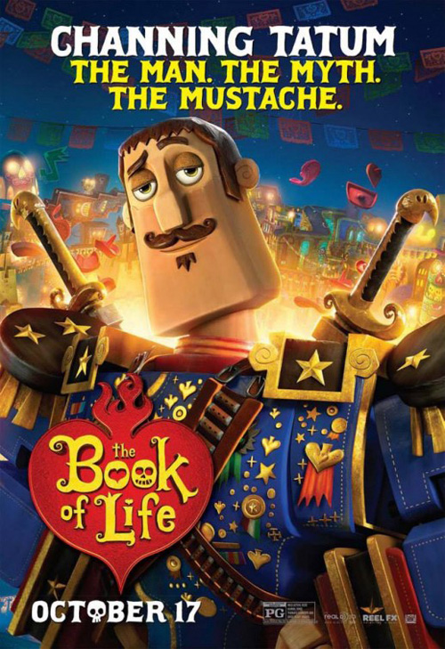
When I think Day of the Dead I generally see images of black and white skeletal costumes. And when I think of Guillermo Del Toro I conjure a fantastically grotesque beauty straight out of the depths of hell. So it’s with great pleasure to see the two combine into such a colorful palette with director Jorge R. Gutierrez‘s The Book of Life (open October 17).
We have Ten30 Studios handling the English posters and The Refinery helming their Spanish (El Libro de la Vida) and Portuguese (Festa no Céu) brethren. Each campaign is very similar as far as which characters to showcase and the background setting overflowing with brightly ornate city structures.
Like most animated films, one should find it hard to decipher where the positive and negative of the film’s style begins and ends in conjunction with the poster design. Luckily for both firms the aesthetic is eccentric and appealing enough to catch eyes and linger in imaginations regardless of any originality or laziness on their parts.
Unsurprisingly the international character sheets give us full-figured bodies in expressive pose while the domestics are happy with constricted facial close-ups. Animated or photographic: we are a nation in love with pretty faces. Not to be ignored, though, we do end up with the best of the bunch and that should count for something. Of course it takes the teaser to put the leads in the shadows and let that gorgeously zany landscape shine.
… and the absence thereof
 |
 |
 |
 |
 |
 |
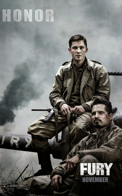
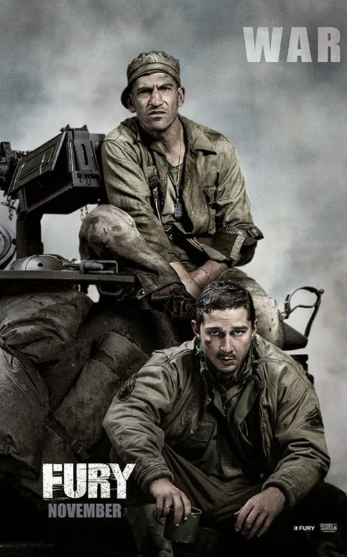
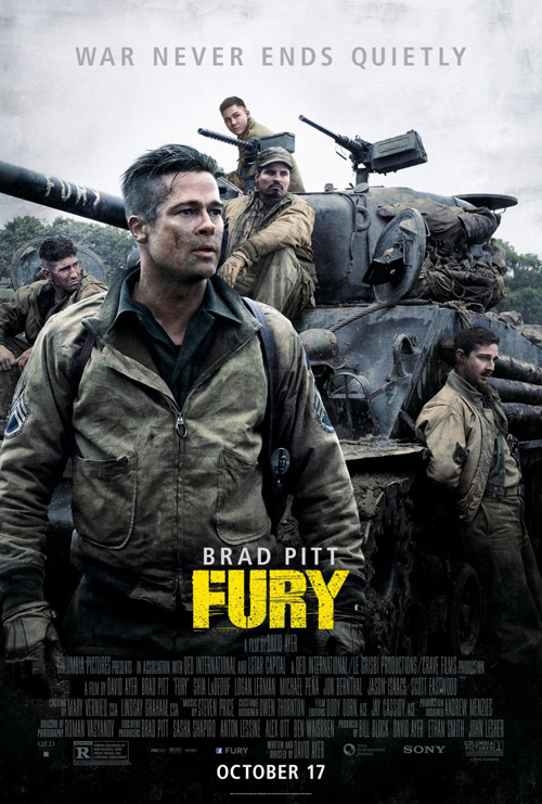
On the opposite end of the brightness scale comes BLT’s moody depictions of war for Fury (open October 17). Whether the triptych combing for an extended view of the quintet at the film’s center or the teaser that should be in my end of year Top Ten, these soldiers look as though they have lived nightmare and then willingly went back for more.
The 3-parter is pretty much what the firm did for The Amazing Spider-Man 2, but we won’t let that taint its effectiveness. Sometimes you just need a landscape orientation to get everything you want in frame without the need to sacrifice clarity or importance. Brad Pitt still gets top billing by being in the center and alone, but the other boys are right there alongside him. Even if Shia LaBeouf wishes he had a paper bag to hide under.
BLT’s third piece isn’t shabby either with its dynamic composition of characters that’s probably Photoshopped and yet not necessarily obviously so. Everyone’s sitting or leaning on the tank so it’s not simply five guys slapped on in bad perspective because their contracts say they all need to be present. The yellow title nicely pops out to steal attention too.
But boy is the teaser firing on all cylinders and showing the rest up as a result. From the massive amount of negative space Pitt got used to on BLT’s Moneyball, to the look of melancholy etched on his face in dirt and blood, to the beautiful use of a prop showcasing the title, it’s a homerun.
Artistic faces
 |
 |
 |
 |
 |
This is a fun poster for Dear White People (limited October 17). Nikkolas Smith Design and InSync + BemisBalkind go illustrative with their massive afro getting twirled by a white hand—a satirical depiction of culture envy and playfully ignoring boundaries like the film itself appears to follow. It may be too photo-realistic to the point of wondering why they didn’t just use the actors, though. Perhaps a more graphic style with silhouette could have been more effective and fresh.
Gravillis Inc. joins the campaign with a straightforward look at four main characters in grainy halftones. The end result is a tad boring and static with stereotypical names, eye lines that don’t look at us, and too much repetition with the DWP insignia everywhere. This idea would work better separated into character sheets where one actor can fill the whole page. Right now it looks studio mandated without much originality.
 |
 |
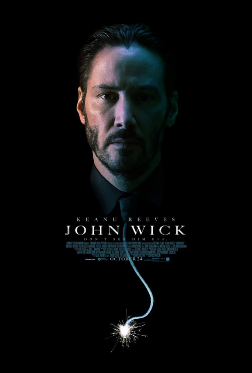
John Wick (open October 24) receives two posters in much the same way—creative and boring.
The former by Ignition is stellar and lacks very little. There’s Keanu Reeves‘ immortal face masked in a dark shadow that brings out the blues and reds of the light source, a fun tie extension into a punny wick, and carefully placed text that’s small enough to not distract yet bright enough to make sure we don’t forget to read. The calm expression is a brilliant visualization of the tag “Don’t set him off” too because you can sense the carnage he’ll leave in his wake.
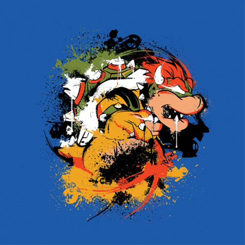
The boring—also by Ignition—is excruciatingly so. It looks as though the artist has been trolling ShirtPunch tees for too long because that site loves this whole inkblot aura look. In fact, they recently sold a Bowser by inkone and probably have another up today.
Not only is the pose generic “action shooter”, the color scheme is forced and the feel fabricated. Why not paint Reeves so he looks like he’s coming out of the ink rather than just placing him on top? Whereas the first feels like a powerful vision executed with care, this one looks incomplete.
 |
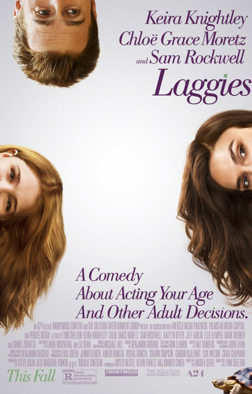
BLT sees its vision through to the end for Laggies (limited October 24). I’d say it’s daring too in the way it refuses to have anything in the middle of the page. Most firms utilizing the effect of putting its characters on the fringes would make it a point to place the text inside the center hole that’s formed. The fact this one is blank almost creates a vortex sucking us in to the point where it’s hard not to find your eye going back despite attempting to read what’s on the periphery.
I also like the detail of everyone’s hair falling with the gravity set forth. While it’s easy to notice on the girls, Sam Rockwell at top also sees his pushing downwards. The forehead that remains actually had me thinking Jason Segel was in the film.
I do want to know what’s up with that turtle, though, considering it’s in this and the teaser. That mystery may have secured my buying a ticket alone.
 |
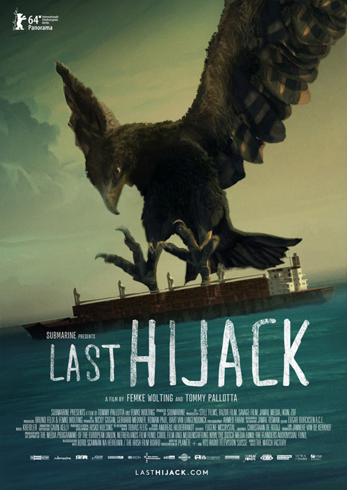
Like him, the best face of this section doesn’t belong to a human. No, that distinction goes to the menacing bird gracing the sheet for Last Hijack (NY/LA October 3). Utilizing the animation of Tommy Pallotta—think Richard Linklater‘s Waking Life and A Scanner Darkly—we’re promised a uniquely constructed documentary.
The imagery is powerful with the hawk/falcon reaching out its talons to grab a ship in the water. The mood created is dark and sinister as scale is thrown out the window to depict emotion rather than reality and its rough title font adds to the tone in the sense it might have been hastily scrawled as a warning to all about what’s happening.
I don’t dislike the teaser with stenciled graffiti on the side of a ship’s hull, but it is too on the nose to be great. The Banksy feel is used without any real purpose other than aesthetic and therefore loses some of its impact. The realistic cracking and rust around the title is a stunning feat, though. I only wish everything above it had the same level of care so as not to look so cartoony.
A bit left of center
 |
 |
 |
 |
I’m not sure when the last month was that major firms Ignition and BLT had so many films releasing let alone good posters advertising them, but October 2014 is huge for both. Here’s another.
Besides the performances from Kaitlyn Dever and Ansel Elgort, BLT’s poster for Men, Women & Children (NY/LA October 1 before expanding October 10) is the best thing about the film. And that’s from someone who’s probably this site’s biggest Jason Reitman apologist.
Then again, I really love this illustration. The film could have been great and I’d still hold this higher because it shows Reitman’s theme better and more concisely than the movie ever could. All the actors are jammed in with their noses in phones so that the aforementioned couple becomes the only ones engaged with the humanity around them.
Design-wise it’s gorgeous. The drawings are realistic despite consisting of few lines, the colors are Muppet-like in a good way, and the texture makes me want to feel the paper and hope it was printed on a thick watercolor stock. Then there’s the perfect positioning of each word to add depth to what’s otherwise a very flat piece. It’s amazing how the “O” in “Women” can make Rosemarie DeWitt‘s arm push forward away from her body.
 |
 |
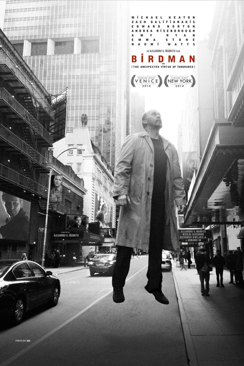
I’m not certain whether BLT crafted the above Birdman (limited October 17) sheet, but since I know they did the other two I’ll give them credit. Its typography is magnificent. From the text block at top that could care less about consistent kerning to the almost unreadable director and writer credits located on the marquees in the background, every letter is in service of the image and not set apart from it.
It’s also a striking photograph in its own right. The glow of white between the buildings provides a spotlight/tractor beam pulling Michael Keaton up into the air so he’s more floating than flying. The rest of the cityscape isn’t cognizant of what’s happening and it therefore makes you flitter between believing its dream or reality.
The one knock—and it’s unfortunately not small—is the horrible need to put all the supporting actors in. The sheet is so subtle and mysterious (look at Birdman standing in the distance like a rooftop statuary) that adding film stills of Edward Norton and Naomi Watts, etc. ruins everything. They are unnecessary additions as light post banners and TV screens, cheapening what could have been perfection.
The other two BLT sheets are fun and creative while retaining the text box I liked so much, but the animated (almost paper collage) portrait and profiled drawing on red don’t possess the same impact. They’ll surely turn heads at the multiplex, but neither forces you to give more than a passing glance.
 |
 |
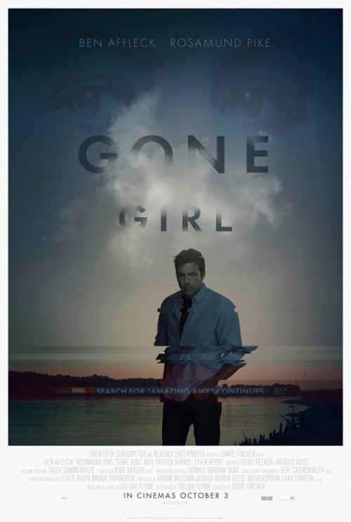 |
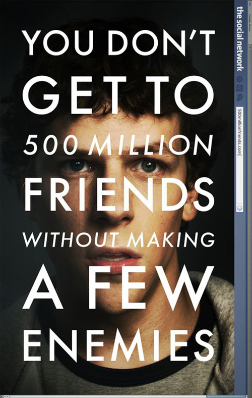
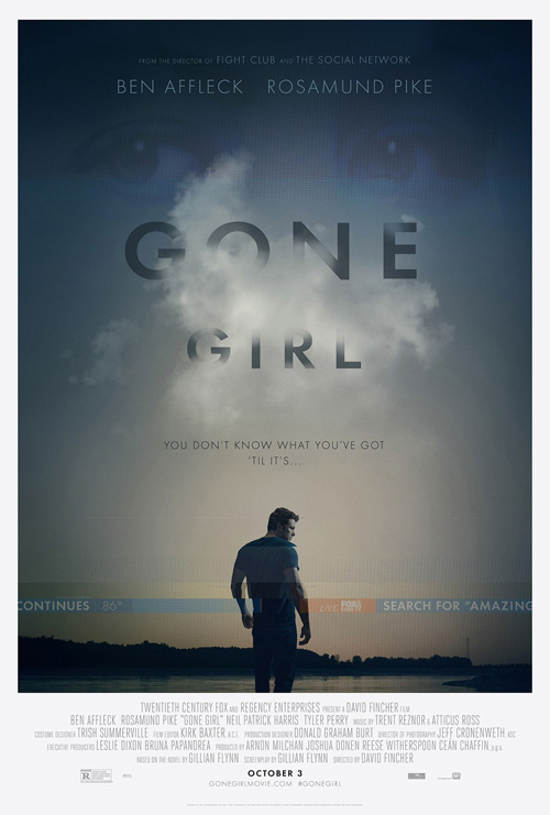
Sticking with his favorite design firm—and no, it’s not BLT or Ignition—David Fincher‘s latest Gone Girl (October 3) receives a poster from Kellerhouse, Inc. like The Social Network and The Girl with the Dragon Tattoo before it. It’s with the former that comparisons are quickly made.
Just like how The Social Network played with electronic media and the nature of its subject Facebook by adding a web browser address bar on its side, Kellerhouse goes full Fox News on Gone Girl with its “Search for ‘Amazing Amy'” scroll on each sheet. Such a maneuver places the design into the real world as more than paper framed and illuminated. We can relate the imagery to real life and ground the pulpy mystery in the heavy stakes needed to separate it from just another checkout line thriller.
What makes the tease so brilliant, though, is its decision to not put anything textually or visually relevant to the film’s title. If you weren’t aware the movie was in production or hadn’t read the book, this poster gives nothing. No hashtag or website—just a date and song lyric alluding to the name by omission. That’s a bold move you have to applaud Fox for approving considering their own inclusion is little more than a logo that’s integrated as part of the illusion.
The other two Ben Affleck-centric sheets are less effective if only because I have the teaser burned onto the back of my eyelids. I do enjoy the cloudy title and the horizontal tracking glitch—something I thought was merely an aesthetic choice because it looked cool in a junker motel television type of way. After reading Ali Gray’s piece on TheShiznit, however, (spoilers included) I see it as a more purposeful and fantastic flourish accompanying Rosamund Pike‘s ghostly eyes.
 |
 |
 |
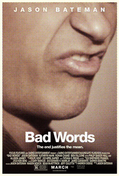
Despite its meticulous detail, BLT reigns as king with their invigorating poster for Nightcrawler (open October 31). Talk about pulpy. This thing is sleazy—almost as much as the character Jake Gyllenhaal plays. P+A may have already done the moire pattern/contemporary Roy Lichtenstein look with Bad Words, but BLT takes it even further to make you squirm in your seat.
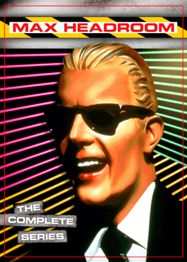
The Fantastic Fest alternate recently released may showcase Gyllenhaal’s weight loss and dedication to menace, but this tease is mesmerizing. If I hadn’t already seen the film I’d wonder if the film was a 21st century Max Headroom horror. But no, it’s about a newly adopted media man off the reservation of sanity willing to take his determined, steely face into the limelight of after hours TV news. As quick with the smile as he is the cold stare, this is a portrait of a monster.