
![]()
“Don’t Judge a Book by Its Cover” is a proverb whose simple existence proves the fact impressionable souls will do so without fail. This monthly column focuses on the film industry’s willingness to capitalize on this truth, releasing one-sheets to serve as not representations of what audiences are to expect, but as propaganda to fill seats. Oftentimes they fail miserably.
2014 soldiers on and the poster selection just gets worse. Luckily the films themselves haven’t been as uninspired. Or maybe they have. After all, this summer is down almost 19% from last year.
In all honesty, I feel bad for the designers because they have so few original properties to work on. When you release sequels and reboots ad nauseam, it’s tough to think of something that hasn’t been done. And when studios are nervous they won’t see the returns they hope for, they simply pick the one-sheet with their star front and center. Hell, there’s a good chance that star only agreed to act in the picture if he/she was on the poster. When creativity is imprisoned, this is the result.
Blockbuster potraiture
 |
 |
 |
 |
 |
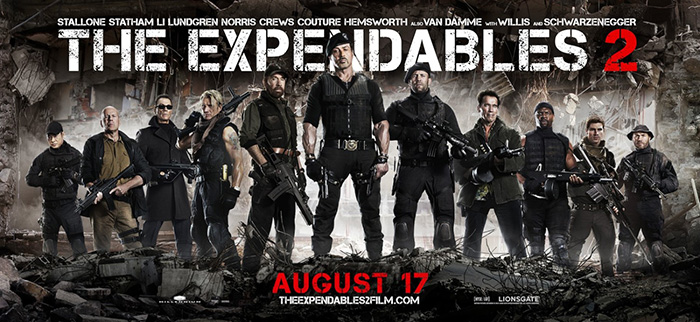 |
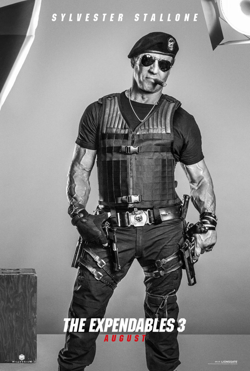
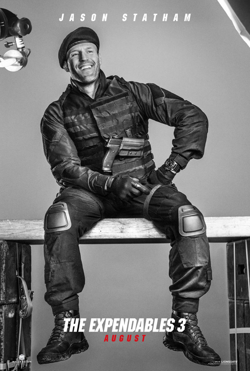
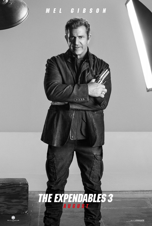
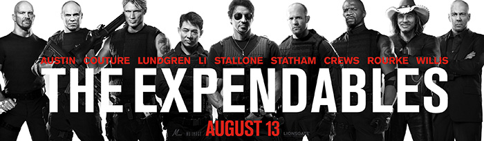
The promotional material for the Expendables series has always focused on the characters. If anything, I have to respect the decision to stick to those guns no matter success or failure. It was cool when Ignition put all those action stars on the same wide poster for the first installment and Frank Ockenfels photography added some destruction, dirt, and sweat for Expendables 2. What Ignition has done for The Expendables 3 (open August 15), however, is just plain weird.
Admittedly, weird isn’t necessary bad. I just can’t seem to gain any traction when trying to think up a reason for their decisions for these two design series.
The first goes back to the simplicity of 2010 with its black, white, and silvery grays, but Ignition doesn’t stop there. Maybe it’s because this is the final installment. (Is it?) Maybe the studio wanted to show a lighter side of the actors above their roles by posing them so the lights, tables, and cameras are visible. These are in effect the raw photos—and maybe humorous outtakes—an artist would otherwise cut out and place against a manufactured backdrop. It’s an intriguing move even if it honestly does nothing to sell the movie besides a friendly, “You like this guy, wanna buy a ticket?”
 |
 |
 |
 |
 |
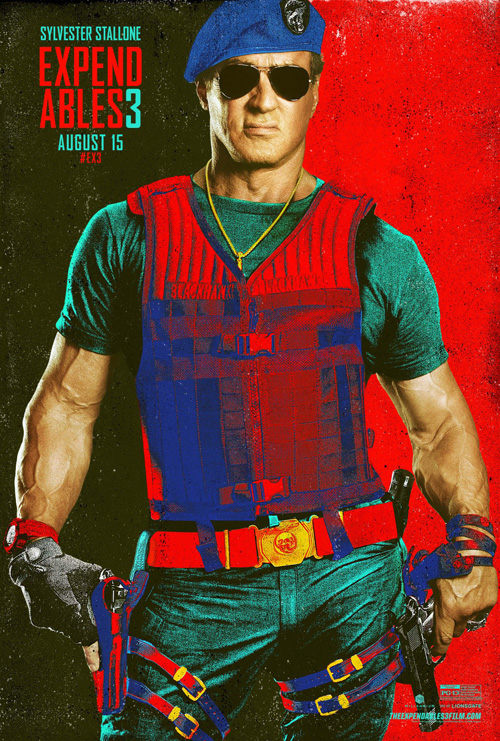
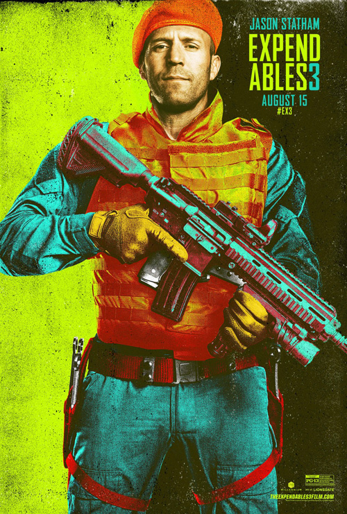
If this isn’t off enough from the franchise’s usual status quo for you, however, just take a gander at the above Pop Art-looking (Andy Warhol homage?) alternates. Kudos to the designer who thought this concept up and congratulations to Ignition’s art director for allowing it to be seen by the studio because I’m completely flabbergasted.
They are fun, colorful, gritty, and extremely off-the-wall. They’ll definitely pop off your local cinema’s display and I guess selling the story is ultimately a waste of time by Part 3. Might as well go for broke and ensure pedestrians have no choice but to look. Some may say it looks like a painter puked on black and white photography, but at least they’re remembering it enough to tell others.
 |
 |
 |
 |
 |
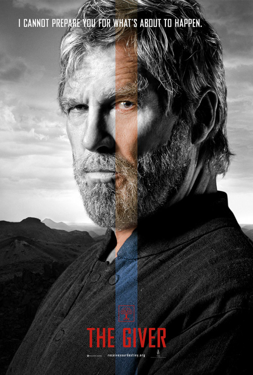
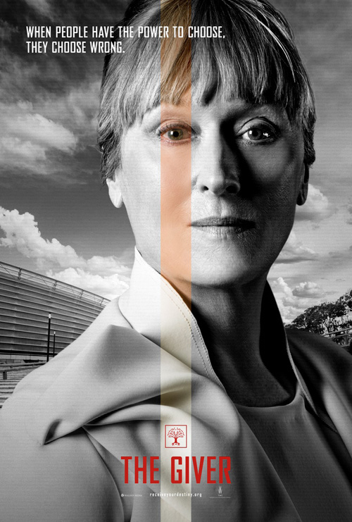
I kind of like Gravillis Inc.‘s character sheets for The Giver (open August 15) even if they are pretty much studio provided images. Sometimes as an artist you are handcuffed a bit and these effectively solve the problem with subtle visual clues creating interest.
My assumption the portraits are studio-issued comes from the fact that Blood & Chocolate / AV Squad have the same images of Jeff Bridges and Meryl Streep idiotically floating behind the young, nameless stars because they needed to put someone recognizable in. The expressions conveyed attempt drama, yet the wide eyes of everyone but Bridges almost emit fear instead. Purposeful for the dystopia setting? Perhaps.
What I like about Gravillis’ layouts is their asymmetrical symmetry. The line of color always shoots down the middle and yet appears off-center because of how it aligns with the actors’ eyes. We want the faces to be centered and thus find the image slightly disconcerting—much like the story’s initial utopia gradually having its dark secrets exposed.
What I don’t like is that the actor-specific taglines at top are left justified despite the title font being centered. This means words sometimes cross the middle color line and sometimes don’t depending on the statement’s length. Where the discomfort from the image appears natural, however, this inconsistency of type plays like a mistake.
 |
 |
 |
 |
 |
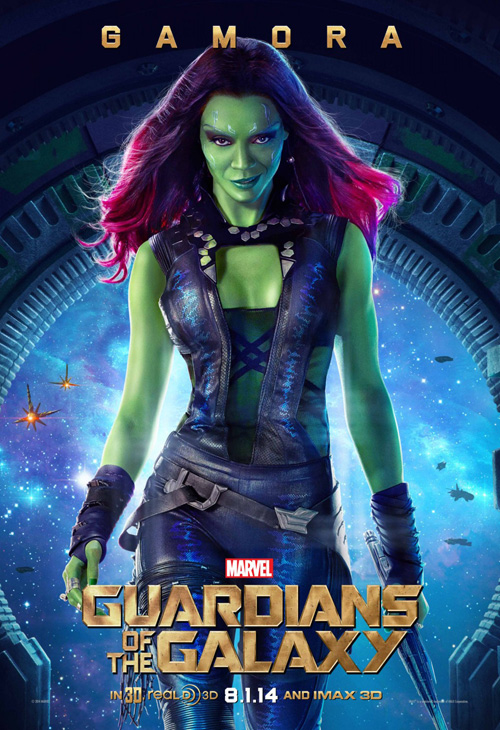
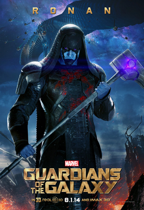
It shouldn’t be surprising that Guardians of the Galaxy (open August 1) receives some of the month’s most uninspiring imagery since Hollywood marketing never allows itself to match the creativity of the actual Marvel comics. This could be because that aesthetic is more akin to Mondo-esque limited prints (see those next), so why waste the cash going above and beyond when fans would rather have those instead?
I do like the painterly quality of Michael Muller‘s photos within BLT Communications, LLC‘s designs, though. The space background on the full sheet is chaotic, the faces on the character sheets more or less fierce. And I wouldn’t use “unique” to describe any of them.
 |
 |
 |
 |
 |
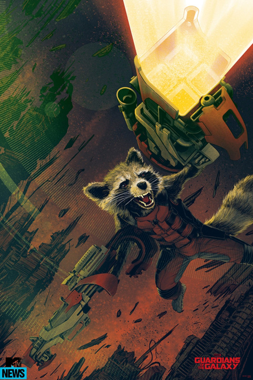
It’s too bad then that the Mondo art will never be seen at theaters. Heck, very few people who weren’t at Comic-Con will ever see them in the flesh at all. But that’s part of the appeal—I’ll admit it. I’ve won and lost many bids to be one of the lucky few over the years.
Francesco Francavilla‘s Star-Lord is one of the best. Stylishly black and red with very graphic shadows against the silhouette, its crispness is comic-like in the best way. Phantom City Creative‘s Drax is cool in concept although the coloring of Dave Bautista‘s skin makes him look like my grandmother’s curtains. Kevin Tong‘s Rocket comes in as the most “realistic” in that the little guy is fleshed out in nice detail with great perspective above the colored cell destruction beneath him. And Randy Ortiz‘s Groot proves the series’ most elaborate if only for the time it must have taken to draw the maze of his bark.
Do any of them give a sense of the movie as a whole? No. But neither did BLT’s. As for Tyler Stout‘s rendition of the gang—I have to admit I’m a bit tired of the style. I find Stout very talented and own four of his works, but I’d love to see him branch out from the line drawing collages.
 |
 |
 |
 |
 |
 |
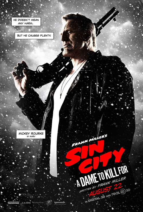
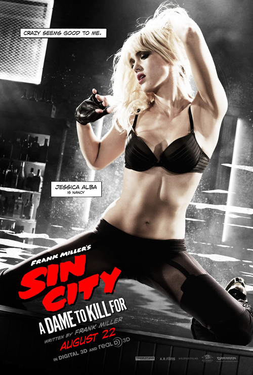
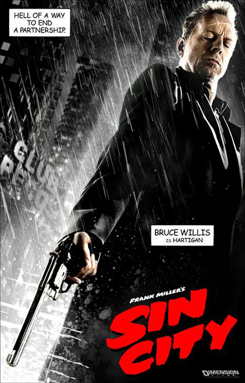
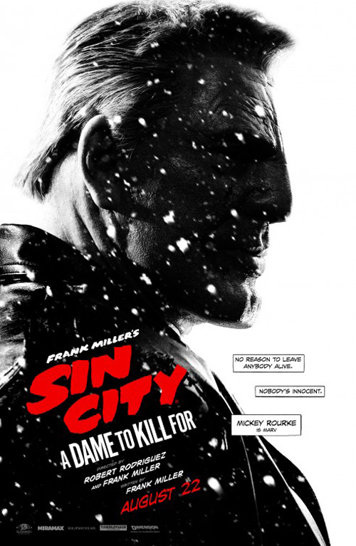
With Rico Torres‘ photography back in the fold, Robert Rodriguez‘s Troublemaker Studios takes over the Sin City franchise from BLT to ensure A Dame to Kill For (open August 22) sees an aesthetic that’s pretty much identical to its predecessor. You know, kind of like how the movie was to the comic book and how this sequel will be like the first. Good or bad, that’s what we’ve been waiting for—or at least what I was waiting for five years ago before forgetting more Sin City films were even a possibility.
I’m not exaggerating when I say identical either. Just look at Bruce Willis‘ gun-toting brooder from then next to Mickey Rourke‘s from now. How about Jessica Alba‘s? Can you even tell the difference? No, the only thing remotely interesting in these rehashes is the by now infamous “banned” sheet of Eva Green‘s breasts.
 |
 |
 |
 |
But wait, that’s not all. Something interesting does come out of the campaign after all within its second series of close-ups. They’re drawn in the same style, yes, but something is amiss with that actress who looks vaguely familiar. She almost looks like Alba …
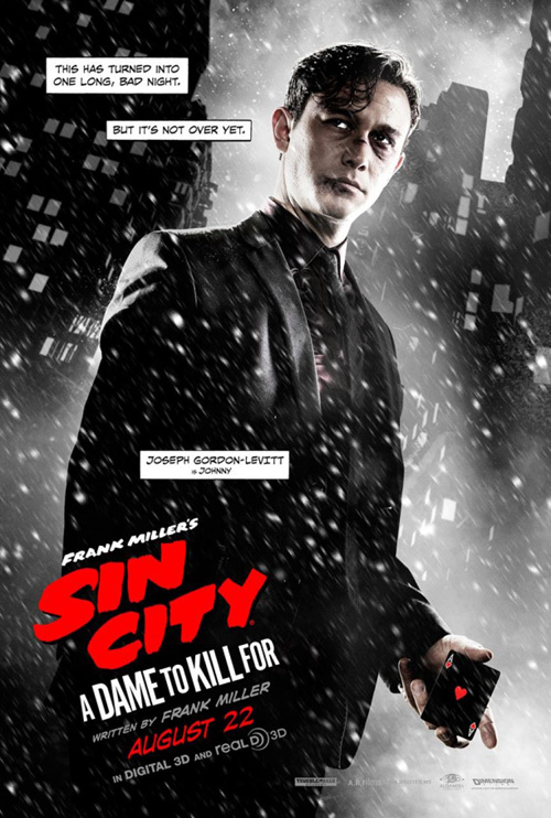
Way to go for titillation rather than intrigue guys because not only is Alba’s Nancy going badass supposedly a big portion of the new movie, but seeing her stitched up face is light years more exciting than the gyrating body we’ve seen before. Rourke’s nose and chin in silhouette is cool for the fanboys that hold Frank Miller‘s saga as Bible and Joseph Gordon-Levitt‘s channeling of De Niro‘s Jake LaMotta is more dramatic than his card holding stare above, but neither compare to Jessica’s glowing, vengeful eyes.
 |
 |
 |
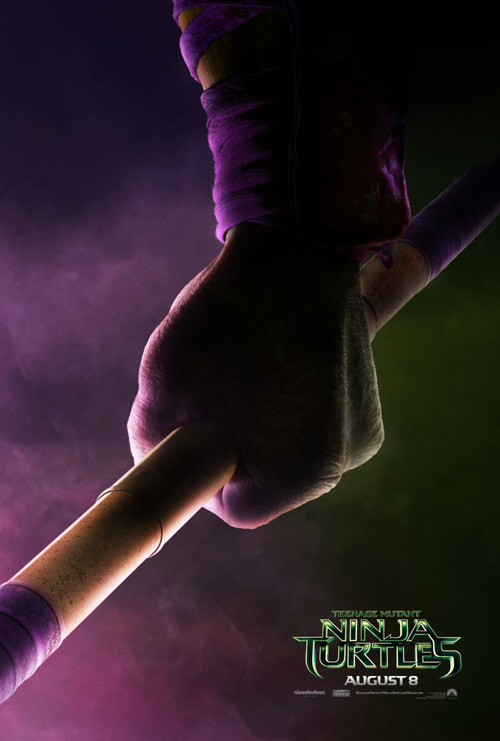 |
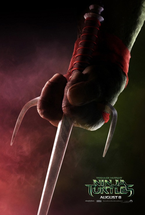
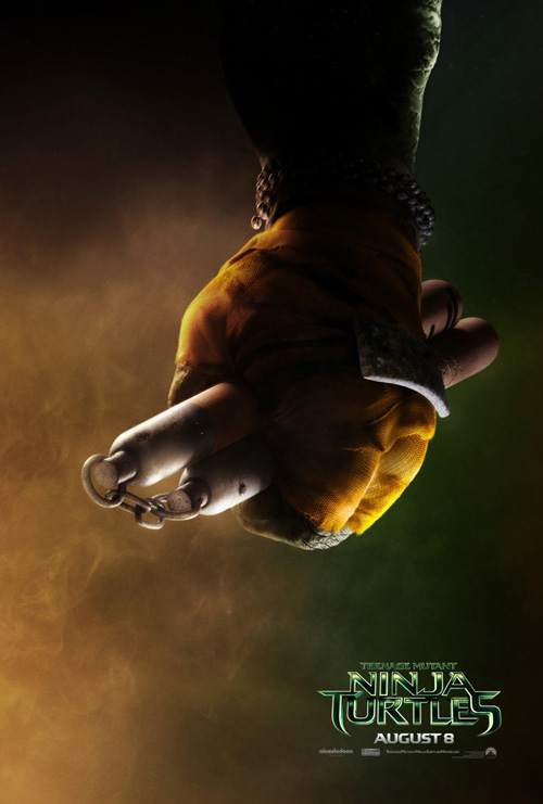
While BLT lost Sin City, they gained a quartet of Teenage Mutant Ninja Turtles (open August 8). Quite honestly, I’d be pretty psyched if their minimal series showcasing everyone’s favorite heroes in a half-shell was the only thing I saw during the promotional run-up. We get the iconic weapons, the clenched fists ready to fight, the designated colors schemes, and a flood of nostalgia putting Corey Feldman‘s voice in my ear alongside Vanilla Ice‘s 90s rap stylings.
Alas, the truth was still to come.
 |
 |
 |
 |
 |
Hmmm …
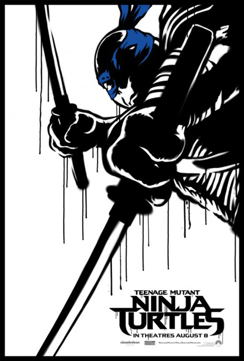
BLT? What’s up with your sad attempt at graffiti/comic cell hybrids that look less spray paint and more fabricated street cred without a shred of authenticity? And why do the turtles look awkwardly beefy, craggy, and utterly frightening?
You’re the firm that created the stellar run for The Wolverine last year by embracing an aesthetic and bringing it to life on the page. So what’s up with this half-assed attempt slathered with a way too hard sheen? The paint lines bleeding down are fake to the point where heavy blurs denoting when the can started and stopped aren’t doing any favors. Even if you could look past them you’ll be laughing at their siblings “dripping” off the too crisp logo to ever allow the wetness necessary to appear real.
 |
 |
 |
 |
 |
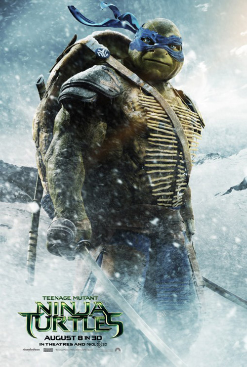
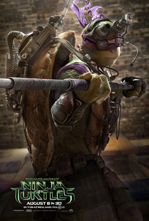
At least we learn BLT wasn’t responsible for botching the body type of these beloved characters in the end. No, the filmmakers transformed them into monsters themselves. Way to turn a franchise I adored as a child into something I have zero enthusiasm towards. I’m a huge proponent of art’s evolutionary paths and artists’ creative license, but whomever thought they could bring mutated, humanoid turtles closer to reality needs to stop.
Sorry, I’ve gone on a tangent about the art direction of the film rather than the posters themselves. Frankly, though, there isn’t much else to say. This third iteration is by far the least appealing of the bunch due to its decision to just put the characters in weird environments. Why is Leonardo in winter? Why is Donatello overly steampunk? And who is Raphael about to kill in the city below?
The main sheet is a mess too, using motion blur everywhere but the four heroes’ faces despite them each being different distances away. They don’t look scared of the explosion behind them or friendly on their descent towards us. In fact, looking into Leonardo’s eyes is making me crap my pants because I think he’s going to jump off the page and slice my head off.
Independent portraiture
 |
 |
 |
 |
While these may not be character posters per se, they do all depict a portrait of sorts to draw an audience in. Rather than merely pose like an action figure in the above Hollywood examples amidst computer generated weather and lens flare, however, these comment more on the mood we can expect as well as capture the star of the show.
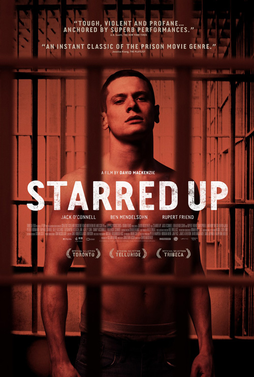
Starred Up (limited August 27) is a great example of how you can create intrigue with very little at your disposal. It may have been a serendipitous event getting this exact shot while filming, but I’d be surprised if that were the case. Rather than simply place Jack O’Connell inside a prison cell, the designers have some fun manufacturing a sense of depth and infinity of bars devoid of escape.
The blurred out layer closest to us adds a fantastic three-dimensionality as the distressed title font rests at the center to make sure we focus on the subject’s unfazed, confrontational gaze. Despite the artist rendering him in as claustrophobic a frame as possible, his demeanor is that of someone free to roam, bust skulls, and wreak havoc.
Akiko Stehrenberger goes a different route with The One I Love (limited August 22) in that the actors are illustrated and therefore unencumbered by any restraints of reality. It’s a disturbing image too thanks to Mark Duplass and Elisabeth Moss‘ glares reflected in the waving water seducing us? Daring us? I really don’t know.
What works is this unsettling nature—the life-like resemblances of blatantly artificial depictions of people who could easily have posed in the exact same positions. What doesn’t is the way the title has been broken up so each word gets its own line. Because of the thin “I” balancing between the two longest words, your eyes want to tell your brain that it’s all off center even though you know it is not. The top two words should be teetering and yet here they are as rigid as the faces peering out from behind them.
 |
For Life After Beth (limited August 22), Union+Webster went a bit more generic as far as content goes yet still found ways to keep things slightly askew from the norm. As it is, the film is a comedic take on the idea of love within a world where zombies exist so it takes the common school portrait format and adds a bit of creepy.
Just look at Aubrey Plaza‘s “over-attached girlfriend”-esque gaze to shift uncomfortably in your seat. Even if you didn’t know she was a zombie, there’s still something not quite right. So when you do know, the comical expression is less invasive and more dangerous. Does she want a kiss or a bite of flesh?
As such, her sheet’s companion piece with Dane DeHaan portrays more of the details. Joy isn’t a word you’d use to describe his face in lieu of the more accurate sense of ambivalence. You can also imagine Plaza is causing shenanigans off-screen—probably growling and lunging, possibly spitting the blood we see spraying his bouquet and neck. It’s a similarly subtle flourish a la Empire Design‘s Stoker, yet one that conjures the complete opposite reaction.
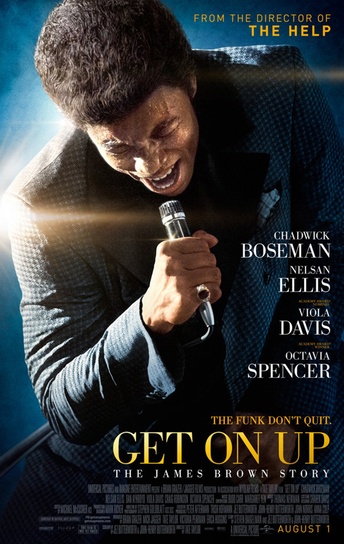 |
The firm who created this poster for Get On Up (open August 1) took subtlety out of the equation but retained the artistic flourish. I like this rendition much better than WORKS ADV‘s straightforward shot of Chadwick Boseman doing his best James Brown because it has more motion and life. You might not think this if the photos were all you saw, but you will after adding the fonts and composition choices.
The one of Boseman screaming into his mic simply comes across as stale with its elegant serif fonts, over-exposed lens flare, and convenient angle fitting the text nice and snugly in its open spaces. The other conversely works in conjunction with its more dynamic, full-bodied pose sliding into frame from the right. A collage of words then fills the white space with seemingly little concern for overlapping—knowing we’ll be able to read everything whether letters are hidden or not. And the distressed sans is much more akin to the musicality and freshness of the film’s subject. You can feel the beat here while WORKS ADV’s sheet flatlines.
Glimmers of hope
 |
 |
 |
 |
Ah, here’s the good stuff.
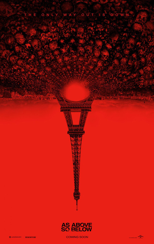 |
I don’t care that this poster for As Above, So Below (open August 29) is in Spanish because it’s cool. The title itself conjures images of Heaven and Hell and one could think of numerous ways to display both together. Ignition may have found one of the best, though, by taking the idea of death towards its physical resting place (cemetery statuary) and rendering it as well-known iconography. And they do it like a playing card, merging the reaper and angel together in a piece that brings the title to life without excess surrounding it.
It’s much more memorable than the firm’s English-language iteration of the Eiffel Tower and rows of skulls turned upside down. This one is too on the nose with a desire for shock factor that has been proven to not be necessary by the other version. The black drawing becomes muddy on the red and I honestly don’t know what’s going on. Is France Heaven or just the location of the movie or possibly neither?
 |
 |
 |
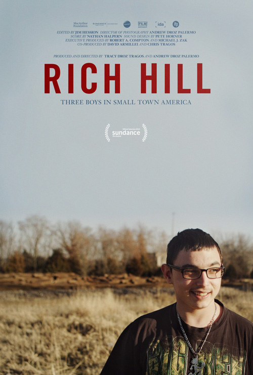
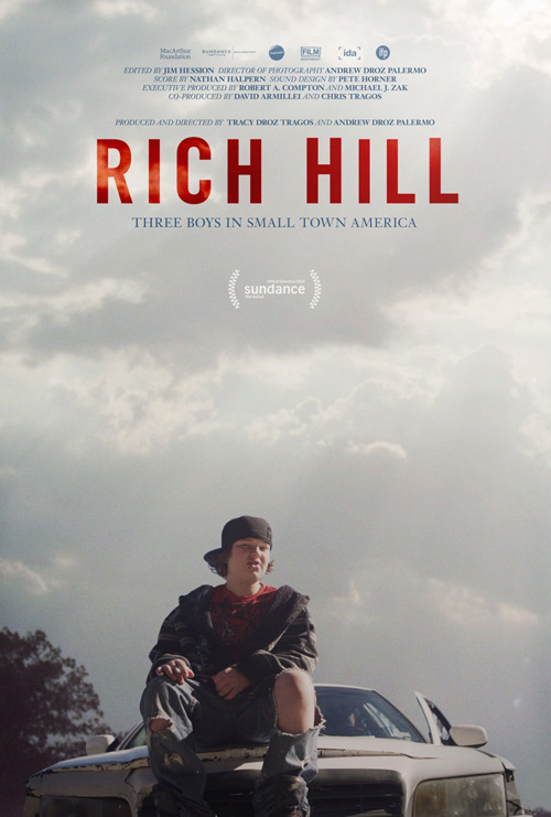
Next up is a wonderfully cropped and composed sheet for a documentary. Rich Hill (limited August 1) receives one of the most visually pleasing posters of the month and I can’t understand how any of its fiction film counterparts with nothing but imagination, studio time, and artistic talent can let that happen.
It isn’t just one poster either. The film receives a “character” installation for all three leads, each shown against the dreary sky of their Midwestern town. Every bit of text is pushed to the top so it won’t infringe on the artistry below and the boys simply act like themselves while the camera creates a malleable enough image to work magic on later.
It’s too bad the final poster can’t live up, though. Trying to keep its text in the expansive sky at top, things have been enlarged too much to successfully fit naturally. Add in a cheery blue and kids having fun and the tone shifts completely. I don’t even think the boy in the foreground is part of the image at either. Gone is documentary verisimilitude, replaced by convention and publicist demands.
I usually don’t like boxed images, but Ignition gets it right with The Last of Robin Hood. I love the symmetry—save the glaring lack of Academy accolades above Dakota Fanning‘s name throwing everything off-kilter—and appreciate the minimalistic chevron convention bearing resemblance to the feathers of one of Robin Hood’s iconic arrows.
The font used is crisp with a nice, tight kerning and sharp angles in a bold black that pops from the white page. The black and white photos are bumped to the perfect saturation so they don’t get washed-out in their color overlays and the alternating positioning of actors (left, right, left) keeps the symmetrical balance intact. It literally brings a smile to my face.
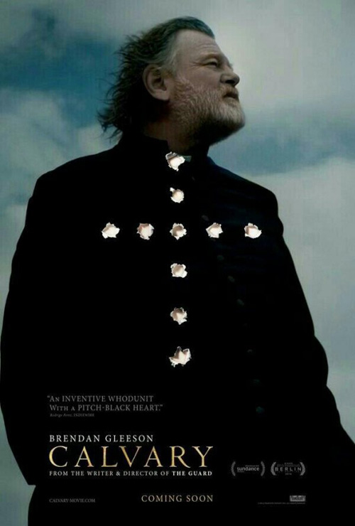
It isn’t my favorite of the month, though. That distinction belongs to Calvary (limited August 1)—a film I’ve been calling Cavalry for the past year. Whoops, sorry Golgotha.
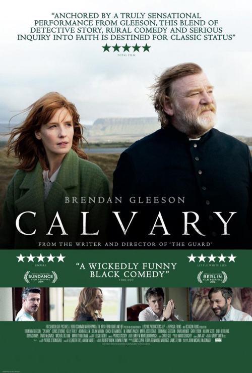 |
Not only is the photo of Brendan Gleeson intriguing in its mystery of him looking off into the distance against a graying sky, but the juxtaposition of bullet holes and a cross can’t help itself from captivating also. It’s amazing how much depth and artifice can be portrayed through those ten holes, their drop shadows and torn edges turning the poster into the two-dimensional page it is rather than a window into a scene like most attempt. This tiny detail makes you believe the poster was actually shot at by someone taking practice before the real thing. Practice before killing Father James Lavelle.
It’s a breath of fresh air for August as well as the film itself since the second advertisement is nothing more than a generic bore. Let’s put more recognizable faces in, add a few soundbyte reviews, and remove the most intriguing artistic embellishment completely. Yeah, that’s how you sell: by doing the bare minimum.