
“Don’t Judge a Book by Its Cover” is a proverb whose simple existence proves the fact impressionable souls will do so without fail. This monthly column focuses on the film industry’s willingness to capitalize on this truth, releasing one-sheets to serve as not representations of what audiences are to expect, but as propaganda to fill seats. Oftentimes they fail miserably.
Despite being another year of blockbusters and animated fare begging for bland character sheets and Photoshop montages, 2013′s movie posters were surprisingly creative artistically. A bunch of the following images selected for this top ten have unique fonts, most only a single actor, and even more some sort of textural filter to make what is a flat, 2D piece of paper into something tactile and worth collecting without the stigma inherent to enjoying the pariah of all art forms known as graphic design.
And it’s not just the small firms looking to make a name for themselves as companies who complement films with equal artistic merit rather than bastardize them with floating heads and bright colors. No, big guns like BLT Communications LLC and Ignition Print each have more than one selection below. This either means studios are finally seeing what a strong brand and eye-catching marketing has to offer or that these firms are desperately trying to stay relevant. The latter is definitely something they need to worry about because they’re are a lot of newcomers on this list too.
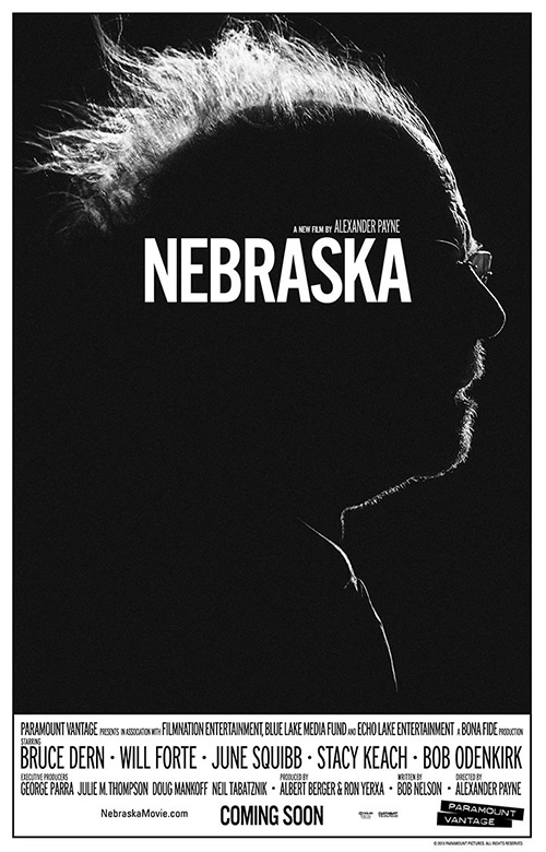 #15 Nebraska BLT Communications |
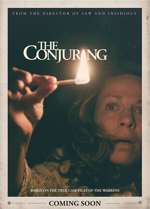 #14 The Conjuring Ignition Print |
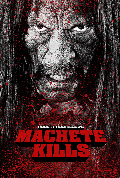 #13 Machete Kills Troublemaker Studios |
 #12 The Hunger Games: Catching Fire Ignition Print |
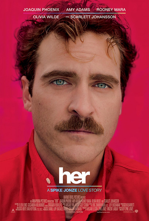 #11 Her aSquared Design Group |
![]()
![]()
#10  Computer Chess  Simplissimus  Simplissimus has outdone itself creating a poster that effectively distills a film shot on a 1968 tube video camera about a bygone era where the code of a video game was the actual game into one iconic visual. They’ve transformed Computer Chess into a crumpled and creased fold-out just like the ones that would have come inside the Atari cartridge’s box its imagery and bold/rounded serif font can’t help elicit. There is a nerd quality to go with its vintage aesthetic that turns heads—a description as apt about the sheet as it is about the movie. |
#09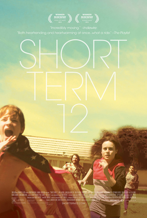  Short Term 12  I know it’s hipster chic, but whatever firm handled Short Term 12 used it to full effect. The thin serif is extra big in a gorgeous reverse pyramid bringing our eyes down to the image; said image is nicely infused with a surplus of yellow for a look just left of realistic; and you can’t angle or crop the action better to ensure all four actors are in frame while also mimicking the fast-paced motion from background to foreground. It looks like a simple no-brainer, yet that level of comfort and attractiveness is anything but. |
#08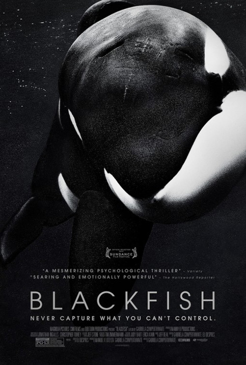  Blackfish  Gravillis Inc.  Blackfish is the first of three entries from Gravillis Inc. yet it’s no less stunning despite than the others still coming. There’s a melancholy at play only heightened after seeing the powerful documentary and understanding how intense Tilikum the whale’s life has been. All the text is pushed to the bottom so no taglines can interpret the starkly contrasted black and white image (probably printed full color to make the shading even deeper) and formatted in a loose box so the sharp angles of the font can contrast the swooping curves above. It almost feels like he’s swimming towards us on the other side of a glass tank. |
#07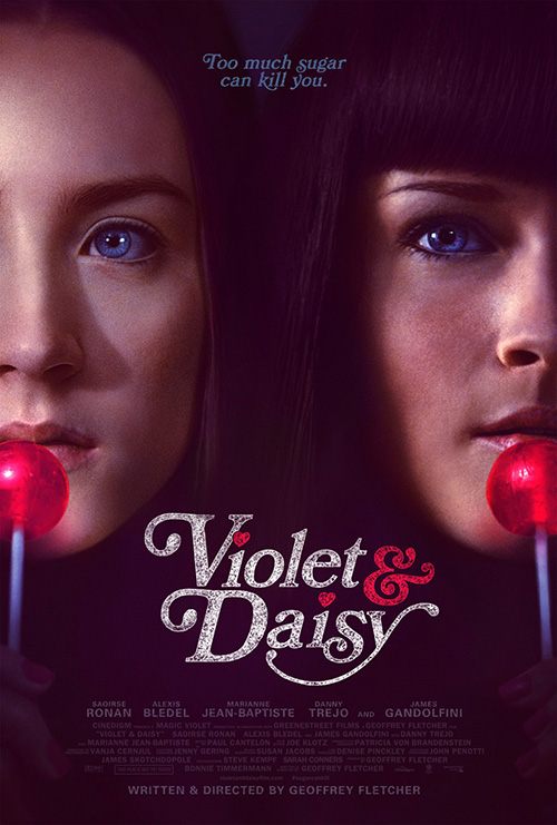  Violet & Daisy  Gravillis Inc.  And here is Gravillis’ second: a similarly deep contrasted image for Violet & Daisy, this time in color and rendered with an old school/pulpy aesthetic. The juxtaposition of the girls’ dead eyes and lollipops perfectly encapsulates the film’s youthful hit-women and their conflicting personas of child-like glee and adult-oriented business. The logotype is playful yet dirtied so the white won’t pop too much and the rest is just vacuum black abyss with glowing blues and reds to create an otherworldly aura much like the dark, fairy tale tone Geoffrey Fletcher gave his criminally underrated debut. |
#06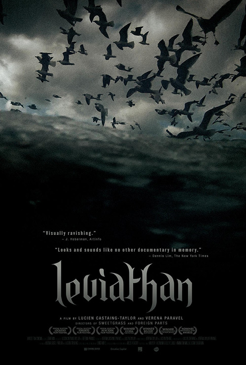  Leviathan  Lucien Yang  Strikingly similar to Blackfish, Lucien Yang‘s sheet for Leviathan utilizes many of its same tricks to portray its darkly sinister and unfiltered depiction of a part of our ecosystem we otherwise dismiss as long as our fish are on supermarket shelves when desired. The text is at bottom again to not distract from the image that’s three-quarters murky sea water topped off by a swarm of birds smelling dinner. I can still hear their amplified screeches and the splash of waves right now while studying this haunting image of the circle of life—one not quite as shiny bright as we’d like to imagine. |
#05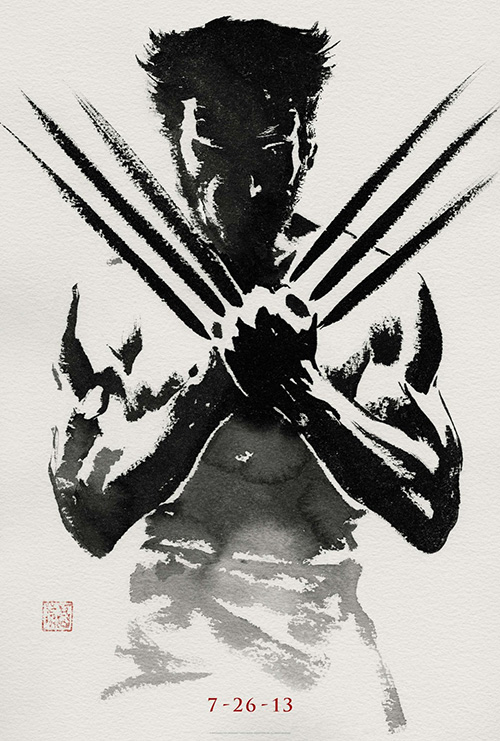  The Wolverine  BLT Communications, LLC  One of the best teaser posters of the year, BLT Communications, LLC proves they know their audience, their subject’s iconography, and the aesthetic of its locale with this stunning inked portrait of The Wolverine. All we need is Hugh Jackman‘s silhouette and his character’s crossed adamantium claws to understand what’s in store while the Japanese ink wash helps explain which comic arc Fox is pilfering. I still hope the square stamp bottom left has the symbol for “wolverine” encased within, but either way you cannot deny this image wouldn’t pop out off a multiplex’s wall. |
#04  12 Years a Slave  Ignition Print  For a firm I’ve seen languishing in the depths of Photoshop hell the past two years writing Posterized Propaganda, Ignition Print surprised me with their stark and subtle 12 Years a Slave advert. The translucent, period cloth shirt and the expression of fear on Chiwetel Ejiofor‘s face is all we need to see his obvious plantation surroundings, so the white background may force us to focus on the man himself enduring unconscionable atrocities. The fact that the “12″ is placed dead center becomes the cherry on top of a meticulously-composed layout, spiraling our eyes out into his desperate run off the page. |
#03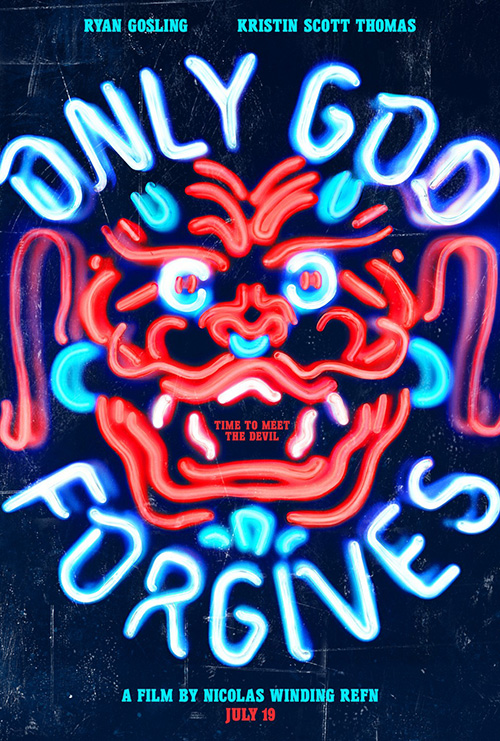  Only God Forgives  Gravillis Inc.  Gravillis Inc.’s third and final selection is the conceptual wonder that is God Only Forgives‘ popular teaser sheet. I can do without the tagline hiding inside this neon dragon’s mouth as well as the blatantly superimposed names at top and bottom that do nothing to integrate with the authentically rendered light fixture, but even they can’t detract from how effective the glowing, twisted tubes are at conveying tone, topic, and feeling. Gravillis would have done well taking a page from BLT’s Wolverine, so I’ll imagine the date is all that complements the red, evil face. If only it were true, this might have been #1. |
#02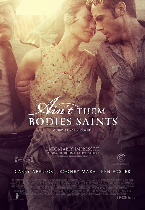  Ain’t Them Bodies Saints  P+A  My runner up is P+A—a firm that’s excelled at indies since 2006′s Brick (and apparently Zack Snyder‘s personal designers)—for the tortured yet softly beautiful, magenta-hued Ain’t Them Bodies Saints. It’s a delicately cropped film still placing lead Rooney Mara‘s painful sorrow and unwavering love at its center beneath its similar to 12 Years a Slave font style. Dripping emotion from top to bottom as the page almost seems to absorb the blood spilled to put these lovers on their current course, it’s gorgeously symmetrical besides Mara and Casey Affleck‘s heads touching to show how they will never be kept apart. |
#01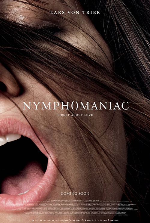  Nymphomaniac  The Einstein Couple / Casper Sejersen  It doesn’t release stateside until 2014, but Nymphomaniac‘s brilliant campaign couldn’t be ignored. From the minimalistic parentheses replacing its “o” in a highly suggestive way on the teaser to the principal cast’s comically bold orgasms, Lars Von Trier‘s latest has must-see advertising. But it’s The Einstein Couple‘s newest close-up of Casper Sejersen‘s photography that truly captivates in a progression/hybrid of what came previous. Charlotte Gainsbourg tilts out of frame while hair flies in the other direction, giving her expression motion and intensity to turn what was humorous into a dramatic image of passion. |

