
![]()
“Don’t Judge a Book by Its Cover” is a proverb whose simple existence proves the fact impressionable souls will do so without fail. This monthly column focuses on the film industry’s willingness to capitalize on this truth, releasing one-sheets to serve as not representations of what audiences are to expect, but as propaganda to fill seats. Oftentimes they fail miserably.
Not too many movies open up in October—and only one studio horror flick at that, despite Halloween. What’s the best way to sell tickets then? Star power. Celebrity faces are going to be starring back at you from every single marquee across the nation with dead eyes and Photoshopped smiles. Are you ready?
Tense faces
 |
 |
 |
 |
 |
 |
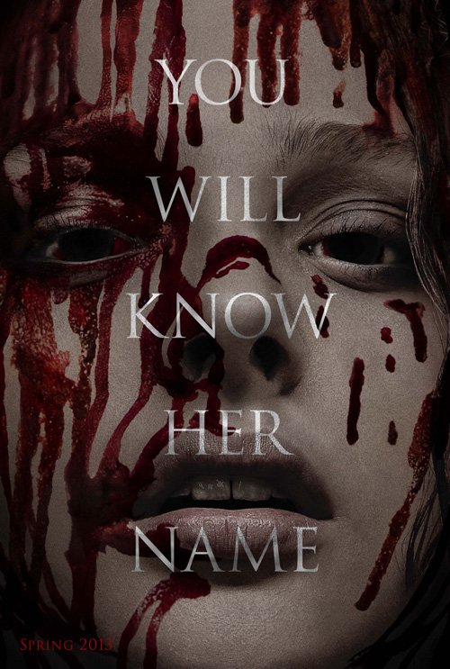
We begin with that one horror film—the Carrie (open October 18) remake. It’s no surprise ARSONAL would decide to go full-force with the bloody, terrifying incarnation of the high schooler for their campaign since those who know the original won’t be spoiled and those who don’t need the gore to get them in the theater.
Say hello to the text over face trope, shudder at star Chloë Grace Moretz’s telepathically-inclined ambivalence, and wonder whether or not that blood was simply red watercolor paint splattered onto her face. It’s not often a teaser gets outdone by the actual one-sheet, but here it is. By no means a great poster in its own right, the final poster at least plays with the edge of the page and strong contrasts to earn some intrigue.
There’s something about juxtaposing Sissy Spacek’s crimson monster against the innocent prom queen she once was that these just couldn’t equal, though.
 |
 |
 |
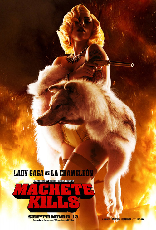
For a tease that does excel, look no farther than Troublemaker Studios’ Machete Kills (open October 11). Its black and white, grainy shot of star Danny Trejo spotted with red has the grindhouse aesthetic down pat to go with its attractively blocky logotype.
Sadly, they decided to use Rico Torres’ photography for the character posters and final sheet, mimicking what Kustom Creative did on Machete. The former are dull with flame motifs while the latter’s attempt at old school montage—with help from Ignition Print—is way too polished in comparison to the tease.
Kustom at least over saturated everything to make their 2008 entry seem a bit closer to a 70s style. This new one has forgotten what the film is trying to accomplish as the carnal ferocity of the black and white is replaced by studio portraiture.
 |
 |
 |
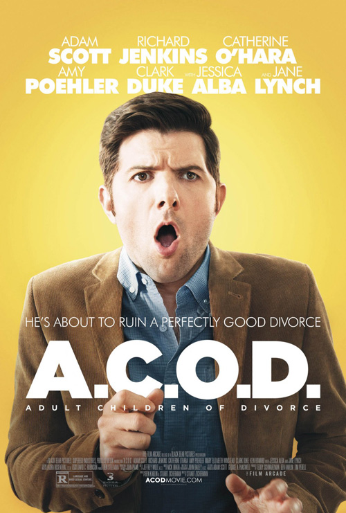
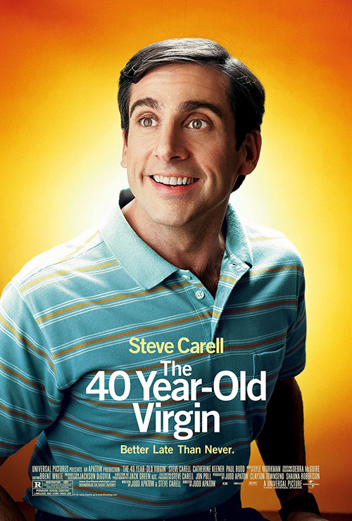
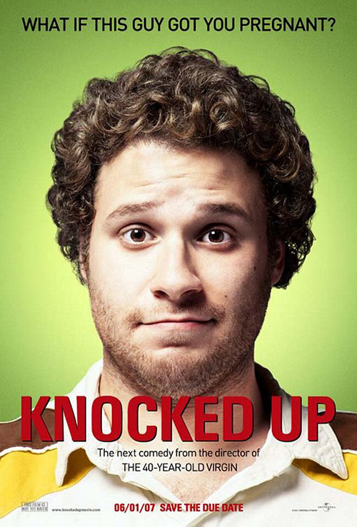
Both of the aforementioned films at least tried, though. I’m not sure the same can be said for The Refinery’s A.C.O.D. (limited October 4). Not only does it look like they wanted to copy the feel of Crew Creative Advertising’s work on Judd Apatow’s The 40-Year Old Virgin and Knocked Up, but it’s as though they simply found a goofy still of Adam Scott, cut him out of his background, and declared themselves done.
Nothing about this is tonally similar to CCA’s want for a school portrait-esque feel—a concept outdone itself by Ignition’s Step Brothers. Maybe they weren’t even trying to conjure that tone anyway, but what else they could have wanted is beyond me. And why even bother with depth tricks on the cast list at top and title name at bottom when the whole endeavor is so unavoidably flat? No reason other than laziness on the part of the studio comes to mind.
Where Cardinal Communications USA’s Kill Your Darlings (limited October 18) is concerned, the end result is just plain unattractive. It’s as though they saw the Machete Kills tease and A.C.O.D. poster and wondered what would happen if they combined the two. Take a masked photo of Dane DeHaan and Daniel Radcliffe, (you can still see the fuzz from the superimposition above the latter’s right shoulder); filter them to high contrast newsprint black and white; and give them a Photoshop multiply to overlay the orange background. Voila!
It actually wouldn’t be too horrible if not for the massive amounts of text. Between the novelized quote at top to the title, tagline, and footer information below, words are all you see. And the mere fact the cast names are jammed in at the center can only mean the designers separated the two actors’ heads as far as necessary to do so. The entire layout seems in response to the text when it should have been the other way around.
Pensive faces
 |
 |
 |
 |
 |
 |
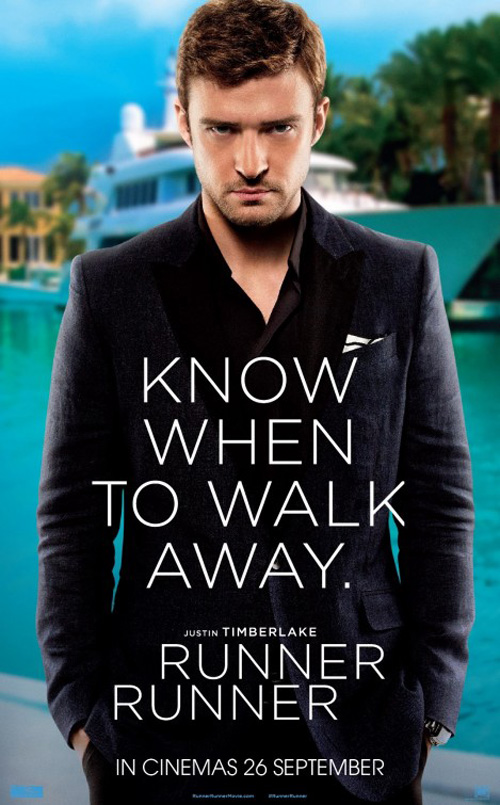
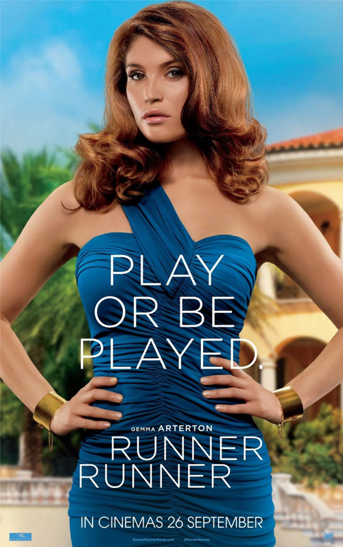
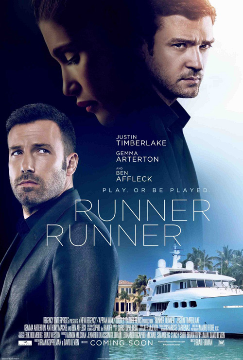
Can the text over posed actors motif die already? If I wasn’t irreversibly done with it before, I definitely am now after The Refinery’s adverts for Runner Runner (open October 4). Just look at the Justin Timberlake one: the words actually hurt my eyes. They’re all displayed in an identical font and color while staying pretty much the same size—it’s too much. Thankfully the Gemma Arterton companion is a bit easier to decipher courtesy of her dress not being black and the copy being reduced to add space between the catchphrase and title.
I don’t necessarily mind the firm’s final sheet—playing with yet another overdone motif—as the color scheme allows the ubiquitous fading faces to complement each other as they melt into one. Its glaring problem, however, is the fact that the film isn’t a romantic drama wherein Ben Affleck longs to win Arterton from the clutches of Timberlake’s brooding heartthrob. With the purple hues and soft, thin text, it plays like one of those reworked movie trailers where The Shining becomes a comedy.
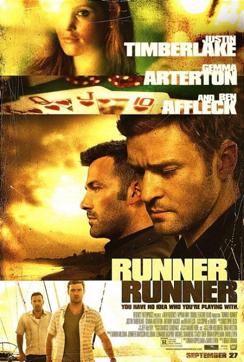
No, despite Ignition’s boring use of the yellow filter Traffic and “Breaking Bad” have tricked audiences into believing designated Mexico for over a decade, you at least get the feeling this is the dramatic thriller the trailer depicts. It’s amazing what some heavy sans serif, grainy imagery, and surface scratches can do to transform The Refinery’s melancholy love into sweaty adventure.
 |
 |
 |
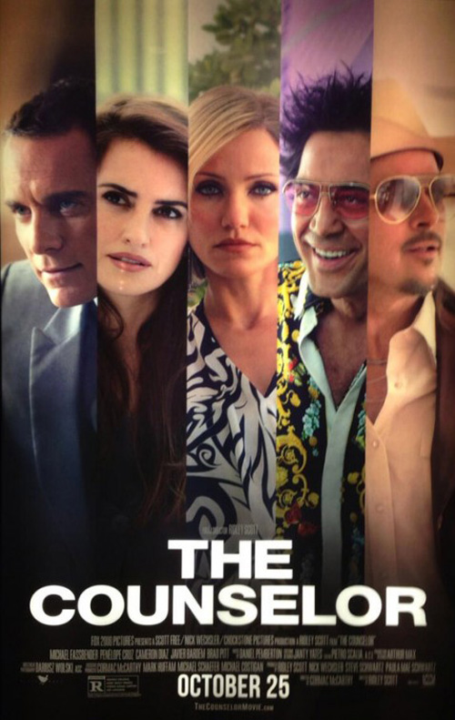 |
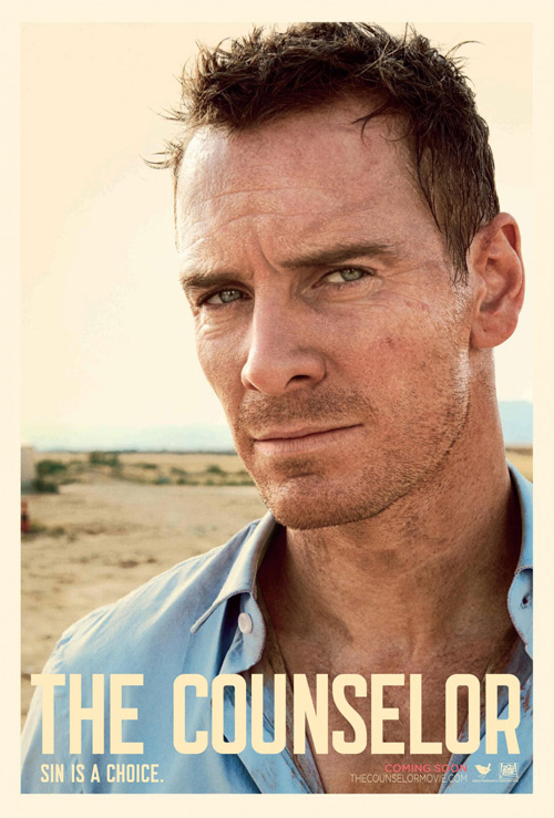
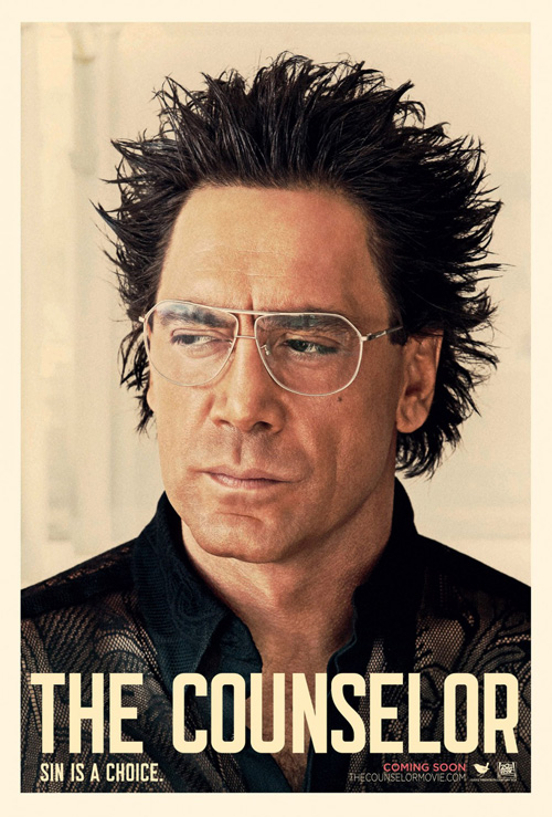
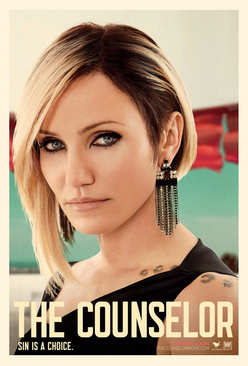
and company has no problem embracing their film’s arid destination or heavy atmosphere, however, as they use portraiture in a captivating way with The Counselor (open October 25). Ignoring Brad Pitt’s out-of-place entry, the firm nicely gives us high definition close-ups of its characters against a sandy beige hue to help complement their faces so their tans may pop. The men keep their craggy imperfections while the women acquire a blemish-free, silky smooth finish.
The title and tag are afterthoughts, dwarfed by the pensive looks shot our way by the performers above them. There’s something simultaneously clean and muddy about them that the one-sheet’s colorful split screen of all cannot convey. It’s the difference between serious weight and cartoonish flavor, a juxtaposition epitomized by Javier Bardem’s two iterations. While the character sheets may seem better suited for an Abercrombie and Fitch catalog, they still do their job of catching our eye so that we may wonder at what’s going on inside their minds.
What is up with that Brad Pitt one, though? Does he have a contractual obligation to be seen smiling, in color, and full bodied? Just because it uses the same frame and as the rest doesn’t mean it comes close to equaling their effectiveness.
Smug faces / Scared faces
 |
 |
 |
 |
 |
 |
 |
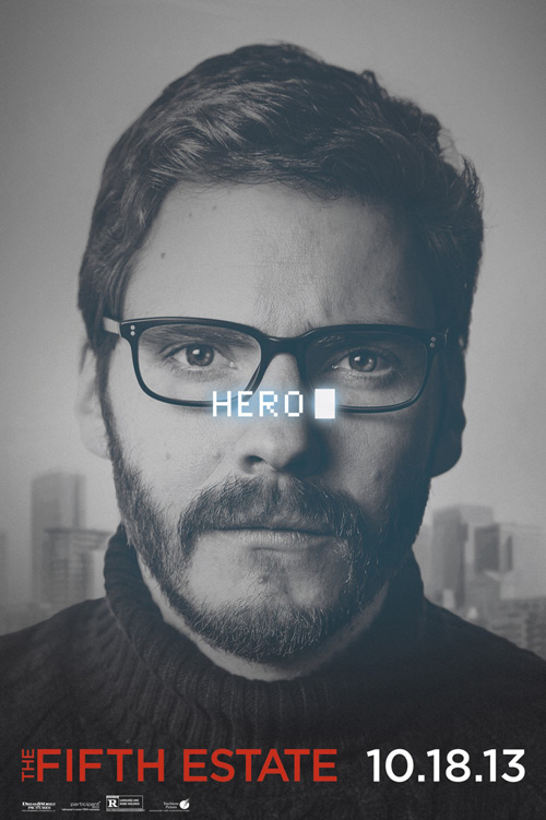
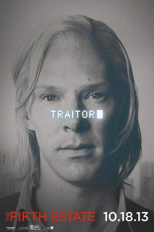
I really like what Bemis Balkind did for The Fifth Estate (open October 18) as far as teaser sheets go. Using a rather innocuous image of both Benedict Cumberbatch and Daniel Brühl, they’ve created a campaign begging for silent audience participation once the words “traitor” or “hero” is superimposed above them. This is the exact tug-of-war that has been playing out since WikiLeaks debuted—did these men serve the citizens of United States or put them in danger?
The grayish muting of the images themselves allows the glowing pixel-based type to pop out while also making a creepy Julian Assange look even more like an alien. Brühl—unlike his make-up for Rush—conversely looks normal despite it. The low monotone saturation should also help it stand out against other posters at the multiplex, receding deeper than their bright colors and in effect allowing the blinking cursor to appear even closer to us than it already does.
BLT Communications, LLC was enlisted to place both men together and do an admirable job considering their avenue of compartmentalizing the page. Both Cumberbatch and Brühl receive an equal share of space while the center houses a nicely rendered field of depth via subtle text shadows and color changes. I’m not so sure about the green tint, though, as it screams “money” to me rather than the moral battle the film is supposed to portray between the two men.
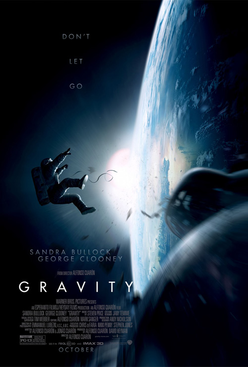 |
Finishing off the myriad October character sheets is The Refinery redeeming itself from the rather forgettable entries they designed above. If you’ve seen Gravity (open October 4) you’ll know how immersive Alfonso Cuarón‘s newest work can become and therefore how appropriate the in-close shots of Sandra Bullock and George Clooney are to sell it. We go into those helmets a couple times throughout the movie so the feeling of claustrophobia will not end with these posters.
There is some really stunning lighting at play with burned whites and pitch-black darks to lay the sharp, angular text atop, but it’s the actors and their reactions that matter. Each singular eye is scared to death, starring down the wide expanse in front of them that we can only imagine until sitting down to watch. If you were to take just these sheets as a description of the whole, I wouldn’t blame you for thinking a second horror flick was coming out in October after all.
The firm’s original poster is good too, adding a sense of dread by depicting an astronaut becoming unhooked, flailing around to grip whatever he/she can to remain tethered against the vacuum of space. While the tagline and actor names holding a gradient for effect has them disappearing into the black background, the minimalist characters have been replaced by more information—too much in my opinion. The whole thing looks painted, the blurring is excessive, and the sense of danger is rendered false. Less is definitely more here.
No faces / Dramatic faces
 |
 |
 |
 |
 |
 |
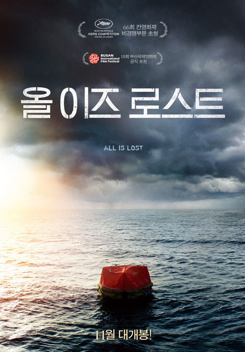
I cannot help myself from thinking about Life of Pi when looking at this Asian one-sheet for All is Lost (limited October 18). A stripped down sister to The Refinery’s work on last year’s Oscar nominee, the sense of isolation on the water here is overpowering. Between the foreboding sky, the covered raft with no signs of life, and the absolute absence of anything else, you can tell you’re be in for a harrowing journey for survival.
Sadly, we don’t really get any of that with Bemis Belkind’s American advertisement. Instead of dread we get Robert Redford‘s mug seeming rather calm considering he’s being pounded by rain. The showering water is cartoonishly perfect in its high-speed slant, the color appears unnaturally drained, and we honestly shouldn’t be able to make out the actor that well if the storm was that bad. And to top it all off, the almost uniformly sized type above him again hurts my eyes more than help them to decipher what’s more important than the rest.
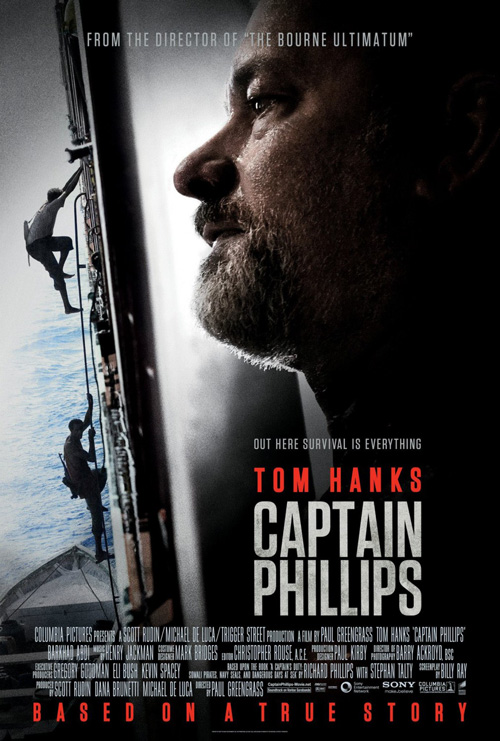 |
Keeping nautical, the fantastic use of a film still for Captain Phillips (open October 11) blows All is Lost out of the water (pun intended). The crop possesses brilliant empty space, the image is distressed ever so slightly for drama, and the condensed font keeps the kerning tight for the blocks of text to exist alongside the slanted boat side rather than cut through it.
To see how something so attractively distilled to its barest sense of tone can be destroyed, however, we don’t have to go too far. The second version of the poster sees its central image becoming more photographically pure; the rope line that covered the top pirate has been removed; the balance of all text being centered at right is ruined with top and bottom blocks spanning the width of the page despite the title remaining where it was; and Tom Hanks gets his face added to what was an invitingly empty area.
I don’t know the details, but it isn’t hard to guess this is a perfect example of studio interference. I can see the conversation now: “We love it. It’s great. But what about putting our star on there somewhere really big? And maybe add some more color to the water so it doesn’t seem so depressing? After all, it’s not like this is about a kidnapping and hijacking …”
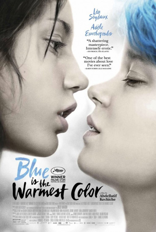 |
Karine Savard‘s poster for Blue is the Warmest Color (limited October 25) went through an alteration from a previous iteration too, but its changes have less commercial motivations. We all know about the film’s NC-17 sexuality by this point, so if the studio were to interfere, they probably wouldn’t have let its two actresses remain in the midst of a kiss.
Admittedly, I like the original better due to its more naturalistic coloring. Savard’s puts a bit too much of a fantasy spin on it with its blue background, painted red lips, and crayon-like brushes of blue on Léa Seydoux‘s hair. To me this second version is an American’s idea of French aesthetic—that whimsically colorful Jean-Luc Godard style. For a movie so intrinsically bonded to its authenticity, however, the bare reality of these two young women is what resonates the most.
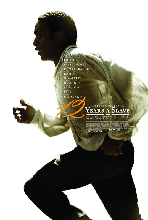
While that one is great, the true winner of the month for me is Ignition’s 12 Years a Slave (limited October 18). This thing is like a Best of compilation of techniques utilized above. They cut Chiwetel Ejiofor out of his background scene like A.C.O.D. did Adam Scott. They put a list of actors at the center above his shadowy shirt a la Kill Your Darlings. And they enhanced the palette by oversaturating the colors to pop his dark skin off the bright white while also letting him melt into the glow via his highlights.
Its shining moment is the placement of the 12 though, colored so deliberately that it simultaneously meshes with the shirt as it escapes it. The number is dead center on the page, stealing our attention once our eyes spiral around the frame from outside in, revolving clockwise from Ejiofor’s face down his left arm and up again through the point of his knee and pumping right hand. It’s a mesmerizing journey where we run with the character as the text sits deliberately structured above.
If everyone is telling the truth about the film’s quality, we should have expected nothing less from its marketing.