
![]()
“Don’t Judge a Book by Its Cover” is a proverb whose simple existence proves the fact impressionable souls will do so without fail. This monthly column focuses on the film industry’s willingness to capitalize on this truth, releasing one-sheets to serve as not representations of what audiences are to expect, but as propaganda to fill seats. Oftentimes they fail miserably.
Here we are at the end of 2012, ready for the release of the last few Oscar. It’s a time where story generally triumphs over mainstream appeal and where the medium’s greatest auteurs find their works let out into the world when people are more than willing to seek shelter at the movies instead of bundling up for the wintry holiday snow.
What’s interesting this year are the number of literary adaptations and other works similar to such a stylistic approach. We’ve got at least four from novels, one a play, two based on true life accounts, and one whose director admitted a couple days ago that his films are written as novels in script form and adapted on set.
Now we just have to hope the finished results do their source material justice. Luckily, most of the posters advertising them appear to be capable of doing so.
The bad, meh, good, and effective
 |
 |
 |
 |
 |
 |
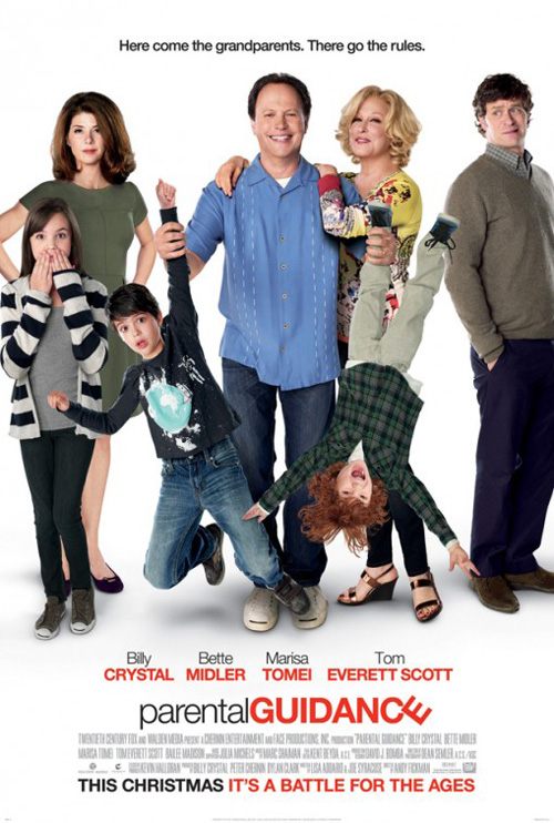
The lack of originality in plot notwithstanding, the use of cutout cast members does nothing to help the appeal of Parental Guidance (open December 25th). Parents go out of town, kids get stuck with grandparents, chaos ensues, morality lessons are learned, and we’re bored from the clichéd futility of it all. I know it’s a family film and I may just “not get it” because I don’t have kids, but there’s no to try when Wreck-It Ralph is still in theaters.
And can the marketing team rip-off “Modern Family” any more blatantly? Actors on a stark white background—check. Title treatment with a thin sans serif font for the first word and a differently colored, thicker font for the second—check. Oh, but there is a playful whimsy in the skewed “E” to add some charm, right? Nope, makes it look even more like a television show.
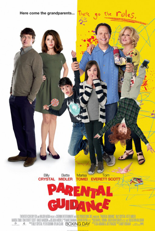
At least the alternate take tries to get at the duality of worlds when kids roam free with their senior family members. It’s title font comes off more cartoony and the crayon scrawls at right are kind of fun. Heck, they even played musical chairs with the actors to serve their thematic purpose. That’s the beauty of interchangeable parts, I guess. It’s just too bad easy malleability means the absence of being memorable.
 |
 |
 |
 |
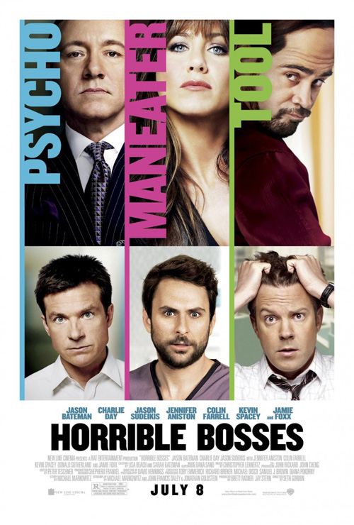
Another lackluster rehash of something I’ve seen recently movie poster design-wise, Lay the Favorite (limited December 7th) does nothing to grab my attention besides slapping Stephen Frears‘ name on it. Boxed faces of actors with vertical text bears striking resemblance to BLT Communications, LLC‘s Horrible Bosses; the colored orbs of light seen everywhere recently making you wonder if the image even comes from the film is a kindred spirit to another lazy December release, Playing for Keeps (open December 7th).
The slightly italicized title makes me think action film—it’s movement alluding to a chase of sorts that probably won’t happen. I have no idea what to expect actually, especially when they mention Frears’ High Fidelity and The Queen. Talk about using two very disparate pictures to sell something. Maybe Queen Elizabeth makes an appearance in this comedy? Maybe Tony Blair?
A second poster at least plays with text to give off a Vegas vibe with its three-dimensionally rendered logotype—the only marker gambling is included at all. As seen by the original play’s cover, this appears to play a big role. So why not make it more visible? It’s not like the firm was completely for Joshua Jackson selling it anyway since his name can’t even grace sheet number two. Or maybe the designer just thought he looked like Vince Vaughn.
Maybe The Grifters would have been the better Frears film to name drop …
 |
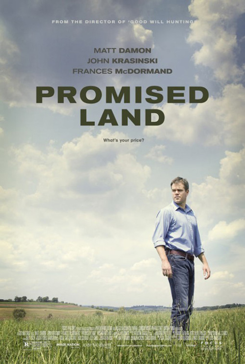
Both of the previous films should take a lesson from Promised Land (limited December 28th) on the less is more philosophy. Dropping in theatres at the latest possible moment for Oscar consideration, Gus Van Sant‘s latest has a trailer that intrigues and the rather surprising fact Dave Eggers‘ story was adapted by stars Matt Damon and John Krasinski. Well, maybe not too surprising since Van Sant did direct a little film called Good Will Hunting from Damon as well.
What I like about the poster is how easily its mood can be projected from the imagery. Dark clouds are moving in and the way Damon is standing makes you understand the crisis of faith he’s having—looking back at the details he’d love to ignore. It’s almost the polar opposite of P+A / Mojo‘s A Serious Man with Michael Stuhlbarg facing towards the future. Damon’s character doesn’t have that luxury.
If I’m nitpicking I’d say the font is too thick and harsh against the more organic clouds, but the fact my eye goes straight to it does prove effective for name recognition. It might be the perfect juxtaposition after all.
 |
 |
And to go four for four without knowing the firm responsible for the posters I’ve highlighted this section, I bring you The Impossible (limited December 21st). A powerful film despite its true story Hollywood contrivances, I’ve loved this advert since it was released. Putting the beauty and love this family shares against the devastation and lonely abyss of the unknown coming epitomizes the movie completely.
I can mention Villuti Creative Studio for its Spanish counterparts and keen sense of the tragedy to throw some credit around, but despite being effective they only capture half the importance. One pretty much spoils the eventual, inevitable end and both appear to use the same template so uniqueness is not a strong suit. The power of the water is impressive on its two-dimensional surface, though.
Like Promised Land, however, less is more works on the first one because it lets the film’s imagery speak for itself. Warm colors versus cool; hope versus despair. You don’t need to show your hand early with the special effects that will wow you in the theater. A little suspense by exclusion can be welcome.
Deservedly on the nose
 |
 |
 |
 |
Here are four posters that achieve their goals exactly. None are flashy or mind-blowingly unique, but each sells its film without unnecessary clutter or need for star power above message. When you’re dealing with Judd Apatow, Michael Haneke, Quentin Tarantino, and Kathryn Bigelow, their names and pedigrees sell themselves
 |
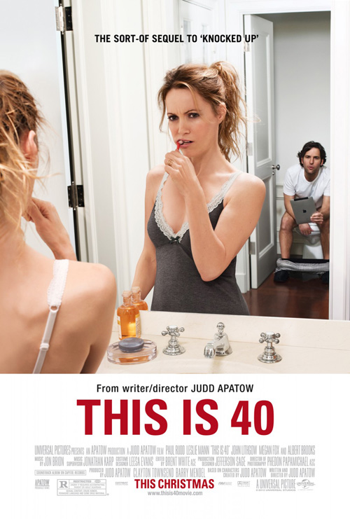 |
For his spin-off film This is 40 (open December 21st), Apatow goes back to the well and The Cimarron Group does the same. Their sheet is a tonal sibling to Crew Creative Advertising‘s Knocked Up much like the films. Our leading duos are shown with faces affixed by indifference; the red font is identical as well as the segmenting of photo with text on white; and the environments prove crucial to their respective plots.
What sets This is Forty‘s apart, however, is the increased attractiveness of the photo. I really like Knocked Up‘s text superimposed on the image, but The Cimarron Group knows this technique will aversely effect their composition. It’s all about the wonderful depth of field and the crisp parents set back while in-motion children wreak havoc at the foot of the bed. It’s just a really fun depiction of the comedy we’re sure to be seeing.
The firm’s alternate take in the bathroom is similar but with less effective results. Leslie Mann is in the foreground while Paul Rudd lives at the back and yet everything’s in focus. Life is injected into the bedroom scene and Mann’s look of disgust in response to whatever Rudd is saying doesn’t possess it. You need the kids going crazy to drive home that the adults are tired and on autopilot, not in a passion-less rut.
 |
|
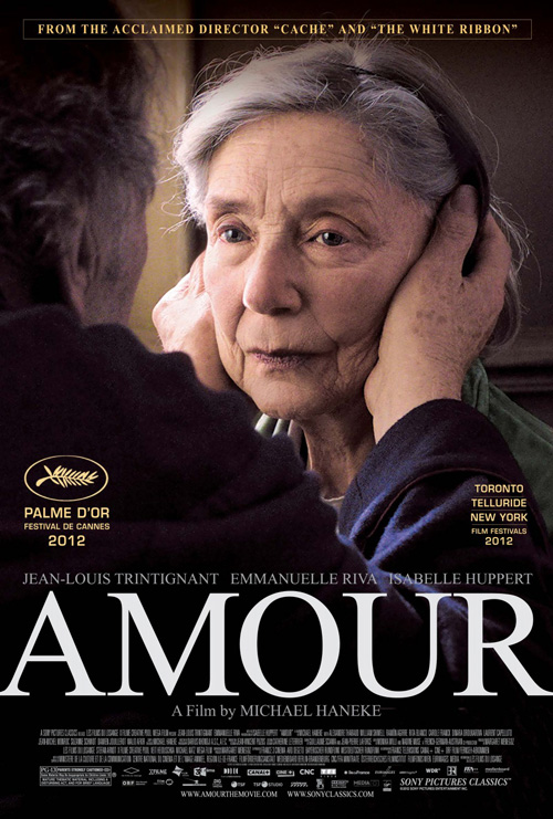
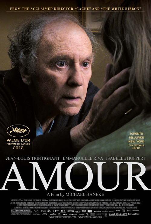
Haneke’s films rely heavily on the perspective by which they’re told. It’s no surprise then to see Amour‘s (limited December 19th) advertising playing up this angle. A set of two posters, we’re shown the same image from two different vantage points. Like the title—Love—the movie is dependant on its core relationship and its two members.
As the director’s work is wont to do, the atmosphere presented isn’t necessarily cheery despite the preconceptions we project on the word ‘love’. Neither actor is smiling or basking in the warm glow of joyous union. No, this is a film about surviving together and willing a way through potential tragedy. Love binds them and their looks show a deep compassion staring into the other’s soul for truth.
Putting both on one poster in profile simply wouldn’t have the same pull on the viewer. We need to see the other’s face; we can’t understand what they are expressing without the other’s reaction. It’s a brilliant maneuver that captures your gaze and wins your desire to find out what’s going on in the characters’ heads at that specific moment.
 |
 |
 |
 |
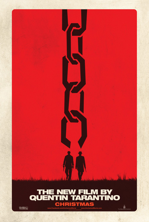
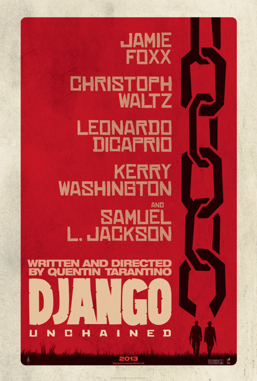
Moving on to Tarantino, here is a guy who’s proven time and time again that he doesn’t need actors’ faces to sell a movie. As a result, many of his films have had pretty creative posters with great aesthetics setting them apart from the photo-heavy contemporary market. Django Unchained (open December 25th) is no exception.
The work of BLT, its teaser is fantastic. Is the broken chain leading down the page to our ‘heroes’ too on the nose? Maybe. But in the director’s great tradition of making films in homage to genres long since past their heyday, the design’s simplistic message works towards its blaxploitation roots. The black on red also helps allude to the copious amounts of blood we can expect.
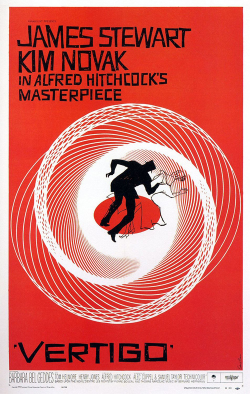
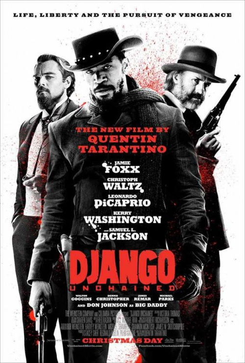
When the firm decided to add names, the finished piece looks a lot like a Saul Bass (Vertigo) rip-off courtesy of the font—if it didn’t already before. It gets a bit bogged down too so the switch to Ignition Print‘s more generic photography isn’t a surprise. However, high contrast black and white imagery with red flourishes looks like every other action film of the past decade and appears too mainstream for the auteur.
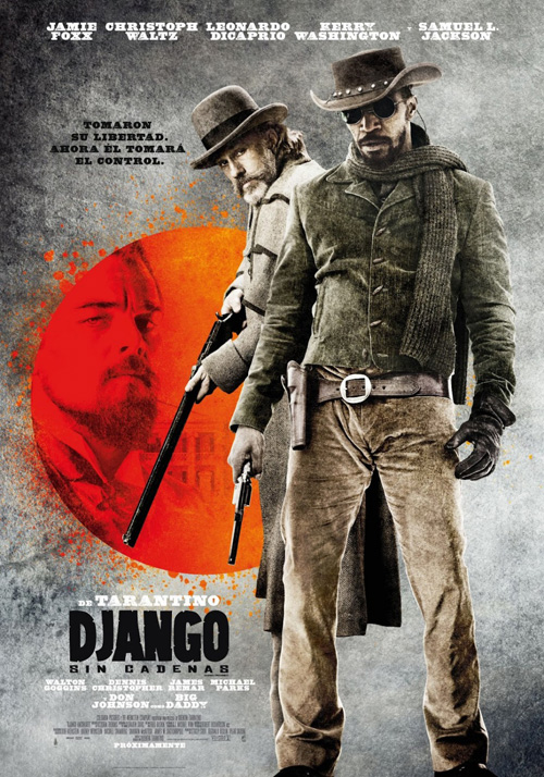
Hopefully the finished project doesn’t follow suit and instead leans more towards what Vox and Associates did in their Spanish language advert. I like the red sun with Leonardo DiCaprio and the rugged color scheme of earth tones. I just want to know why they felt the need to cover Jamie Foxx‘s eyes with sunglasses. It’s obviously the same image as Ignition’s so there must be a reason.
 |
 |
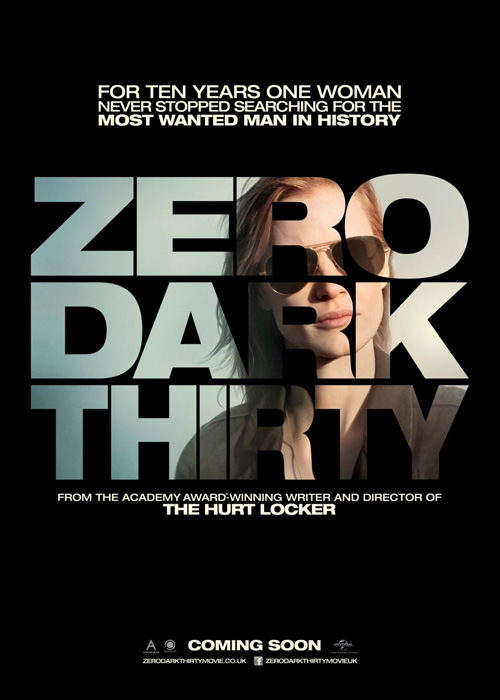 |
In my favorite poster of the month—and possibly the year—BLT’s Zero Dark Thirty (limited December 19th) begs you to find out more. Nothing garners attention more than that which we’re not allowed to see. If you redacted, they will come.
Unlike Brian De Palma‘s film Redacted, however, this one actually covers the name itself. I guess Sawyer Studios didn’t trust the gimmick fully. BLT has no fear, though, as they marker over everything yet still make it just barely legible. Those black lines epitomize the War on Terror and they know every American citizen is aware of the fact.
You can’t blame the studio for wanting other options not shielding their title, though. The more palatable sheet of a drone’s view from the sky is attractive, but I kind of wish it was never released. As for the third, putting Jessica Chastain inside the title is the complete opposite of the previous goal. It makes the name transparent rather than opaque, helping us appreciate the daring of the teaser that much more.
Judging by the cover
 |
 |
 |
 |
 |
 |
 |
 |
And that brings us to the four literary adaptations of the month. They span genres and eras and I’m sure diverge from their source material in film as they do in print, but I thought it would be interesting to compare and contrast the posters with the book covers.
 |
 |
 |
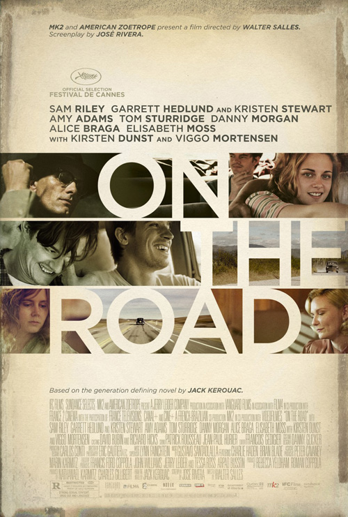
For On the Road (limited December 21st), I have no idea what’s happening on its cover. Jack Kerouac‘s ‘beat’ opus gets a small window with buildings/crayons/abstract art and a title resting on alternating planes of vertical height. Basically, it is a bunch of things the marketing teams decided to ignore.
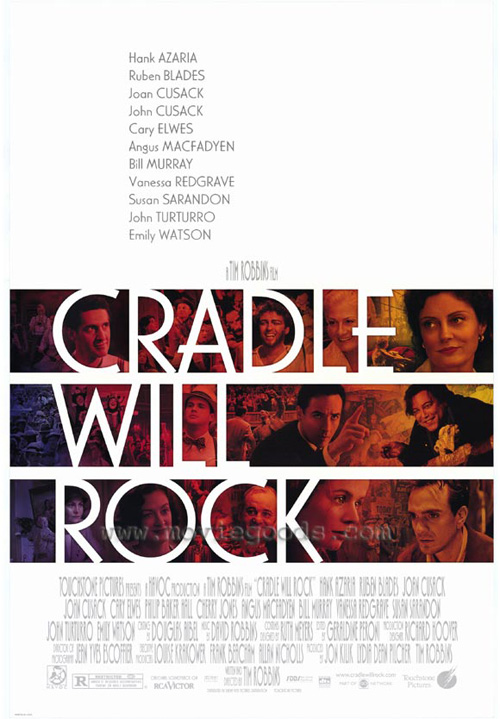
P+A’s version seems to be the definitive work with a bunch of the actors interspersed throughout the letters a la Bemis Belkind‘s Cradle Will Rock. I like the negative space formed by the title and the offset horizontal justification of its words (maybe they didn’t ignore the book after all). The stained browns of the background also nicely complement the images. Does it scream, “Buy a ticket”? No, not really. It gets the name out there and hopes people recognize it with interest.
Carnival Studio and Le Cercle Noir go literal by showing a road and really ruin any true appeal. Would I rather the poster be black with a title? Maybe over these last two, but not the first. P+A’s is at the very least aesthetically pleasing even if it does nothing to portray the essence of the work.
 |
When it comes to Jack Reacher (Open December 21st), you can’t blame BLT for wanting to put the film’s star Tom Cruise front and center. It doesn’t look any different than a Mission: Impossible poster as he’s looking angrily pensive deciding where to run to next, but the couch-jumper puts butts in seats so who cares?
Heck, the filmmakers killed formalities and renamed the series in its hero’s guise anyway when author Lee Child never did. The first novel to feature Reacher is entitled Killer Floor and subsequent entries follow suit. In fact, the movie isn’t even based on it, but instead the ninth, One Shot. I’m sure if a sequel is greenlit, however, it will merely be Jack Reacher 2 no matter which book they use.
I will just say that BLT needs to stick with the full figure Cruise because the second poster doesn’t cut it if he is their spokesman. It may be the crop, the color, or who knows what, but that is totally Christian Bale.
 |
 |
 |
 |
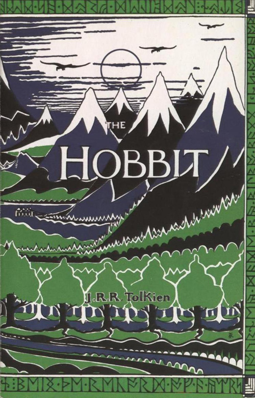
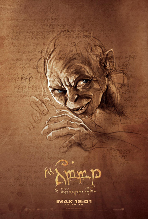
I really hoped The Hobbit (open December 14th) wouldn’t follow this trend. For starters, star Martin Freeman isn’t exactly a household name to Americans when they have John Krasinski and Lucy Liu portraying two of his most famous roles this side of the pond. That’s why I find BULLDOG‘s sheet featuring him as Bilbo Baggins so intriguing. Pair it with Ignition Print’s jampacked frame of dwarves and that’s a lot of unrecognizable actors. I guess it just shows how ubiquitous the word ‘hobbit’ has become.
No firm would ever have gone the graphic route like the first edition of J.R.R. Tolkien‘s novel, but I do really enjoy Art Machine, A Trailer Park Company‘s series of character shots for what appears to be an Arabic market. The handdrawn illustrations are very cool and lend it some added appeal in contrast to the usual photographs.
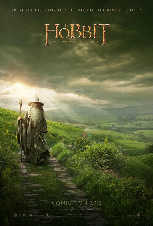
Even so, though, my favorites of the bunch are probably the ones depicting more world than character. BULLDOG’s Middle Earth with Gandalf off to the left and eclipse‘s opening of Bilbo’s door are gorgeous in their own right and utilize Peter Jackson‘s greatest strength—New Zealand’s amazing landscapes.
 |
 |
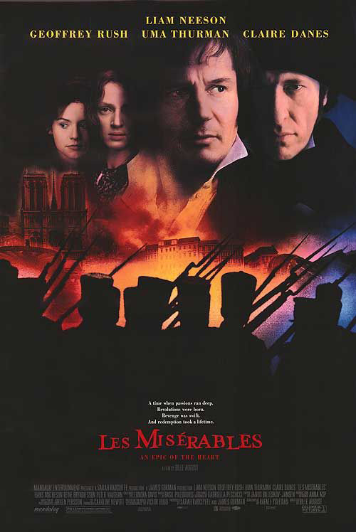 |
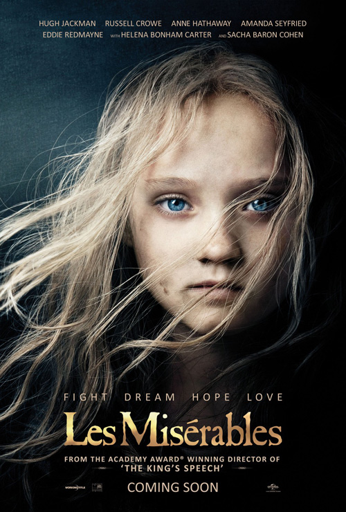
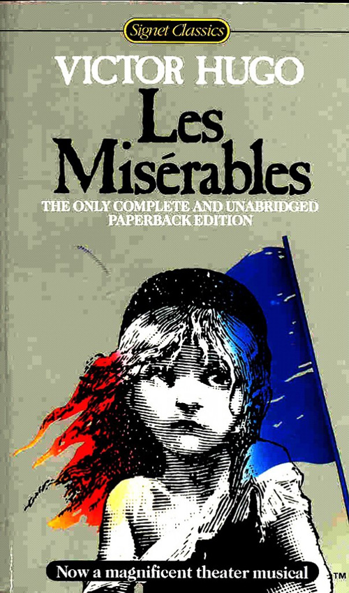
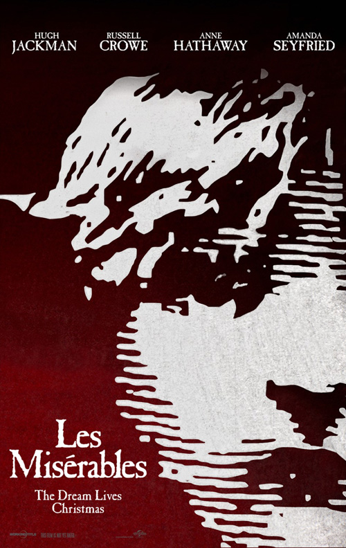
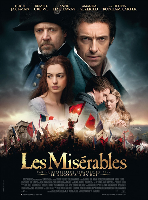
Bucking the trend, Les Misérables (open December 25th) embraces its origins by not only using the Signet cover on the teaser but also recreating it with Isabelle Allen for a stunning one-sheet. Quite the inspired move by Ignition.
Another entry uses the tried and true floating heads montage—the 1998 adaptation did so as well—and you can see how less interesting the result is. Something about the squalor in Allen’s visage gets at the heart of the tragic underpinnings to the film and remains absolutely familiar to the classic illustration. This is an iconic image that even someone like me who has never seen the play or film or read past page 200 of 1000 of the novel knows the image of young Cosette. Frankly, anyone would be stupid not to use it. Thankfully Ignition found a way to breathe a bit of fresh air under the sails.